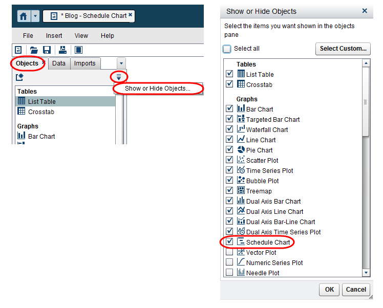
You may be wondering if you need something special to gain access to the Schedule Chart object. Don’t worry, you don’t, you just need to unhide this visualization if it isn’t already. You can do this from the Objects’ drop down menu. There are several other objects available to you if you’d like to show those as well. Simply check the ones you want to include in the list and then click ok.
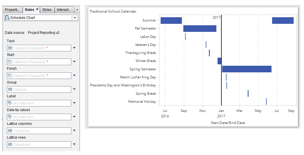
The VA 7.3 Schedule Chart is similar to the traditional Gantt chart in that it serves to illustrate the start and finish duration of a category data item. You must provide a category data item and two date or datetime data items representing the start and end dates. You can also add a group by category, lattice by columns and/or rows. Here is a simple example that visualizes my local school district’s 2016-2017 Traditional School Calendar.
Schedule charts can be used to visualize a variety of data such as:
- Calendar Events
- Project Tracking
- Campaign/Promotional Runs
- Floor Service Coverage
Essentially, any category which can be associated with a start and end date can use this visualization.
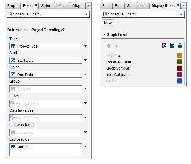
Here are some examples of using the Schedule Chart to look at project tracking data. Our team uses a similar visualization; however, I have modified real names and gave it a Star Wars theme for a bit of fun.
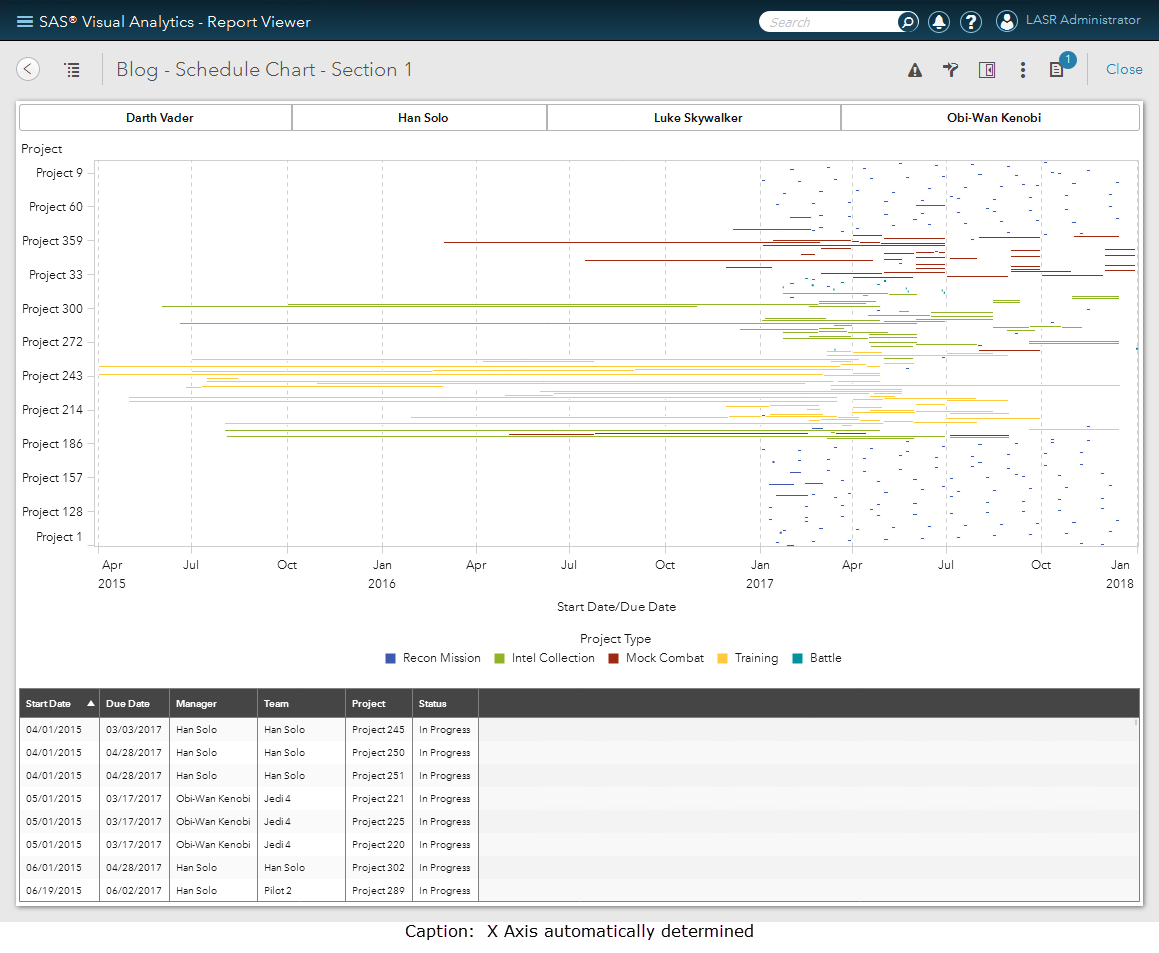
Example 1
In this example, the Project name is assigned as the main category. Here are a few takeaways:
- The schedule chart gives a great bird’s eye view of a lot of data. This particular data has over 350 projects spanning a team of 19 individual members.
- The schedule chart automatically includes the least and greatest date value. You can override the X Axis in the Properties tab by assigning a fixed minimum and maximum.
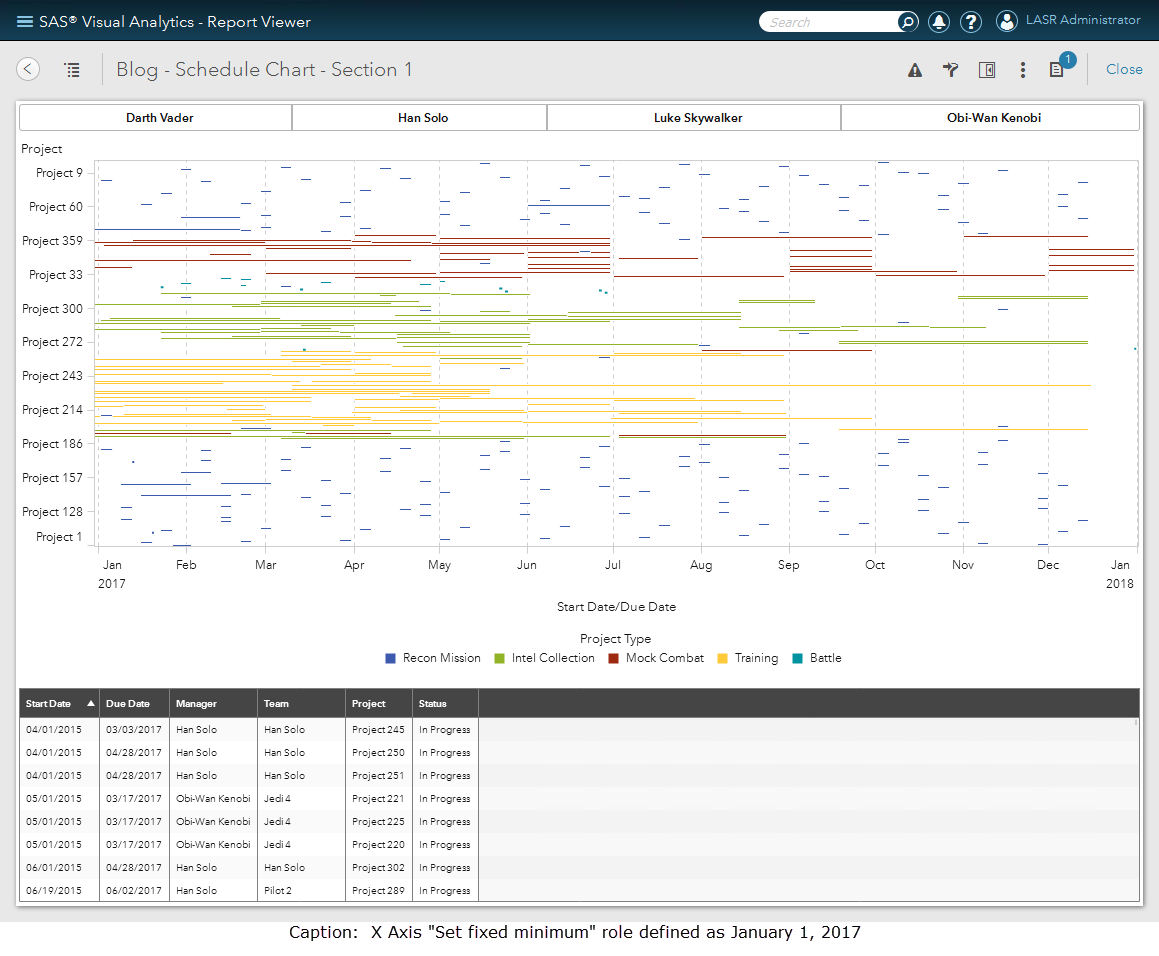
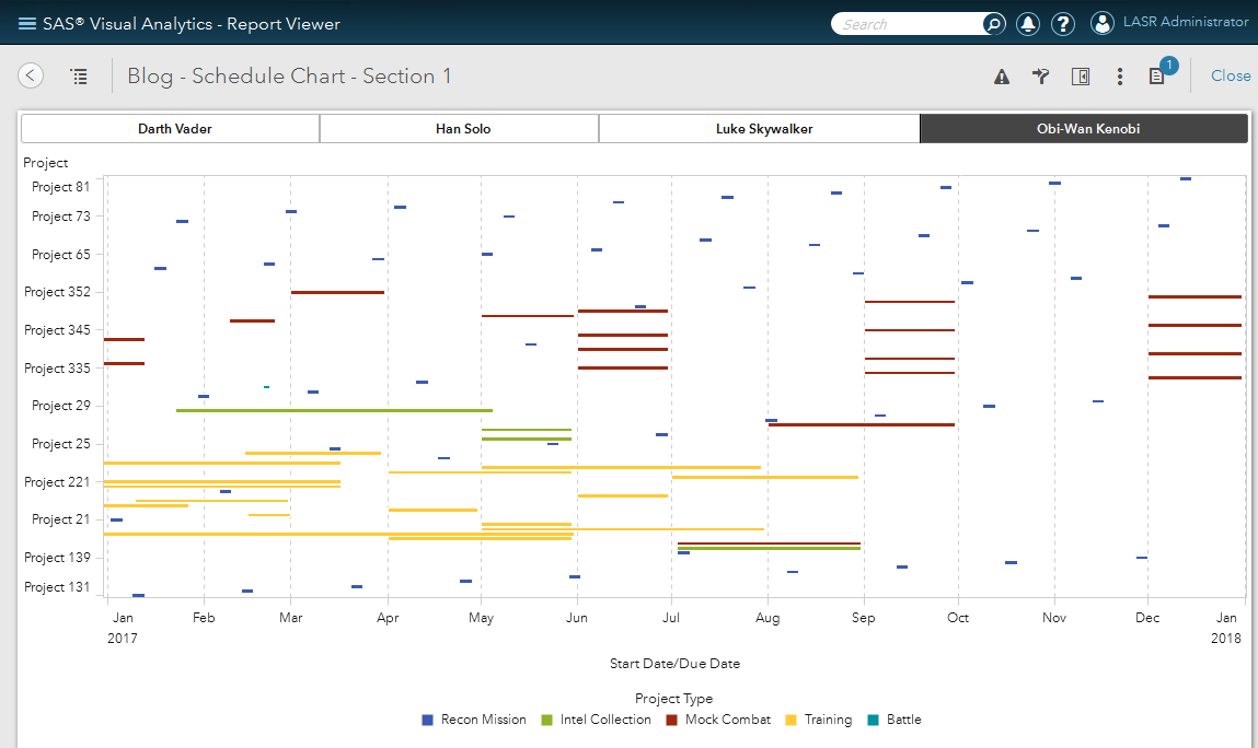
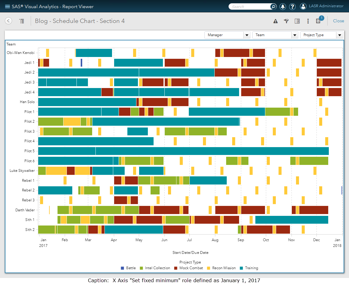
In this next screenshot, I have selected the manager Obi-Wan Kenobi to filter the Schedule Chart. Therefore, by adding section filters to this report, you can see how spotting coverage of Projects and Project Types are easy. And, with some Mock Combat planned later in the year, the Jedis might want to up their training.
Example 2
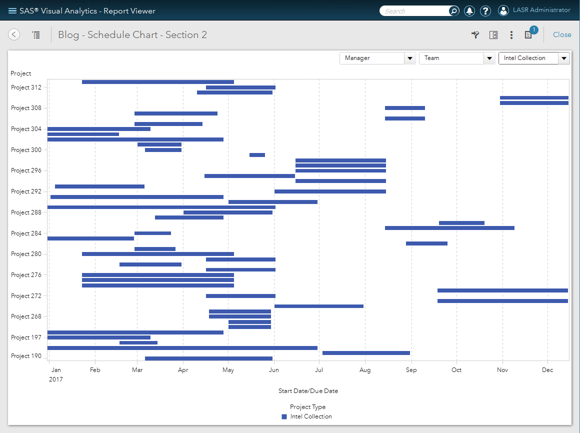
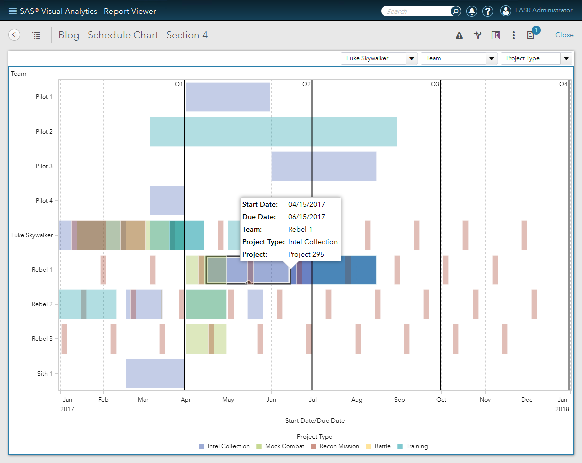
This example uses the same Schedule Chart role assignments as before, but different section prompt filters. Here, this report shows how an individual team member can use the Schedule Chart to visualize several things:
- A list of his/her assigned projects.
- The planned duration of each project.
- How the projects are spread throughout the year.
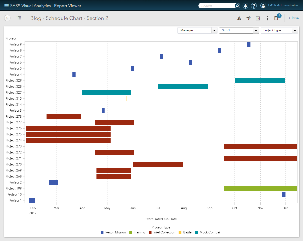
If you chose to look at a particular Project Type, then this visualization would help list the Project names and how they span across the year.
Example 3
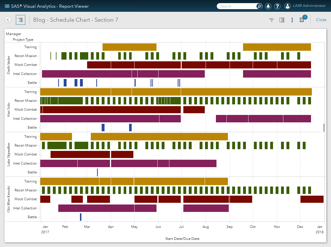
The next example moves away from the traditional use of putting the Project as the main category data item and instead places the Team Lead on the Y Axis. This now allows us to see how busy each Team member is and with which Project Type. By the way, did you notice the neat way the Team names are sorted? I used a custom sort!
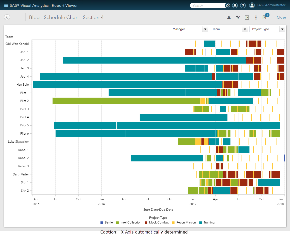
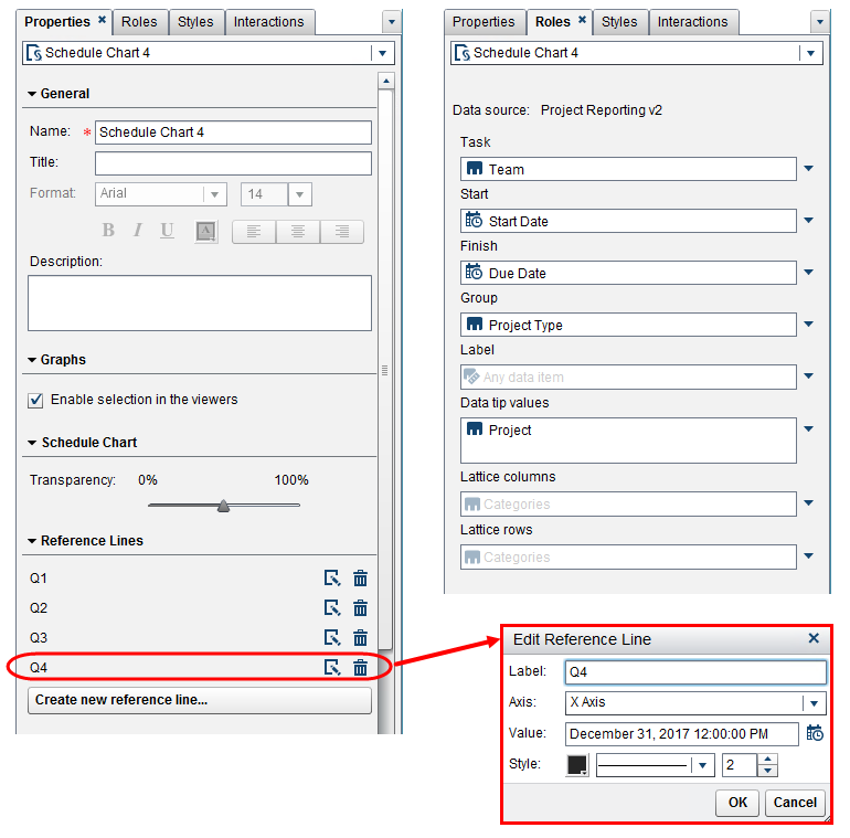
Here are just a few more things you can do to enhance this visualization: you can adjust the transparency so you can see overlapping projects and you can easily add reference lines to the X Axis. In this example, I’ve added the reference lines for Q1 through Q4. I’ve also selected a manager from the report section filters and added an additional data item for the Label.
Example 4
In this example, I wanted to demonstrate the use of the Lattice rows and I also applied a Display Rule for the Project Type. This is a good way if you want to view overlapping information and the transparency property isn’t distinct enough.
Schedule Chart Limitations
If you want a bar representation on the Schedule Chart to appear then the data must have a start and end date for every row of data. If either is missing, then the category name will appear on the Y Axis but no bar will be displayed on the visualization. Also, you cannot create an interaction from or to the Schedule Chart object. That means you cannot create a filter or brush with another object in the report area. The Schedule Chart will be filtered by either report or section prompts. I hope you can include the Schedule Chart into your reports, it is one of my favorite visuals.

7 Comments
Hello Teri,
If want to show another date in between start and end dates , let’s say actual completion date, is it possible?Could you please help?
Hi Sri,
I emailed you offline with an example solution using SAS Custom Graph Builder. Essentially, I layered two Schedule Charts on top of each other and I made the top chart 50% transparent. Then I created some shared roles to allow for easy Role assignment for the Start Date and Group role. I then used the two End Date roles from each Schedule Chart.
Thank you,
Teri
Hi Teri,
My sincere thanks to you for the reply.
Yes, this is very helpful. We are still using version 7.5. So, not many options to make things easy.
This morning, after I sent a note to you, I tried custom graph builder and used schedule chart + bubble chart (to accommodate completion date).
Please see the attached screen print.
But, there are few things that I am not able to resolve. 1) I wAnted to apply display rule to bubble (red/green) depending on the completion date compared to scheduled end date. But, the display rule is apply for the schedule chart also (for a given project)
2) if completion date is not available, it is not displaying project title.
3) not sure if there’s any room to accommodate report status field also (kind of labeling)
Kindly advise me if I can resolve these.
Again, Thank You so much.
With best regards,
Sri
Hi Sri,
WOW! I really like the Schedule & Bubble Chart overlay! Very creative. I was able to find solutions for two of your issues.
1) Display Rule: I created a new calculation to be a “flag” with an IF/THEN/ELSE to be both numeric (to support the Display Rule) and custom category (to support the Data Label).
2) If no completion date – the project doesn’t show: This is the nature of the Schedule Chart that we also saw in our data. It has to have a start and finish date to be plotted since both roles are required.
3) Data Label: I added the Data Label to the Bubble Plot role. This is so that the label appeared next to the bubble. At first I made it a shared role for both the Schedule Chart & Bubble but the data label was printed twice. So depending on what you want to Label – only add that role for either the Bubble or Schedule.
Let me know if you have additional questions.
Thank you,
Teri
Hello. This is a very interesting article. I would also like to request for the raw dataset of the data for the purpose of learning how to create/recreate schedule graphs.
Hello, I'll reach out to you directly.
Thank you,
Teri
Teri - Really enjoyed this article. May I request a copy of the raw dataset so I may recreate your visualizations? This will enable me to learn this object fully.
Thanks for the Star Wars theme too!! An Excel sheet is perfectly fine.
Cheers,
Ben