For many people, building something from scratch, no matter how simple or complex, is fascinating. That’s why programs similar to How’s It Made are so appealing and, for me, addicting. And thus, the inspiration for this blog; I will walk you through building a set of graphs and how to improve each visualization through my own personal iterative process. Like all forms of art, a visualization is never complete, as constant improvement, tweaking and alterations are required to accommodate the constant influx of data and the ever changing needs of our audience.
These graphs use telecom data about cell phone network service including call duration and data usage.
Example 1: Calls versus Drops
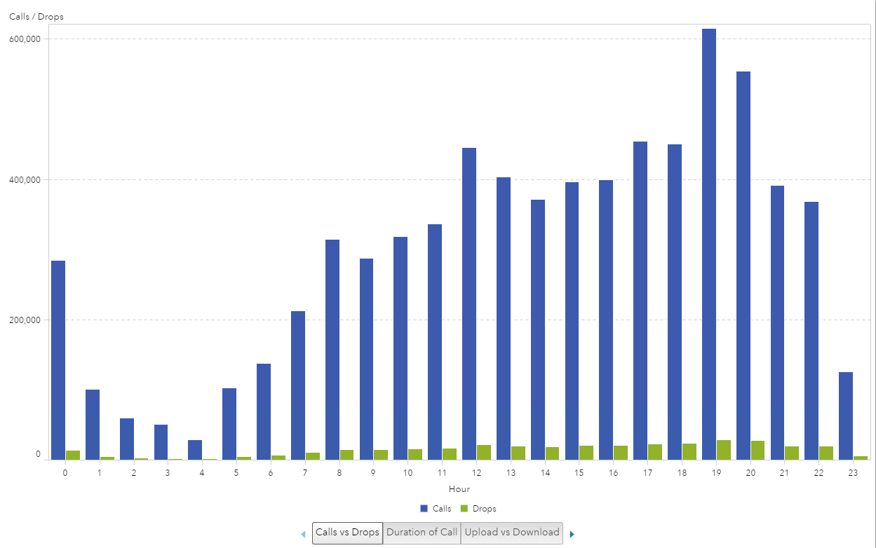
In this first example, I noticed that the data contained the number of calls and the number of dropped calls. Like most analytics, audiences are interested in the outliers. In this case, we look at the poor performing occurrence of a call being dropped. This data would prove useful if a company wanted to research poor performing cell technology either of the handset itself or of the cell towers. It could also be used to find any dead zones, where additional towers may need to be added. In this example, I decided to plot the data against the 24-hour day to determine if volume of calls impacted the number of calls dropped.
Example 1: Iteration 1
Naturally, I started with a bar chart visualization. I plotted the hours of the day (24-hour scale) on the x-axis and the number of calls and the number of dropped calls on the y-axis. At first glance, it looks like there is some variation in the number of dropped calls and the hour of the day.
Example 1: Iteration 2
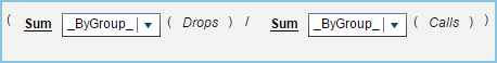
Since the number of calls and the number of drops are of the same scale, we can easily take the ratio of the two to plot the call drop rate. The equation is to take the number of dropped calls divided by the number of calls. I used an aggregated measure to create this ratio, which will be evaluated on the fly, depending on the Group By variable. In this example the “ByGroup” is the hour of the day, and I used a Percent format.
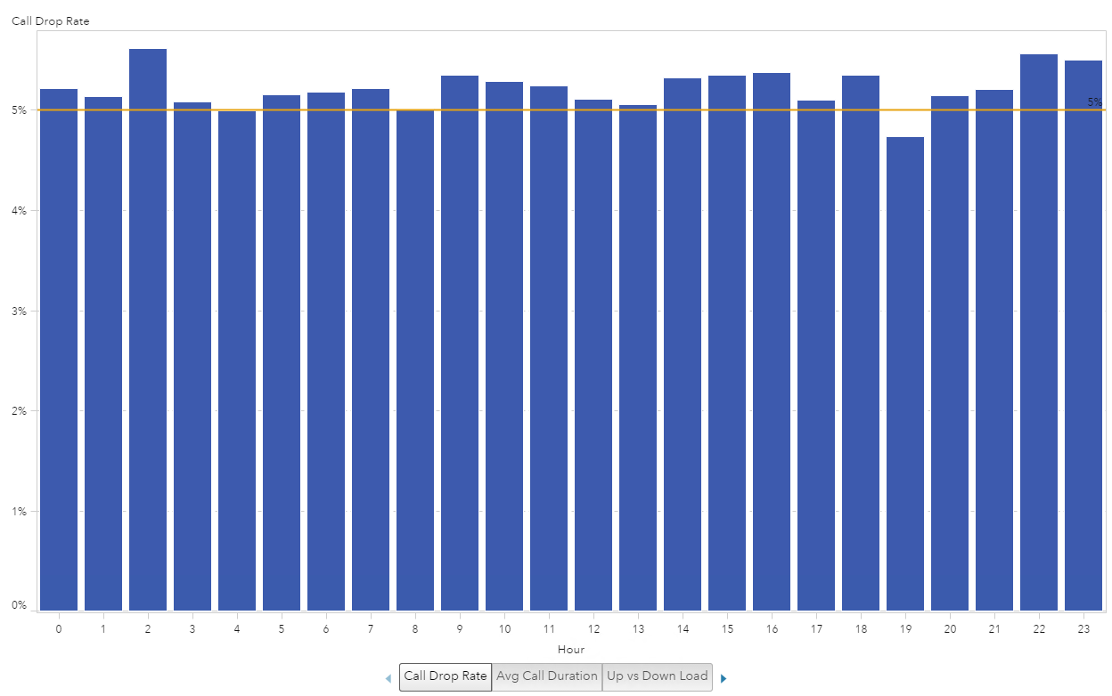
This now gives us one bar to evaluate against the hours of the day. We can see that the Call Drop Rate does not fluctuate as much as the previous graph could lead one to believe.
I also added a reference line at 5% to make it easier to see which hour of the day fell below or above the 5% rate.
Example 1: Iteration 3
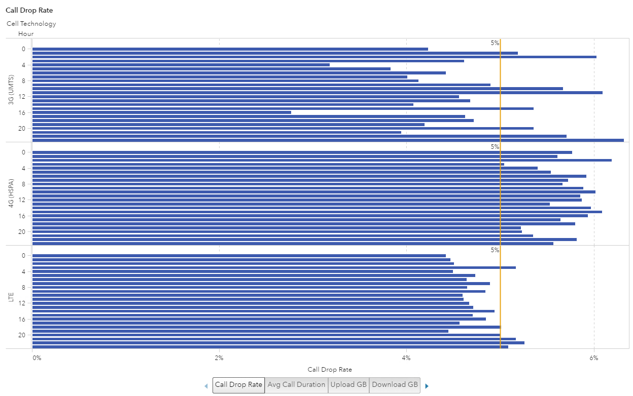
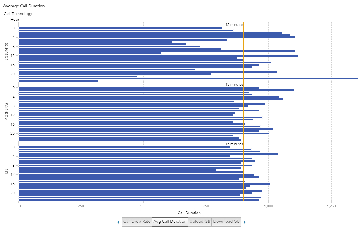
Finally, I noticed that the data contained a Cell Technology category. I thought it would be interesting to see if a certain technology was more unreliable than another. To do this, I added Cell Technology to the graph. I liked the visualization the best when I changed the bar chart to a horizontal orientation, used a row lattice for the Cell Technology and kept the 5% reference line. This now gives me an enhanced “quick glance” comparison ability to see that the 4G Cell Technology seems to have the most consistently high Call Drop Rate (over 5%) for all hours of the day.
Example 2: Call Duration
Example 2: Call Duration
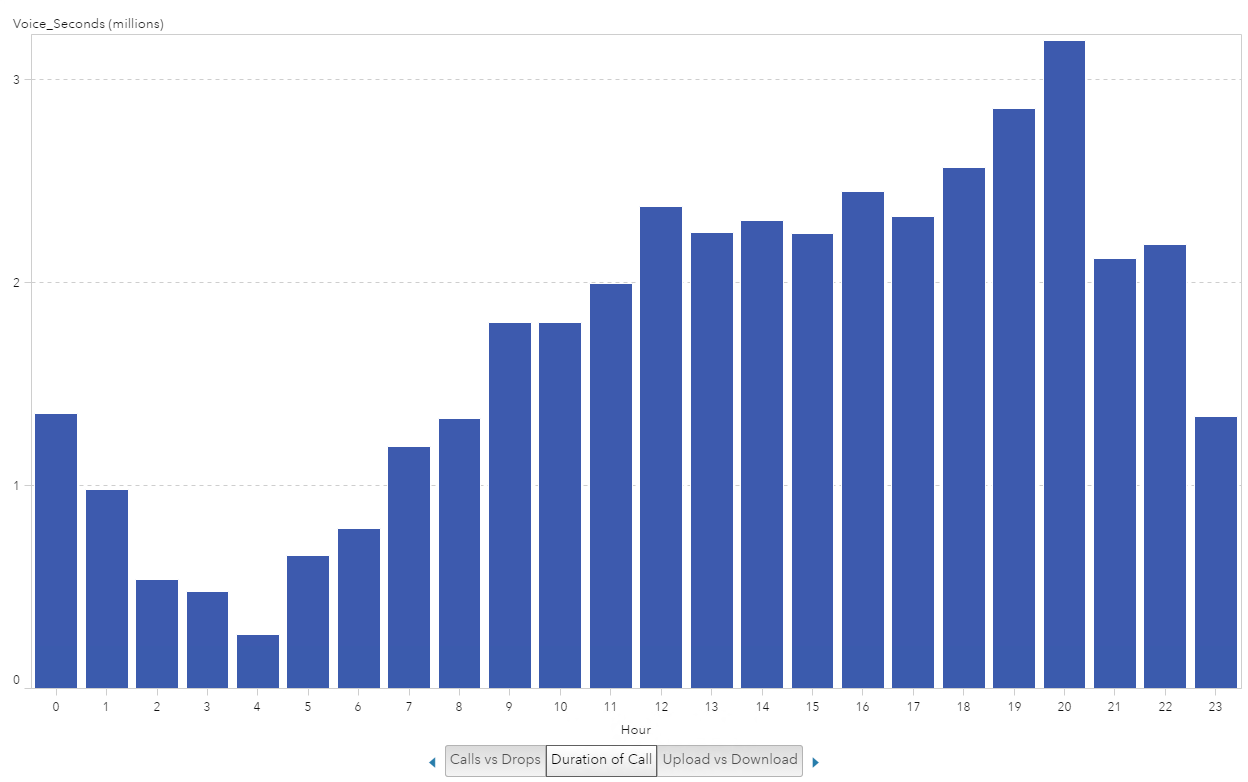
In this second example, I used the Voice_Seconds data item to study the duration of calls over the course of the 24-hour day. This visualization could help determine what the peak hours of the day are for voice calls and potentially the best time to schedule any required maintenance to impact the least amount of customers.
Example 2: Iteration 1
Again, I stared with a bar chart visualization where I plotted hours of the day on the x-axis and the Voice_Seconds on the y-axis. The first thing I noticed was that at hour 20 there was a peak _SUM_ of over 3 million Voice_Seconds. This immediately prompted me to want to find out how long 3 million seconds was and that I need to look at the average of Voice_Seconds.
Example 2: Iteration 2
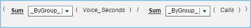
The first thing I did was create another aggregated measure to produce the Average Call Duration. To do this I took the sum of Voice_Seconds divided by the sum of the number of calls for a By Group.
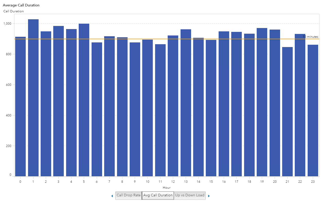
The next thing I wanted to do was provide a reference point for how long 1,000 seconds is in minutes. Granted, I could convert Voice_Seconds into a new metric but instead I decided to use a reference line where 900 seconds equates to 15 minutes.
Example 2: Iteration 3
Lastly, I wanted to see if the type of Cell Technology had any impact on the distribution or length of call, mostly just because I was curious. I was surprised that this data shows an average call of 15 minutes. That’s a long personal call when I consider most of my calls consist of “are you on your way?” and “we forgot x at the store – please pick it up on your way home”.
If this were call center data you would be able to determine how quickly issues were getting resolved. If this were sales call data, and representatives were following a script, this visualization would show, on average, how long those calls took and maybe the longer calls would result in a sale. So you could see which hours of the day sold more product.
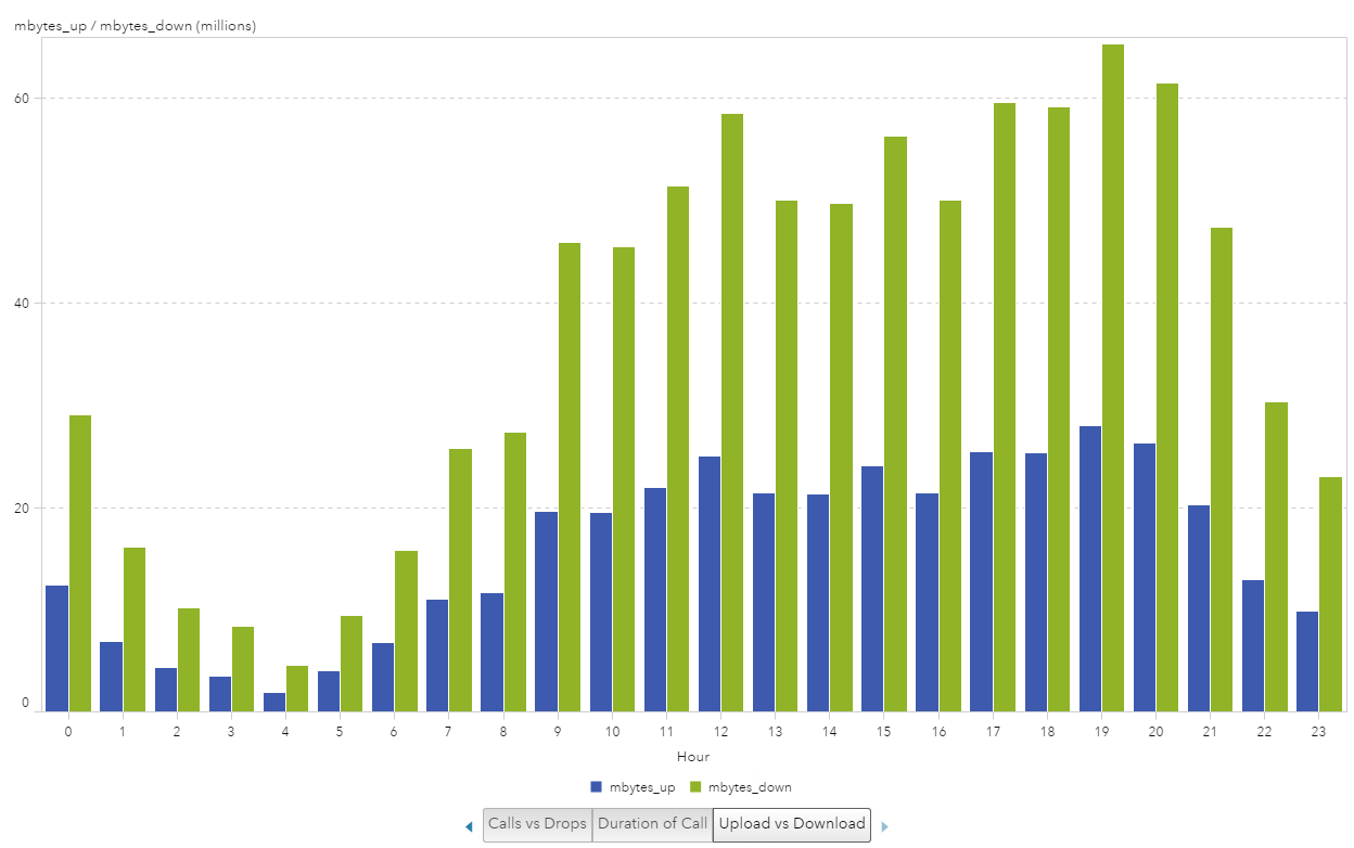
Example 3: Data Usage
In this third example, I explored the data usage. I had two data items available for use: mbytes_up and mbytes_down. This visualization could help determine peak hours for which to perform system upgrades or maintenance. It could also help identify those peak hours and then add tower locations to help determine if additional hardware could help network speed performance.
Example 3: Iteration 1
I started with the bar chart visualization and plotted the hours of the day on the x-axis and the mbytes_up and mbytes_down on the y-axis. Again, the first thing I noticed was that I was looking at the _SUM_ for the metrics and the large difference in the numbers for up versus down usage.
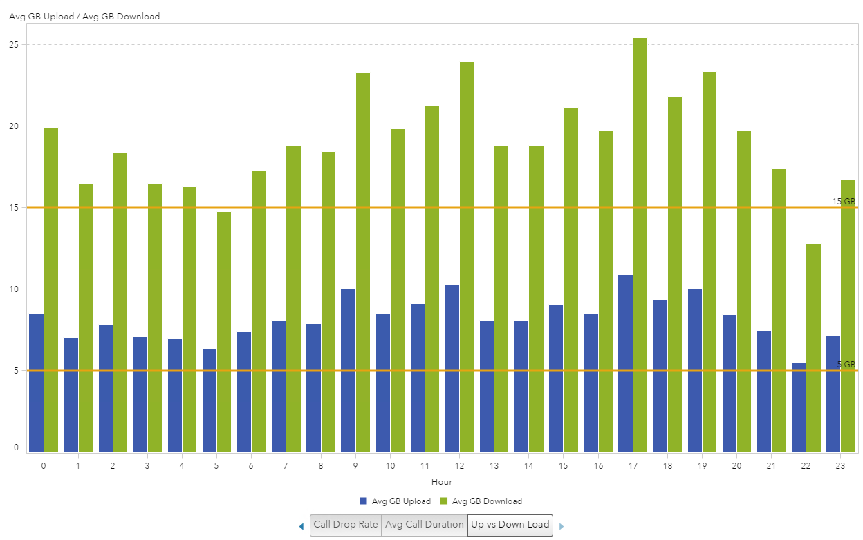
Example 3: Iteration 2
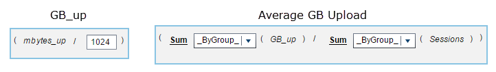
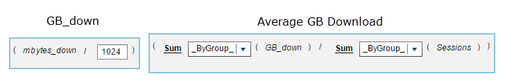
The first thing I did was convert the megabytes to gigabytes by creating new calculated data items and then I created the Average Upload and Download by creating aggregated measures.
Here are the two metrics I created for Upload:
And here are the two metrics I created for Download:
This makes the visualization a bit easier to consume, now that we can compare the average upload or download size per session. I also added two reference lines at 5 GB and 15 GB. I still felt like the data needed to be visualized a bit better to understand the usage since I know most typical cell phone plans allow for 5 GB of data per month and the average session using more than 15 GB, it just seems like a lot.
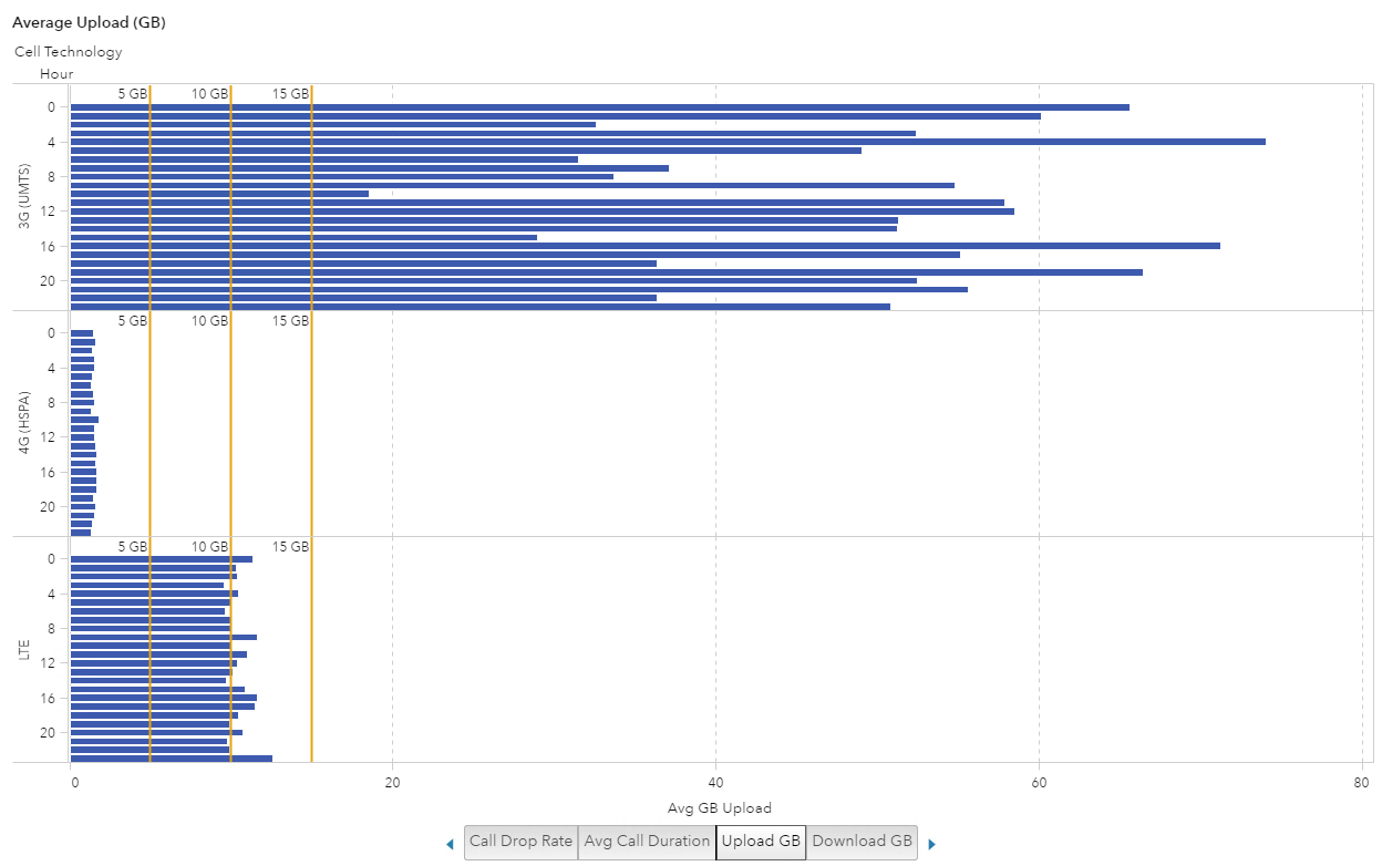
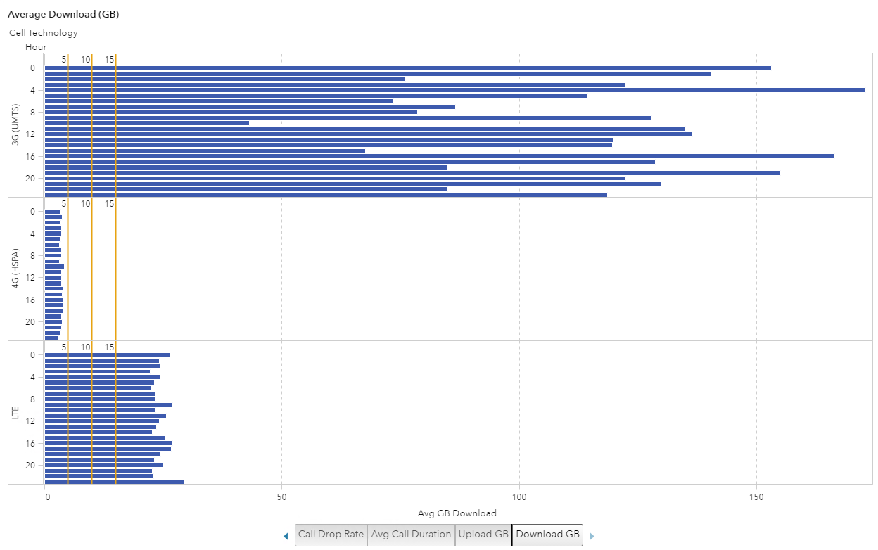
Example 3: Iteration 3
To further classify the data I added Cell Technology to the visualization and broke it into two visualizations: one for upload and one for download. Once I did that, the visualization really started to show different data usage patterns.
Both visualizations show the 4G technology doesn’t even reach 5 GB, which makes me think that the customers with new phones and new service plans are sticking to their data allowance. But the customers with the older technology of 3G may be “grandfathered” in with their unlimited data plan and making the most of it.
Average Upload (GB)
Average Download (GB)
This blog has taken you through three examples of how I iteratively develop visualizations using SAS Visual Analytics. Ultimately, what this process shows you is that the more specific business question you have, the better a visualization you can create.