This blog is not about the original movie The More the Merrier (1943) or its remake, Walk, Don’t Run (1966), which I’ve actually seen a couple of times. It’s actually about the wide variety of descriptive statistics available in SAS Visual Analytics—and when you want to examine the characteristics of numeric data in your report—the more, the merrier.
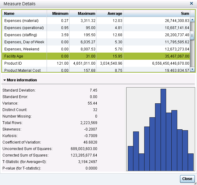
SAS Visual Analytics Explorer and SAS Visual Analytics Designer display a multitude of descriptive statistics when you select Measure Details.
Types of descriptive statistics
These statistics can generally be classified as three general types:
- measures of location (or central tendency, such as mean)
- measures of dispersion (how spread out the data is)
- measures of shape
These statistics help you understand the characteristics of the data you are working with and provide preliminary information on how the data is distributed. These measures are important because most statistical tests have certain assumptions attached to them, such as the data is normally distributed, or assumptions about the level of measurement of the variables (e.g. that the variables be nominal or interval).
Once you know the structure of the data, such as its distribution, its central tendencies and so on, you can then determine the appropriate statistical test or technique to apply. These additional statistics also provide information that could indicate the need for data transformation if you intend to use the data to build statistical models using SAS Visual Statistics.
What do they tell us about the data?
So what information do these additional statistics provide? Let’s take a look at each one in a little more detail.
Standard Deviation – a measure of dispersion, which indicates how spread out the data is. If many data points are close to the mean (or average), then the standard deviation is small. If many data points are far from the mean, then the standard deviation is large. The square root of the variance is the standard deviation, so in this example is it √55.44 = 7.45.
Standard Error – another measure of dispersion and also referred to as the standard error of the mean (SEM). Standard error is the standard deviation of the sample mean. Think of a set of data from which you take a multitude of samples and for each sample you calculate the mean. Taking the standard deviation of those sample means over all possible samples is the standard error. Put simply, the standard error of the sample is an estimate of how far the sample mean is likely to be from the population mean; whereas, the standard deviation of the sample is the degree to which individual observations within the sample differ from the sample mean. Note that in this instance the Standard Error is 0.00 in the screenshot.
Variance – another measure of dispersion or how spread out the data is. Variance is a measure of the average squared differences from the mean. For each observation, subtract the value from the mean, square it and add them all up (which is the corrected sum of squares), then divide by the number of observations and you have variance. Note that the variance here is 123,285,677.64 ÷ 2,223,569 = 55.44.
![]() Skewness – a measure of shape. Skewness indicates if the data is spread out more on one side than the other. If positive, the data is skewed to the right. If negative, the data is skewed to the left.
Skewness – a measure of shape. Skewness indicates if the data is spread out more on one side than the other. If positive, the data is skewed to the right. If negative, the data is skewed to the left.
![]() Kurtosis – another measure of shape. Kurtosis indicates whether the data is spread out towards the tails or ends of the curve. Kurtosis is a relative measure. The measure is relative to a normal distribution with the same mean and variance. Positive means it has heavier tails than the normal and negative means it has lighter tails than the normal.
Kurtosis – another measure of shape. Kurtosis indicates whether the data is spread out towards the tails or ends of the curve. Kurtosis is a relative measure. The measure is relative to a normal distribution with the same mean and variance. Positive means it has heavier tails than the normal and negative means it has lighter tails than the normal.
Coefficient of variation – another measure of dispersion. The coefficient of variation is the ratio of the standard deviation to the mean multiplied by 100. It is useful when comparing numbers that are represented in different units of measure. In this example, 7.44614÷15.9505 ×100=46.6828
Uncorrected sum of squares – another measure of dispersion, it is the sum of the squared values.
Corrected sum of squares – another measure of dispersion, it is calculated as a summation of the squares of the differences from the mean.
T-statistic (for Average = 0) – the t statistic is the difference between the sample mean and the hypothesized mean (assumed to be zero) divided by the estimated standard error of the mean. In this example, it is equal to the mean divided by the standard error or 15.9505 ÷ .004993509 = 3194.2497.
P-value (for T-statistic) – calculates the probability of observing a value at least as extreme as or more extreme than the one observed. In this example, it is the probability that the sample average of 15.95 or larger or less than -15.95 or smaller will be observed if the true mean equals zero. As our p-value is very small here, certainly less than .0001, we can conclude that it is highly unlikely that the true mean of the population equals zero.
In conclusion, having these descriptive statistics at your fingertips provides a heads-up in terms of performing exploratory data analysis, which is a necessary first step before modeling. If you’ve used Base SAS, SAS/STAT or SAS Enterprise Guide to provide this type of information, you will be glad to see that the work has already been done for you in SAS Visual Analytics and it is done at lightning speed!

3 Comments
It's one of the first dialogs I look at and recommend to others to look at when working on an exploration. It's fantastic that all these statistics are available at a click for the end user. It's great to have the frequencies of the category data items automatically provided in the data pane to also validate your data before exploring/modeling. I look forward to sharing this descriptive and helpful blog post. Thanks!
Michelle . . .
We're glad you found this post useful. Thanks for sharing.
Christina
My pleasure Christina.
It ties in to the journey to building a useful model with data visualization, a blog post I wrote exactly 2 years ago - http://blogs.sas.com/content/anz/2013/03/14/the-journey-to-building-a-useful-model-with-data-visualisation/