In case you haven’t read about SAS Visual Statistics, let’s start with a quick overview.
- First, it’s an add-on to SAS Visual Analytics.
- Second, it’s a web-based solution with an interactive, drag-and-drop interface that helps you rapidly build descriptive and predictive models.
- Lastly, SAS Visual Analytics and SAS Visual Statistics are a powerful duo, supporting a logical flow of analysis from exploration tasks to modeling tasks.
Because of their ability to access shared data stored in SAS LASR Analytic Server, working with data in SAS Visual Analytics and SAS Visual Statistics is streamlined. To model your data in SAS Visual Statistics, it’s a recommended practice to start your analysis in SAS Visual Analytics Explorer. At first glance, this step may seem odd. But remember, in the usual course of predictive analytics, you’ll want to handle tasks such as investigating the distribution of the different variables, understanding relationships among variables or handling data manipulations before you do any actual modeling.
For one-step exploratory modeling, I find it simpler to start with the data from particular visualization types that you have already created in SAS Visual Analytics Explorer. Once you switch to a view of that data in SAS Visual Statistics, you can continue to refine the baseline model, add more variables, evaluate the model’s fitness and perform model comparisons.
Let’s look at some simple examples of how this process works using just a few visualizations that were created in SAS Visual Analytics then modeled in SAS Visual Statistics.
Scatter Plot
Figure 1 is a scatter plot visualization created in SAS Visual Analytics Explorer. To model the data from the scatter plot to SAS Visual Statistics, right-click on the scatter plot, or use the drop-down list to select Extended Features => Model Responses in SAS Visual Statistics. The variable on the y axis will be assigned to the response role.
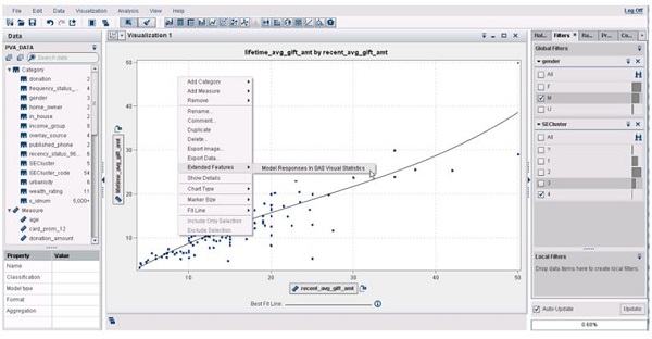
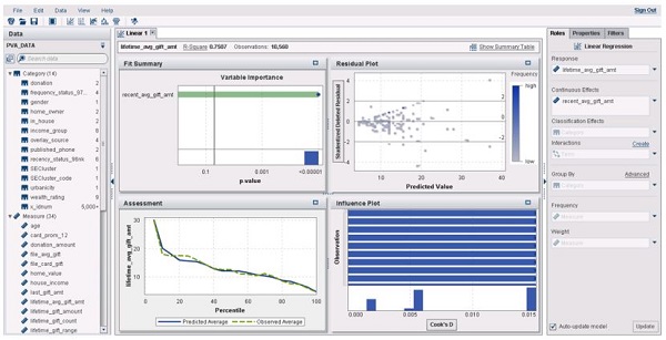
Figure 2 shows the initial linear model displayed in SAS Visual Statistics. One thing that is important to note is that you must start with a scatter plot, not a heat map. When using SAS Visual Analytics Explorer with large volumes of data, it will create heat maps rather than scatter plots, so just be sure that the visualization type is a scatter plot.
Box Plot
Figure 3 is a box plot visualization created in SAS Visual Analytics Explorer. The box plot has income_group on the x axis, which has eight distinct levels or values, and house_income and age on the y axis. To model the data from the box plot, right-click on the box plot, or use the drop-down list to select Extended Features => Model Responses in SAS Visual Statistics.
In SAS Visual Statistics, the category variable on the x axis (income_group) will be assigned to the response role, and house_income and age will be assigned as continuous effects. When modeling data where the response variable that has more than two levels, you are prompted to select an event level to model.
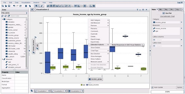
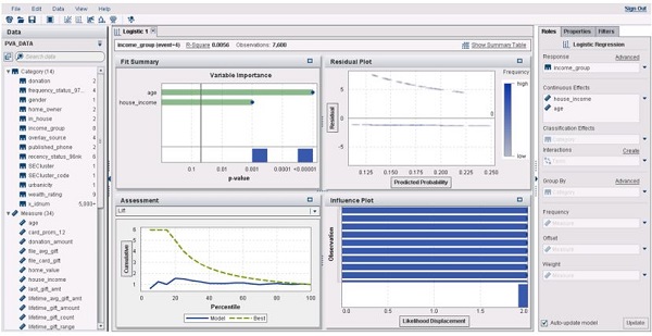
Figure 4 shows the initial logistic model displayed in SAS Visual Statistics. In this example, there are some missing values for the variable age, and the analysis will not use any observations where there are missing values for any of the model variables. Once the initial model is complete, you can improve on it by adding other effects.
Correlation Matrix
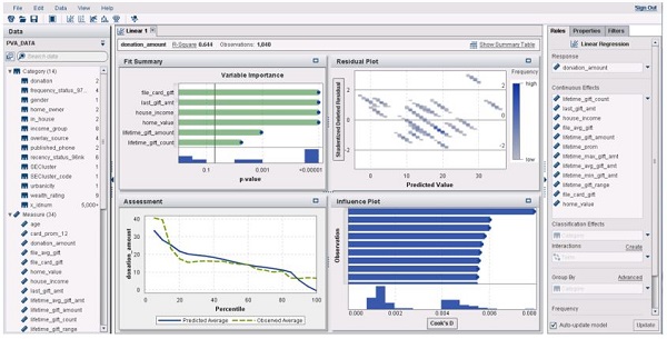
Figure 5 is a correlation matrix visualization created in SAS Visual Analytics Explorer 6.4. The correlation matrix was created using several measures, making sure to select donation_amount first as that will be the response variable in SAS Visual Statistics.
To model the data from the correlation matrix, select one or more cells in the correlation matrix from the same row or column. They do not have to be contiguous cells, but they must be from the same row or column. With the cells selected, right-click on the correlation matrix, or use the drop-down list to select Extended Features => Model Responses in SAS Visual Statistics.

Figure 6 shows the initial logistic model. Note: there are missing values for the variable donation_amount.
Additional resources
Interested in a trial run? Visit the SAS Visual Statistics Try Before You Buy site.
You can learn more about SAS Visual Statistics from these resources: