In sports these days, there's a lot more data to keep track of than just the score! How can you make sense of it all? Being the Graph Guy, of course I recommend graphing it! Here's an example that's up close and personal for me - dragon boat racing... Below
Tag: maps
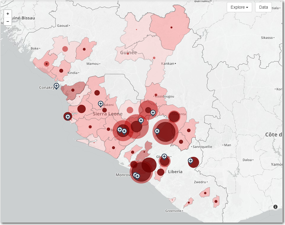
In a previous blog post, I showed how to layer colored areas on a SAS map to show both countries, and the areas within countries that had cases of Ebola. But as the Ebola epidemic has spread, more data has become available, and in this blog I show how to
With Amazon Prime's 2-day shipping, I seldom go to physical stores any more. How do they deliver items so quickly? Let's analyze some data to find out... There are very few services/memberships that I truly feel like I'm getting "a good deal" for my money - and Amazon Prime is
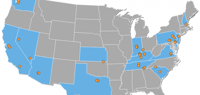
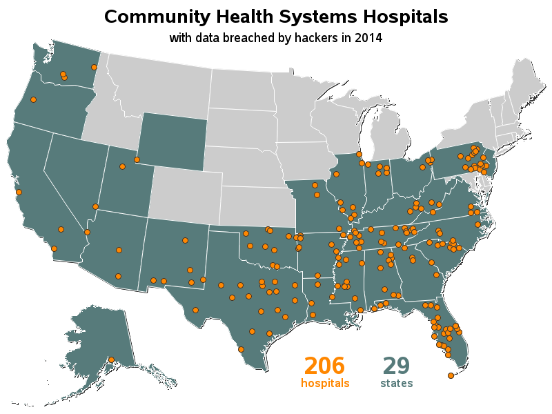
If you're a really big company, with many locations around the country, how do you keep track of all that? ... With a great map, of course! I recently read a CNN article about the Community Health Systems network being hacked - exposing the names, Social Security numbers, physical addresses, birthdays
Find out which state you'll live in, if the US state borders are redrawn so we have 50 states with equal population! (Don't worry! - This is just a fun/hypothetical "what if" blog!) To get you in the mood for this topic, here's a picture of one of the many
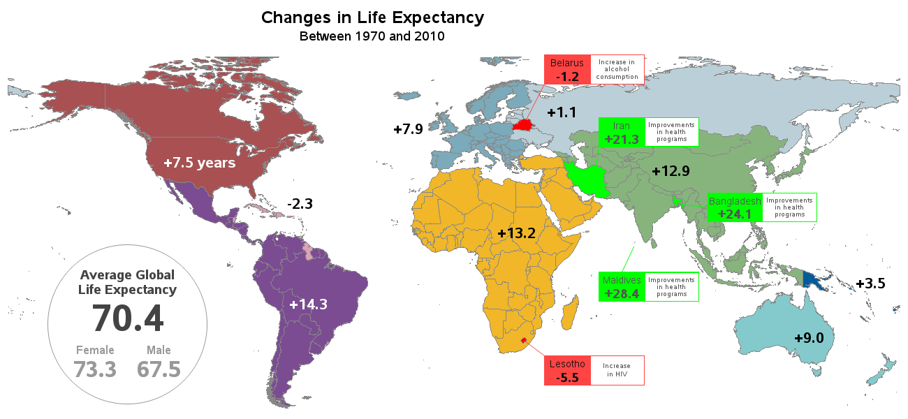
I bet a lot of SAS users know where the phrase "Live Long and Prosper" comes from ... but can we use SAS software to also help analyze 'how long'? This blog posting shows several different kinds of SAS graphs that can help answer such a question! Let's start with
SAS software can be used for many things - here's how you could use it to help save endangered sea turtles! You've seen SAS used to track endangered wildlife by the shape of their footprints, and help run Texas Parks & Wildlife. Now, how about tracking the movements of (and thereby helping
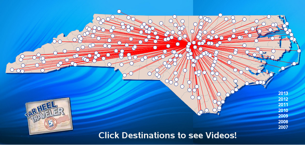
This blog post describes a neat example of some cool SAS capabilities, and also teaches you a little more about the state where SAS software is made... Here at the SAS headquarters in Cary, NC, the main TV news channel is WRAL TV5. And my favorite segment during the news is Scott
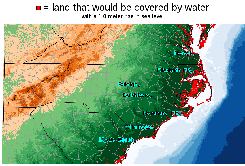
In light of the recent reports that glaciers in Antarctica are melting, what SAS graphs might be useful in analyzing the data?... When floating sea ice melts (such as at the North Pole), it doesn't raise the sea level - but when ice on land melts (such as glaciers at
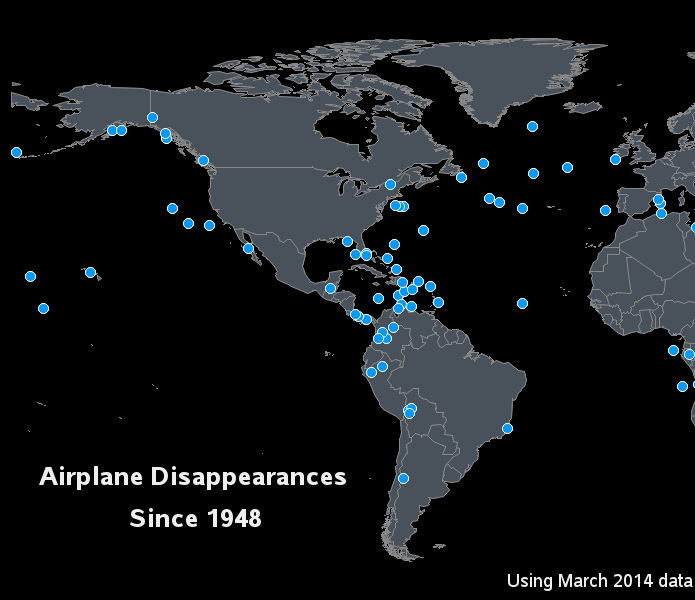
With all the recent news reports about the missing Flight 370, I wondered what other airplanes have disappeared without a trace ... and I used SAS to visualize that data! There was in interesting infographic on the Bloomberg website that sort of answered my question, but their map just had