SAS Learning Post
Technical tips and tricks from SAS instructors, authors and other SAS experts.
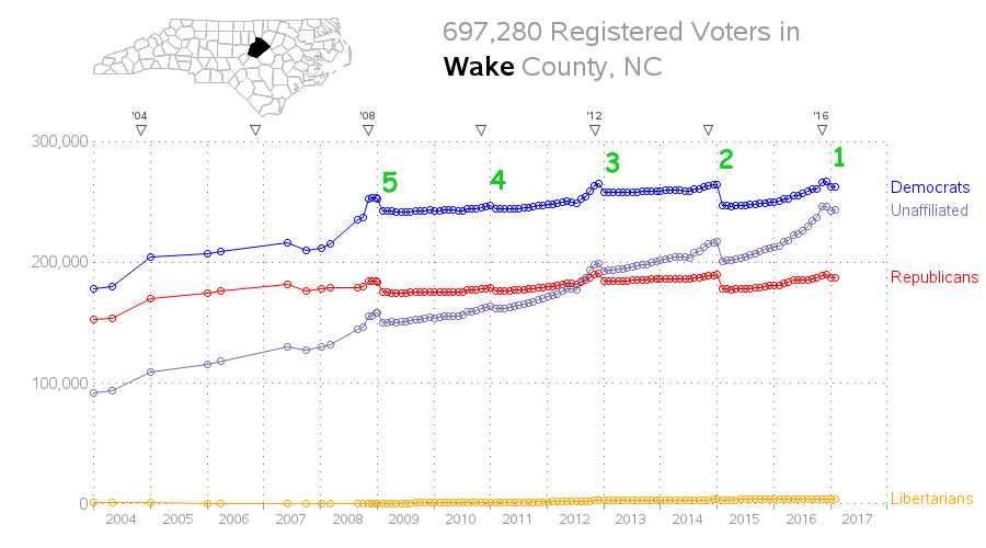
After the recent presidential election, I was updating my graphs of the voter registration data and noticed that the number of registered voters decreased after the election. At first I thought that was odd, but then I realized that maybe inactive voters were being purged. I wanted to find out

A topic that's been in the news a lot lately is the presidential power to grant pardons, commutations, and such. But all the articles I've seen just quoted numeric totals - I haven't seen a graph of the data anywhere! So I set out to find the data and graph

Doing business in a global economy, have you ever found yourself wanting to show Chinese (or Korean, or Japanese) labels on a map? If so, then this blog is for you! Before we get started, here is a photo of some Chinese characters to get you into the mood. This
