SAS Learning Post
Technical tips and tricks from SAS instructors, authors and other SAS experts.
If you're into data visualization, here's something that might interest you - a free eBook showing several ways to use SAS to visually analyze your data. (Did I mention it's FREE?!?!) We've picked juicy chapters from several books and upcoming books (and a few other sources), to show you what
Users frequently ask how to plot their data as markers on a map. There are several ways to do this using SAS software. If you're a Visual Analytics user, you can do it using a point-and-click interface. But if you're a coder, you might need a little help... In this
Here in the US, it's the nationwide men's college basketball tournament season! Therefore let's use some data from the previous years' tournaments to sharpen our analytics & visualization skills... But before we get started, I must mention (brag?) that my alma mater, NC State University, won this tournament in 1983.
SASĀ® users have an easy and convenient way to quickly obtain useful information (referred to as metadata) about their SAS session with a number of read-only SAS DICTIONARY tables or SASHELP views. At any time during a SAS session, information about currently defined system options, libnames, tables, columns and their
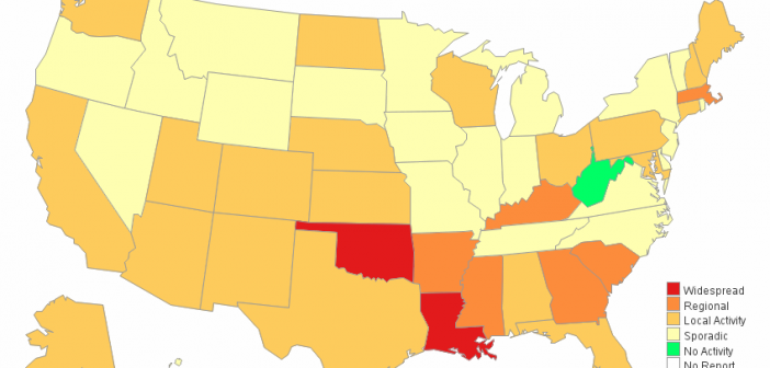
If you're a fan of SAS' ODS Graphics, you probably know that it does pretty much everything except geographical maps. But it's flexible enough that you can "fake it 'till you make it"! This example describes how to fake a geographical (choropleth) heat map using Proc SGplot polygons. In my
If you give an artist some tools, they can create a pretty picture. Sure, they might have a preferred tool - but they can probably do a pretty decent job no matter what you give them (paint, colored pencils, watercolor, charcoal, etc). And creating pretty graphs in SAS is no