SAS Learning Post
Technical tips and tricks from SAS instructors, authors and other SAS experts.
If you consider yourself as a visualization expert, you strive to create graphs that set you apart from the data analysts and statisticians. Graphs that merely plot the data in a clear/concise manner aren't enough for you. You want your graphs to also be intuitive, easy to read, and provide

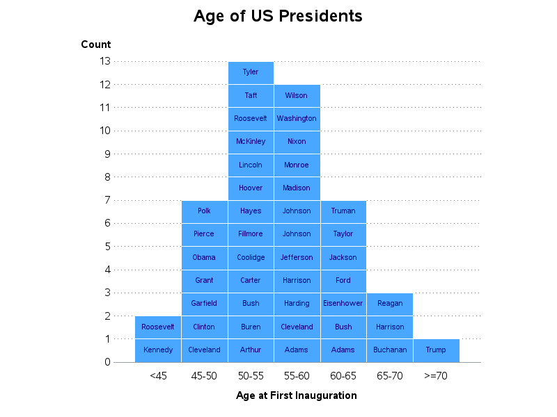
Recently, my fellow SAS blogger Rick Wicklin wrote a post showing how to graph the ages of all the US presidents. And Chris Hemedinger showed how to create a bar chart showing the number of presidents having each of the 12 zodiac signs. Both are interesting graphs, but I wanted to

Are you the lone-wolf SAS programmer in your company - managing the data, performing the analyses, and graphing the output for everyone else? And what's the only format they all know how to work with, and wish they had your output in? Let's face it ... that's probably an Excel
