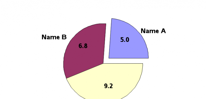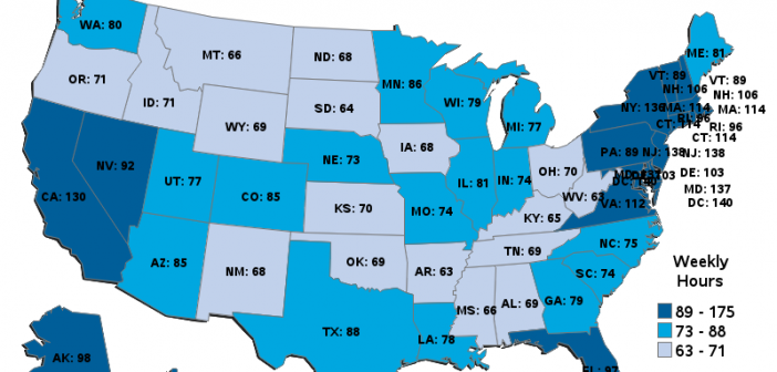
Facebook has millions of users, and therefore when people share an interesting graph on Facebook it can "go viral" and millions of people might see it. Some of the graphs are obviously a bit biased - especially ones that are trying to sway your opinion one way or another on a topic
Author
Do you use SAS for analytics and Microsoft Excel for graphs? Why not use SAS for your graphs too?!? Then you could completely automate the entire process in one SAS program, with no manual steps! A lot of people use Excel to create their graphs because "it's what they know." What if somebody
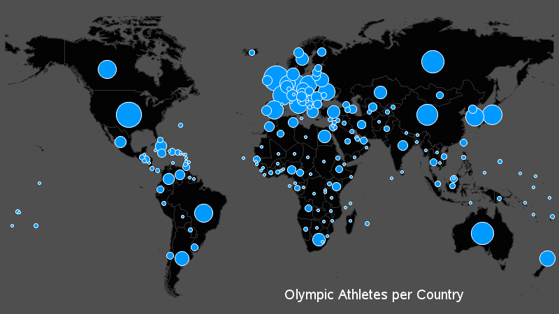
Everyone in the world has their attention turned towards the Olympics this week, so what better topic to tie in to a SAS/GRAPH blog than that?!?! I had seen a graph on the guardian website that I thought was interesting, so I decided to try to create my own (slightly different)
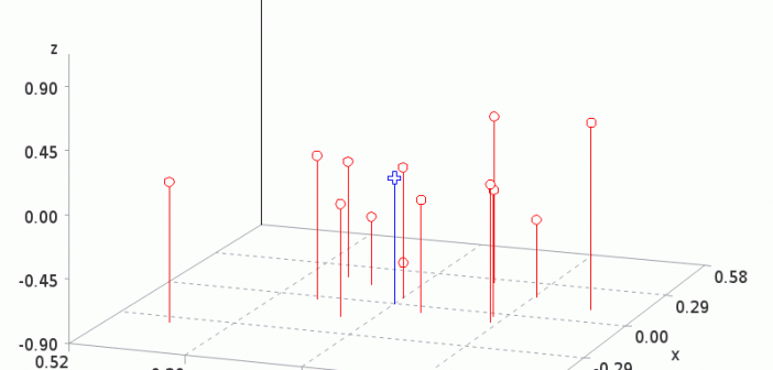
Hopefully you know that a gif animation can be used for more than just showing a cartoon animal doing cute tricks! Being a savvy data-meister, I'm sure you are also aware that you can use gif animations to see how data changes over time. But perhaps you didn't know you could
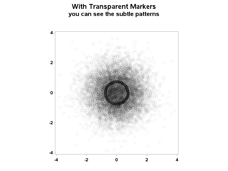
When working with "big data" you usually have too many points to view in a plot, and end up subsetting or summarizing the data. But now, in SAS 9.3, you have an alternative! For example, the following scatter plot of 10,000+ points is just a visual "blob": But using a new