I recently saw an interesting PEW study showing the percent of each state's revenue that came from federal funds. They had some pretty nice graphs ... but just like jell-o, there's always room for more graphs, eh! Let's start with the map. Their map had an informative title, a reasonable gradient
Author
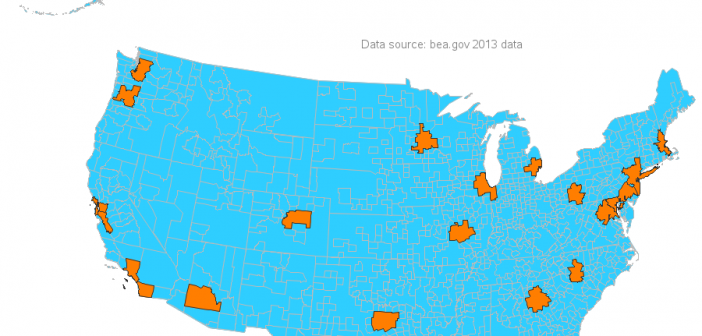
When it comes to economic activity, a handful of the largest metropolitan areas in the US account for lion's share. In 2013, the top 23 Metropolitan Statistical Areas (MSAs) accounted for 50% of the total US Gross Domestic Product (GDP). I recently came across a map created by Alexandr Trubetskoy
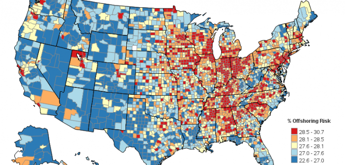
Employment - that's been a hot topic here in the US lately. Many of the manufacturing jobs we had in past decades are gone now, and it would be great if there was a crystal ball to predict which jobs might be at risk of disappearing in the future. The
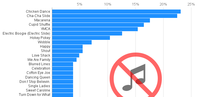
A lot of my friends seem to be getting married these days. Which got me thinking about wedding parties. Which then got me wondering what songs DJs do/don't play at weddings these days. And what was the outcome of my meandering thoughts ... a fun & interesting graph, of course! It
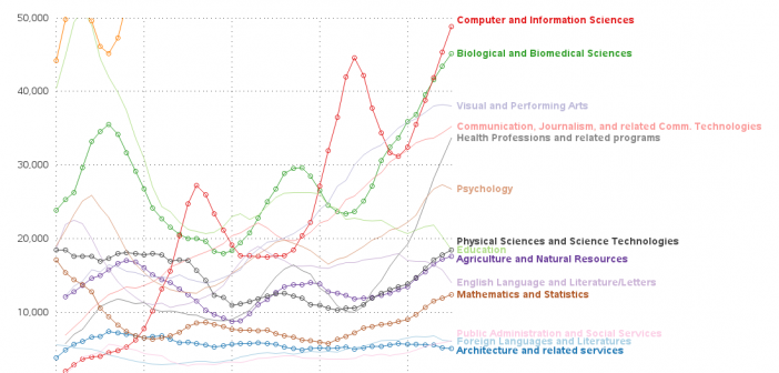
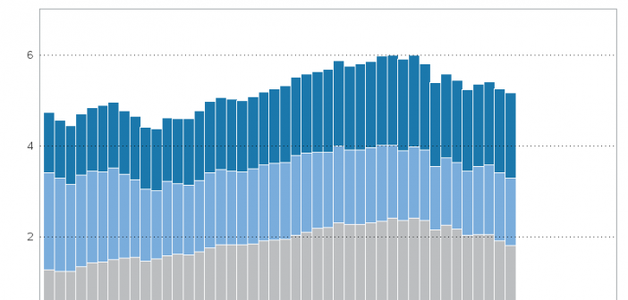
My previous blog post focused on a graph, showing the % of women earning STEM degrees in various fields. While that graph was was designed to answer a very specific question, let's now look at the data from a broader perspective. Let's look at the total number of STEM degrees
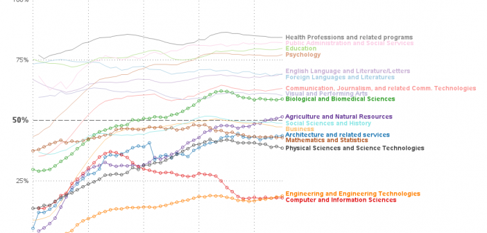
For the past several years, efforts have been under way to recruit more women into the STEM (science, technology, engineering, and math) fields. I recently saw an interesting graph showing the percentage of bachelor's degrees conferred to women in the US, and I wondered if I could tweak that graph
Carbon Dioxide ... CO2. Humans breathe out 2.3 pounds of it per day. It's also produced when we burn organic materials & fossil fuels (such as coal, oil, and natural gas). Plants use it for photosynthesis, which in turn produces oxygen. It is also a greenhouse gas, which many claim
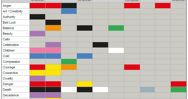
Choosing great colors for a graph is sometimes the most difficult part. And here is yet another thing you need to worry about ... sometimes colors represent different things in different cultures! In this blog post, I improve a graphic to help you get a grasp on those color-to-culture relationships.
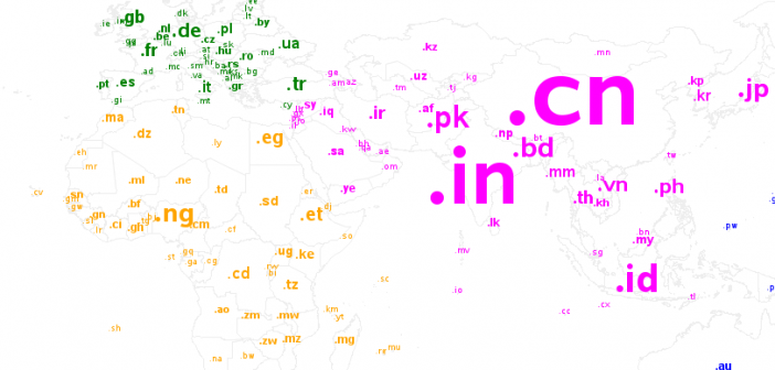
Here in the US, we typically use top level domains such as .com, .gov, and .org. I guess we were one of the first countries to start using web domains in a big way, and therefore we kind of got squatter's rights. As other countries started using the web, they
There have been several polarizing topics throughout history, such as religion & political affiliation. And for software developers there's one more biggie ... tabs -vs- spaces! Which group is right? Perhaps the opinion of the better programmers should have more weight(?) Is there a metric we can use to determine whether