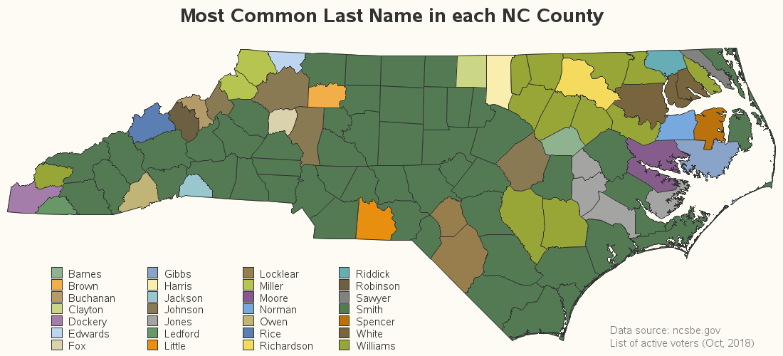
The other day I was playing around with the voter registration data for all ~8 million registered voters in North Carolina (yes - this guy knows how to have fun!), and I got to wondering what last names were the most common. I summarized the data by county, and the results are interesting - especially when you plot them on a map. What's the most common last name in your county? Let's see if you guessed correctly!...
Here's my map (click to see the interactive version):
You'll immediately notice there is a lot of the dark-green color in the map ... that corresponds to the last name 'Smith'. It's traditionally a very common name in the US - so common that people joke about falsely using that name to conceal their true identity. For example, in his country song You're Gonna Ruin My Bad Reputation, Ronnie McDowell mentions checking-in to the Paradise Motel under the alias "Mr. Smith," as the desk clerk winks and grins at the latest "Mrs. Smith" he's with.
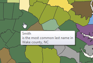
What about the other last names in the NC map? There are 100 counties, and 28 names ... and it's difficult to discern that many colors. Therefore click on the map image above to see the interactive version, with HTML mouse-over text. Then you can hover your mouse over each county to see the most popular name in a text popup window. This is one way you can determine the most popular last name in your county:
If you liked this blog topic, you might want to check out some of my other blog posts about names!
How'd He Do That?
For those of you who like working with data, you might be interested in the details...
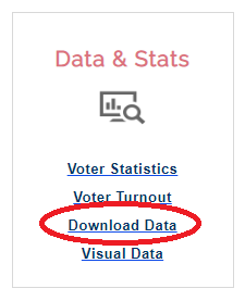
I went to the North Carolina State Board of Elections website (ncsbe.gov), and clicked the 'Download Data' link.
I navigated into the 'data' folder, and downloaded the NCVoter_statewide zip file. (If you're planning to download this file, note that it is 500MB in size, and could take a while to download, depending on your network speed!)
After the download was complete, I extracted the zip file, and the resulting ncvoter_Statewide.txt file was 3.7GB (yes, text files tend to 'swell up' when you unzip them). I then imported it into SAS using Proc Import:
PROC IMPORT OUT=ncvoter
DATAFILE="ncvoter_Statewide.txt"
DBMS=TAB REPLACE;
GETNAMES=YES;
DATAROW=2;
RUN;
This let me have a preliminary look at the data, but it wasn't quite good enough for my analysis. By default, Proc Import only analyzes the first few lines of the file to 'guess' what length and type to use for each variable. And most often the first few lines don't contain the longest possible values, and therefore the variables are defined with length that are too short for some of the longer values that appear later in the file (and they get truncated when they're read in). You could use the "guessingrows=all;" option to avoid this problem, but on a really long text file this takes quite a while to run. I'm not patient enough for that, therefore I took the manual approach.
I ran the default Proc Import (above), and then looked in the SAS log and copy-n-pasted the code Proc Import had generated, and then used the information in the ncvhis_ncvoter_data_format.txt file (provided in the ncsbe.gov data download folder) to manually modify length of each variable declared in the code. Now I can run the code to import the text data directly, without having to wait on Proc Import to analyze the data to determine the length of each variable. Here's a shortened version of my code:
data ncvoter;
infile "ncvoter_Statewide.txt"
delimiter='09'x MISSOVER DSD lrecl=32767 firstobs=2;
informat county_id $2. ;
informat county_desc $15. ;
/* more lines not shown */
informat vtd_desc $60. ;
input
county_id $
county_desc $
/* more lines not shown */
vtd_desc $
run;
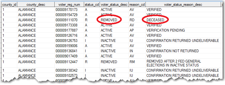
Now I can start playing with the data for the more than 8 million people registered voters ... I viewed it in the SAS table viewer, and noticed that the data contained several different statuses for voters, such as: active, inactive, and removed (for example, people who had moved or died).
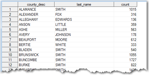
I decided to limit my analysis to just the 'active' voters - this reduced the number to just 5,841,692. I then used Proc SQL to perform a summary count of how many active voters had each last name in each county. I then select the name with the maximum frequency in each county. Now I've got a dataset containing the most popular name in each county:
I plotted this data on a map using Proc GMap, and I used the 'analysis' ODS style to control the colors.
proc gmap data=my_data map=my_map all;
id county;
choro last_name /
legend=legend1 coutline=gray33 html=my_html;
run;
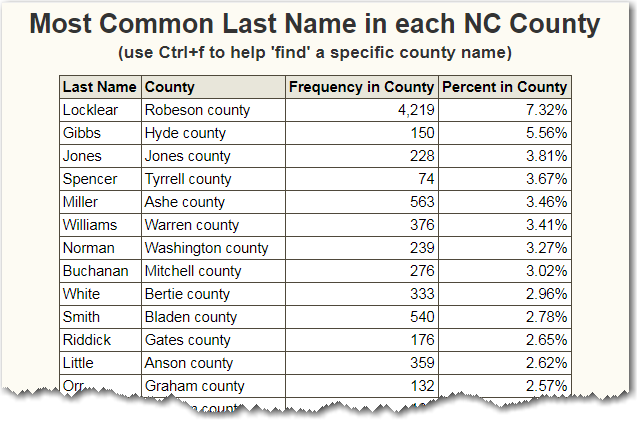
And for a little 'bonus feature' I added a table below the map. I sorted the table numerically, which is useful, but makes it a bit difficult to visually find a specific county name. To get around that problem, you can use your web browser's Ctrl+f feature to 'find' a specific bit of text in the table, such as a county name. (This is another way you can find the most common last name in your county.)
Did you learn anything today? Were you able to guess any of the most popular names? Were any of the names a 'surprise' to you? Did you have any "Aha!" moments? (feel free to discuss in the comments!)





2 Comments
Nice! But I would capitalize the word "county" in your tooltips ("Wake County" looks better and is more commonly used than "Wake county"), and leave it out of the "County" column of your table entirely (where it's redundant).
I might change that to upper-case in the mouse-over text!
At first I tried leaving 'county' out of the county names in the table ... but some of the county names sound a lot like last names, so I added it there to avoid any confusion. :)