Elections are in the news again, therefore I have been on the lookout for interesting graphs. I recently found some graphs of the Census Current Population Survey (CPS) Voting and Registration Supplement data, and tried to improve them. Follow along if you're interested in voter data, or creating better graphs!
Voting Rates
Here in the US, a census is taken every 10 years to count every person in the US, and collect a variety of data about them. But we also need to get a feel for how things are going more often than every 10 years, therefore we survey a subset of the population. The Current Population Survey (CPS) is a monthly survey of about 60,000 US households conducted by the United States Census Bureau for the Bureau of Labor Statistics (BLS). On election years, there's a Voting and Registration Supplement for the month of November, and here's one of the graphs of that data I found in the Census Blog:
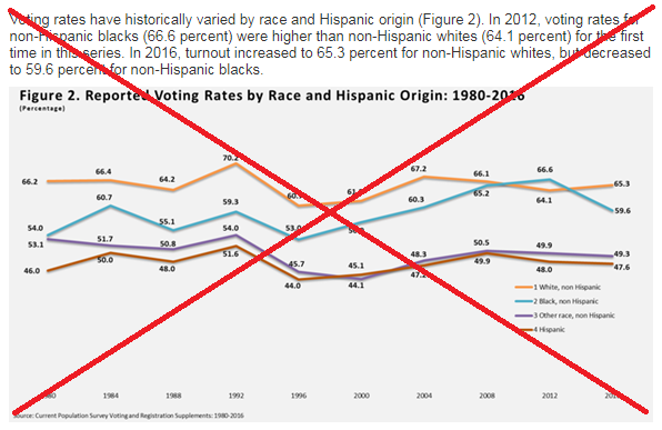
A few problems jumped out at me:
- The biggest problem was that the text in the graph was too small to read. The text in the article (which I included some in the screen-capture) was a normal/readable size, but the text in the graph was much smaller. I assume the graph might have originally been created in a much larger size, and then 'shrunk' down to fit in the blog(?)
- The graph also seems a bit cluttered. There is some repetition (such as the years appearing on the axis, and also in the title), and the labels on all the data points seem a bit much.
- There are no horizontal reference lines, therefore it's not easy to see if the data lines are trending up, or down.
- There are no vertical reference lines, therefore it's difficult to see exactly which year labels correspond to which data points.
- And the gray background makes the text more difficult to read.
I think it's poor form to complain about a graph without creating your own version, therefore I created the following (using SAS software):
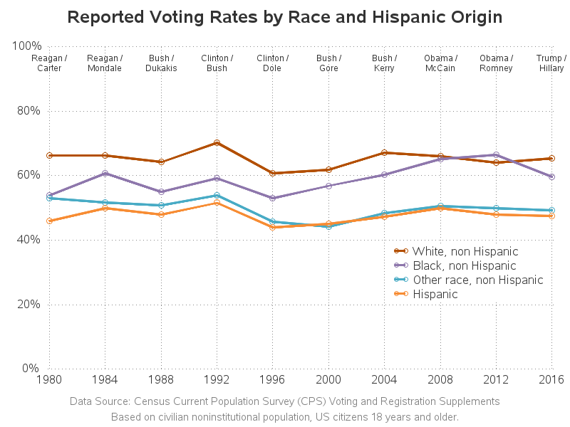
Here are some of my improvements:
- I used much larger text, so it's easier to read.
- I added horizontal and vertical reference lines, so it's easy to see if the data lines are trending up or down, and you can also tell which year goes with which data point.
- I used a white background, for higher contrast with the text.
- I added footnotes to describe exactly where the data came from, and what the data represents.
- I showed my numbers with '%' so it is obvious that they are percent values.
- I made the y-axis go from 0-100% (since that's the possible range of values).
- In my interactive version (click the image above to see it), I have HTML mouse-over text for each plot marker, so you can see the data values.
- And I annotated the 2 main candidates for each election year, since that might correlate to the voting rates.
Share of Voters
Looking at voting rates by race is interesting, but it might not be so important if a race comprises a very small percent of the population. This next graph from the Census blog takes that into account, and showing the % share of voters by race, for each year.
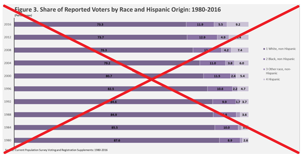
But the Census bar chart also had a few problems:
- The text is too small to read.
- Showing the years along the vertical axis is not the customary orientation for time.
- Using gradient shades for the races is not useful.
Here's my new/improved version:
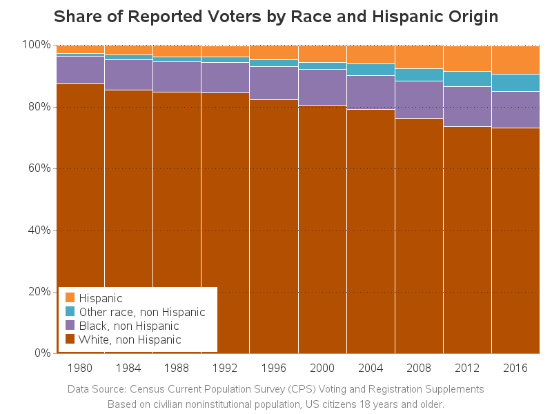
Here are some of my improvements:
- I used much larger text, so it's easier to read.
- I removed the spacing between the bars.
- I placed year along the horizontal axis, as is customary for time values.
- I added faint horizontal reference lines, so you can more easily see if values are increasing/decreasing.
- And I used the same colors for the races as were used in the line chart, so it's easy to relate between the graphs.
Were there any surprises in these graphs? What other voter information might it be interesting to plot, and is that information actually available? Remember - since our elections are secret-ballot, and the voter registration data is controlled by each individual state, a lot of the statistics about voters are based on voluntary surveys, and might not be 100% accurate!


2 Comments
Nice re-work. I didn't even try to puzzle out the originals; they pushed me away.
Thanks! - I take that as high praise, coming from you! :)