Of course you know how to create graphs ... But do you often find that preparing the data to plot is often the hardest part? Well then, this blog post is for you! I'll be demonstrating how to import Excel data into SAS, transpose the data, use what were formerly column headers as data values, and then summarize the data to plot.
Here's a hint about the data I'll be using. This is a picture of my friend Becky's daughter in her graduation cap & gown (thanks Becky!). Now can you guess what data I'll be using in my example? Yep - data about student loan debt!

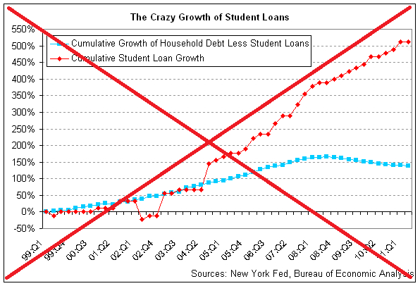
A few years ago, the increasing amount of student loan debt was a big topic in the news. Here's an example of an old article on that topic, and a graph from the article:
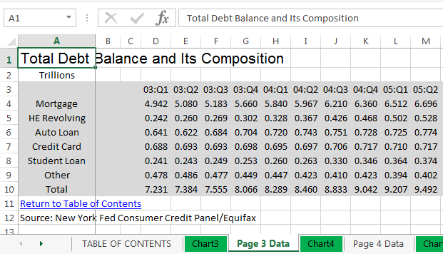
I did a little digging, and found the data on the newyorkfed.org website. I downloaded the Excel spreadsheet, and found the information I was looking for on the "Page 3 Data" tab (this was actually the updated data, 2003-present). Here's a screen-capture of the spreadsheet in Excel:
I used the following code to import it into SAS:
proc import datafile="HHD_C_Report_2018Q1.xlsx" dbms=xlsx out=raw_data replace;
range="Page 3 Data$A3:BL9";
getnames=yes;
run;
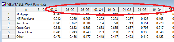
And here's what the SAS dataset looks like, very similar to the way it was in the spreadsheet:
Although we've got the data in SAS, we can't really graph it like this. That's because the date (year & quarter) is encoded as part of the variable name, rather than as a value of a variable. That might be an efficient (normalized) way to store the data, but it doesn't lend itself to programmatically analyzing or graphing the data.
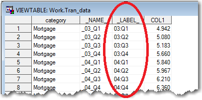
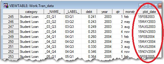
SAS allows you to work-around that problem by transposing the dataset. In the code below, first I clean up the variable names a little, and then I transpose the dataset (making the variable names become values). After transposing, there are 366 lines of data (instead of the original 6), with lots of repetition ... not as efficient for storing the data in the minimum amount of space, but much easier to use for analyzing and plotting. Here's the code, and a portion of the resulting dataset. Notice the values that were previously the variable names & labels in the SAS dataset are now values (see circled in red):
data raw_data; set raw_data (rename=(a=category) drop = b c);
run;
proc transpose data=raw_data out=tran_data;
by category notsorted;
run;
Now that we've got the yy:qq as values where we can programmatically work with them, let's turn them into real date values. The following code parses out the year and quarter, and then uses those values to create a SAS date value in the approximate middle of the quarter:
data tran_data; set tran_data (rename=(col1=debt));
year=.; year=substr(_label_,1,2)+2000;
qtr=.; qtr=substr(_label_,5,1);
if qtr=1 then monstr='feb';
if qtr=2 then monstr='may';
if qtr=3 then monstr='aug';
if qtr=4 then monstr='nov';
format plot_date date9.;
plot_date=input('15'||monstr||trim(left(year)),date9.);
run;
And now we can create a plot of the student loan debt over time, using simple code like the following:
symbol2 value=circle h=1.9 interpol=join color=red;
axis1 label=(j=c 'Debt' j=c '(trillion $)') minor=none offset=(0,0);
axis2 label=none minor=none offset=(0,0);
title1 ls=1.5 "Student Loan Debt in the U.S.";
proc gplot data=tran_data (where=(category='Student Loan'));
format plot_date year4.;
format debt comma5.1;
plot debt*plot_date /
vaxis=axis1 haxis=axis2 vzero
autovref cvref=graydd
autohref chref=graydd;
run;
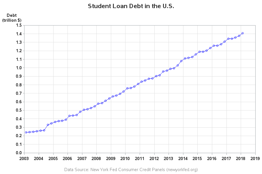
It's a decent plot, but we're still not done. Rather than showing the debt each quarter, we want to show the % increase (or decrease) compared to the first year in the graph (2003). To do that, we'll need to do some data summarization. First I'll create two custom categories - one for Student Loans, and one for all the Other types of debt.
data tran_data; set tran_data;
length my_category $20;
if category='Student Loan' then my_category='Student Loan';
else my_category='Other';
run;
I then summarize the data by those two categories, and save the 2003 summarized values into macro variables (called student and other):
proc sql noprint;
create table summarized_data as
select unique my_category, plot_date, year, qtr, sum(debt) as debt
from tran_data
group by my_category, plot_date, year, qtr;
select debt into :student
from summarized_data where my_category='Student Loan'
and year=2003 and qtr=1;
select debt into :other
from summarized_data where my_category='Other'
and year=2003 and qtr=1;
quit; run;
And finally I calculate the % increase (or decrease) of each quarterly value, compared to the 2003 value I've stored in the macro variable).
data summarized_data; set summarized_data;
if my_category='Student Loan' then debt_pct=(debt-&student)/&student;
else debt_pct=(debt-&other)/&other;
run;
I'm now able to create my new/improved version of the original graph. Here's a link to my complete SAS code if you want to see all the nitty-gritty details, and below is the resulting graph:
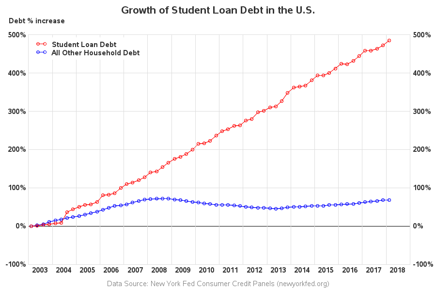
Here is a list of my changes and improvements:
- The quarter values along the bottom axis of the original graph were difficult to read, and impossible to relate back to the markers in the plot. I use years along the bottom axis, and draw a reference line between each year.
- I use fewer tick marks along the left axis, so it's not so crowded.
- I duplicate the left axis along the right side of the graph, so you don't have to visually follow from the end of the graph back to the left axis, to see what the values are.
- I use solid reference lines instead of dashed ones, so they don't distract from the data lines and markers.
- I don't include a border around the edge of the image file - their border of the graph, plus the border around the outside of their image, just looks too busy and cluttered.
- I use a more informative and tame title.
Hopefully you've learned a few tricks to get data out of a spreadsheet, and into a form that is easier to analyze and plot. If you frequently work with data, I guarantee these tricks will be worth learning!
And now back to that graph - were you surprised to see student loan debt increasing so much more than all the other debt? What do you think is causing the increase? (feel free to discuss in the comments)

6 Comments
Much nicer! Do we all get these warnings or notes?
NOTE: No units specified for the HTITLE option. The current units associated with GUNIT will be used.
NOTE: No units specified for the HTEXT option. The current units associated with GUNIT will be used.
124 legend1 label=none position=(top left inside) repeat=2 across=1
125 value=(t=1 'Student Loan Debt' t=2 'All Other Household Debt')
126 cborder=white offset=(1,-1) order=descending;
WARNING: Can not use MODE=RESERVE and POSITION=(INSIDE). Changed to MODE=PROTECT.
WARNING: The intervals on the axis labeled "plot_date" are not evenly spaced.
WARNING: No minor tick marks will be drawn because major tick increments have been specified in uneven or unordered intervals.
NOTE: Foreground color WHITE same as background. Part of your graph might not be visible.
NOTE: Graph's name, STUDENT_, changed to STUDENT1. STUDENT_ is already used or not a valid SAS name.
I usually ignore warnings and notes in the SAS log, as long as the graph comes out looking the way I want. You might be able to tweak the code so it doesn't produce the messages.
You could have saved one programming step by using the data step with array processing and extracting the values via the scan function.
Ahh! - Yep, usually about 10 ways to do any given thing in SAS! :)
Nice. What did you have to annotate the bottom axis?
I wanted to center the year labels, rather than print them on the tick mark at the beginning of each year.