How old was the oldest person in your family, or the oldest person you personally know? And how do they compare to the oldest people in the world? ... Perhaps you can easily make the comparison, with this cool graph!
But before we get started, here's a picture of my old friend David at one of his (many) birthday parties. He's well into his retirement years now, but as Monty Python put it "He's not dead yet!" He's still mentally sharp, flies airplanes, and out-skates most of the younger skaters at the Wednesday night 80s-music skate parties.
It turns out David is not just young at heart - he's actually a young whippersnapper compared to the oldest people in the world! And how old are the oldest? ... That question was recently answered by a popular graph posted by Arancaytar on Reddit (so popular it has gotten over 6,000 up-votes). Here's a screen-capture:
As you can tell from my purple markings, I had a few ideas for improvements. So I downloaded the data Aran had made available on Github, imported it into SAS, and started working on my own version.
Here are a few improvements I made:
- I eliminated the wasted white-space to the left of 1960 and to the right of 2020, making more room for the data lines, so it can show more detail in the same space.
- I use a 1-year increment in my age-axis (rather than 2-year), and I show the ending age at the top of the age-axis so you don't have to guess what that is.
- I added a title to the graph, so it's obvious what it represents, if someone is looking at the graph by itself without the context being set by the Reddit posting.
- I also added HTML mouse-over text in my interactive version (click here to see it) so you can hover your mouse over the lines to see the names of the people, and the maximum age they attained.
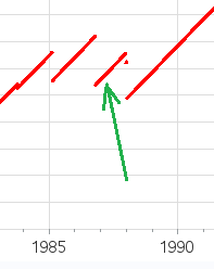
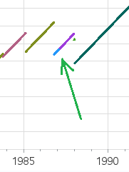
I liked my graph, but one of my improvements also helped uncover yet another problem in the visualization. When looking at the mouse-over text, I noticed that sometimes what looked like a single continuous line segment was actually multiple lines (representing more than one person). For example, the line around 1987 represents two people - Mary McKinney who lived to 113.68, and then Anna Eliza Williams who lived to 114.57.
So I made a new version of the graph, and used a different color for each person. Now you can more easily tell whether a line represents a single person, or multiple people.
The graph looks a little more cluttered with all those colors, but in this case it's useful clutter!
And then (using the mouse-over text again), I noticed yet another problem ... it said the age of Chiyo Miyako (the current oldest person) was 117.x, but I had just seen in the news that she was 116. I plugged the dates into a few online calculators, and they indicated the age should be 116.x. So I contacted the author of the graph and data to ask about it, and got the following reply:
"Good point to bring up, and I do notice I made a small error in the calculation. The Y axis should track the age in 'average years' that are the days divided by 365.243. (Tracking the exact calendar age isn't really feasible in the plot.) There are 97 leap years in 400 years, making the average year 365.243 days. Unfortunately, I messed that part up, and instead of using the days divided by 365.243 as intended, it's dividing by 365, leading to an error of about .067% - or almost four weeks for supercentenarians. I'd have caught that, but the error was in a spreadsheet formula instead of being properly calculated from the dates in Python directly. Ouch. :P" - Arancaytar
It would be better to use an "average days per year" to calculate the approximate age, but why use an approximation when you could calculate the exact value? So I added a line of SAS code to calculate the exact age using the SAS yrdif() function, which automatically takes into account things like leap years. Here's the simple line of code I used:
max_age=yrdif(dob,end_oldest,'AGE');
Hopefully you've learned a few things to consider when plotting data. And now it's time for you to learn some interesting trivia about our past oldest humans. I set up my interactive graph so you can click on the lines in the graph to launch a google search for that person. I encourage you to click on Jeanne Calment's line (this is the longest/tallest line), and read the interesting story about her rent money!


2 Comments
Thanks Robert. You drew me in with the cliffhanger about the rent money. I read about it in the NY Times coverage of Jeanne Calment's passing. Good story.
Her story is almost more interesting than the graph, eh!?!
I bet some of those other supercentenarians also had stories equally as interesting! :)