Recent news reports indicate that the number of illegal immigrants apprehended along the US/Mexican border has dropped significantly since Trump took office. So, even though Trump hasn't had time to build a physical wall, perhaps there's a virtual wall in place now (built from the change in attitudes)? I've seen people debating both sides of the argument, so let's see what the numbers say...
Before we get started with the real data analysis, here's a fun diversion. At the border between North and South Carolina, there is a roadside amusement called South of the Border. This border is a bit less secure than the US/Mexican border, and probably a lot more fun to cross. Thanks for the photo, Joy!
The Original:
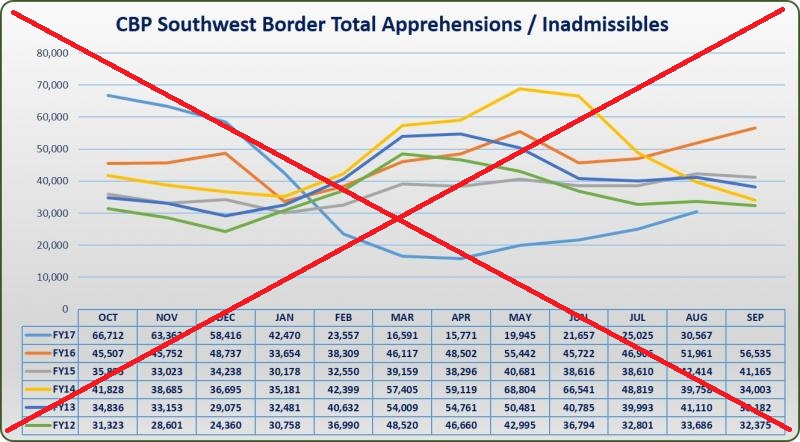
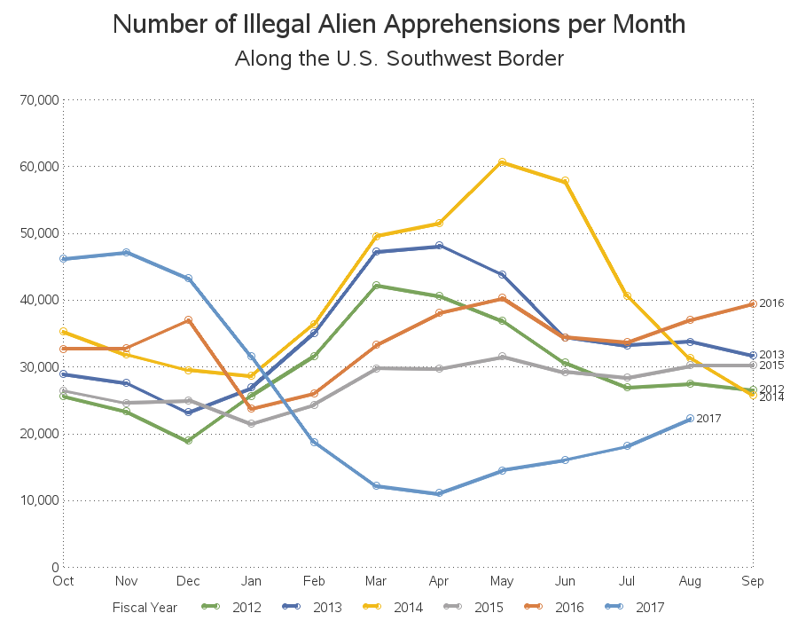
And now, let's have a look at the numbers associated with the real border. I did a bit of searching, and found that the border between the US and Mexico is referred to as the Southwest border. The Customs and Border Protection website has a graph that shows the number of people apprehended and/or determined inadmissible along the Southwest border since 2012 (see copy below). I think it's a decent graph, and the blue line shows that the number has declined noticeably since January 2017. Similar graphs have appeared in many news articles.
The Data:
Even though their graph has a table below it with the data values, it's not really in an easy form for me to use (the table is part of the image, and can't be copy-n-pasted). Therefore I set about finding the data in a form I could work with easier. After a bit of searching, I found a set of tables containing the monthly data back to the year 2000. The numbers are slightly different (it contains the number of "Illegal Alien Apprehensions", whereas the graph above shows "Apprehensions / Inadmissibles"), but I think that's good enough for my purposes - perhaps even better than the data in the original graph. These tables were in a pdf document, and although that's not the easiest format to work with, I was able to use pdftables.com to import the tables into an Excel spreadsheet, which I could then easily import into SAS.
My Graphs:
My first goal was to create a graph similar to the one above ... with slight improvements. I got rid of the table and let the graph proportions extend a little larger in the Y-direction (which spreads the lines apart, and makes it easier to see the differences). I also added year labels to the end of each line, so you don't have to look at a color legend to determine which line corresponds to which year. And if you click the image below, you can see the interactive version with HTML mouse-over text.
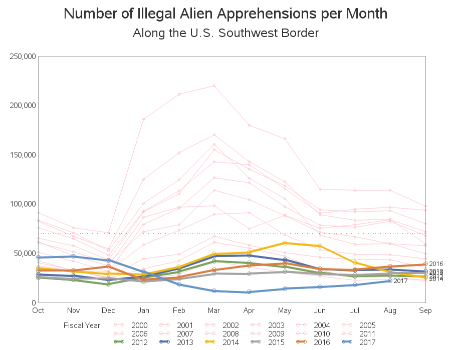
So, it does appear that the monthly totals since January 2017 have been noticeably lower than previous years ... since 2012, at least. But why did they only go back to 2012? Why not go back to 2010? Or since older data is available, why not go back even further in time? So I decided to re-plot the graph, with all the years of data I had access to. Below is my graph, with data going back to year 2000 (the older years I added are all in pink, and the previous graph's Y-axis level is indicated with a dashed reference line). It seems that the 2012-2017 values (ie, the data values that was in the original plot) are almost all lower than the 2000-2011 values. So perhaps there was some cherry-picking going on when they selected 2012 as the starting point for their graph(?)
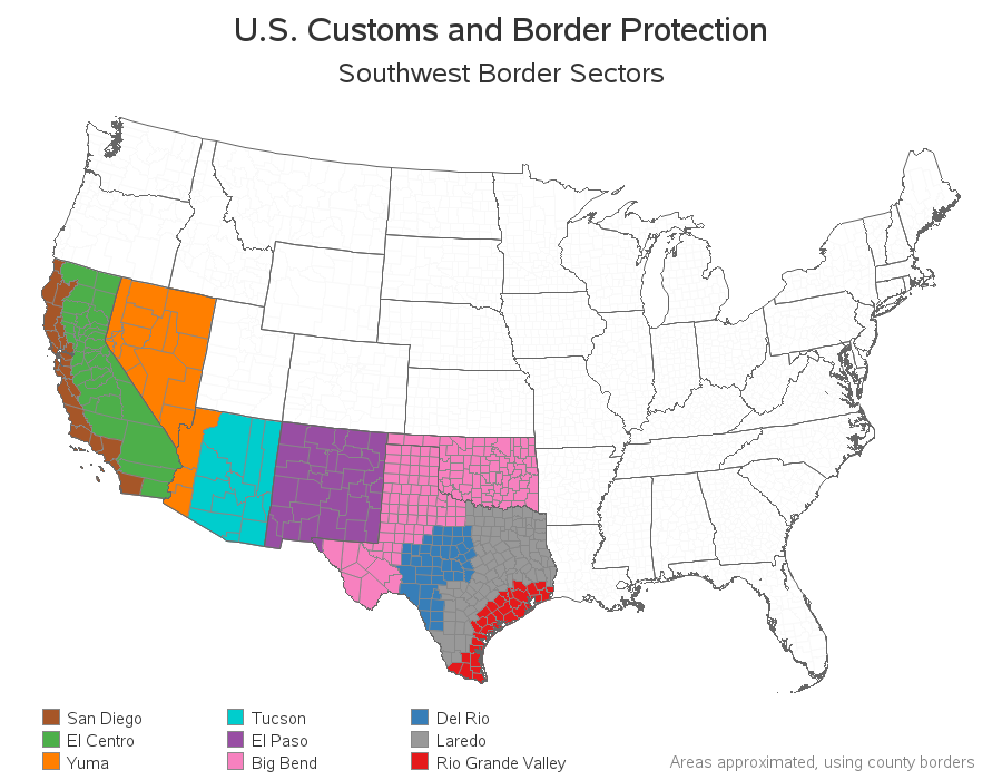
The values in the graphs above are the totals for the entire Southwest border. I was also able to find data at a more granular level, by sector - let's see if that has any interesting trends. Below I have created a map of the nine sectors along the Southwest border, so you can see which areas the data represents. Which of these sectors do you think had the most apprehensions?
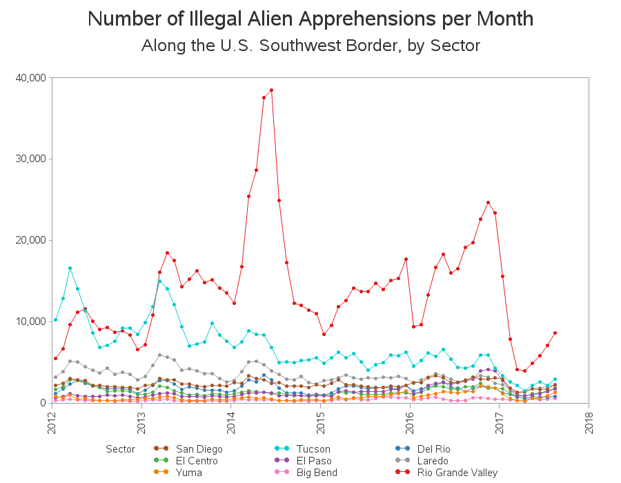
I plotted a separate line for each sector (using the same colors as the map above), and instead of overlaying all the years, I let them extend out like a proper time-series. It looks like all the sectors had seen a general decrease over the six years, except for the Rio Grande Valley (along the east coast of Texas) which didn't really see a decrease until 2017.
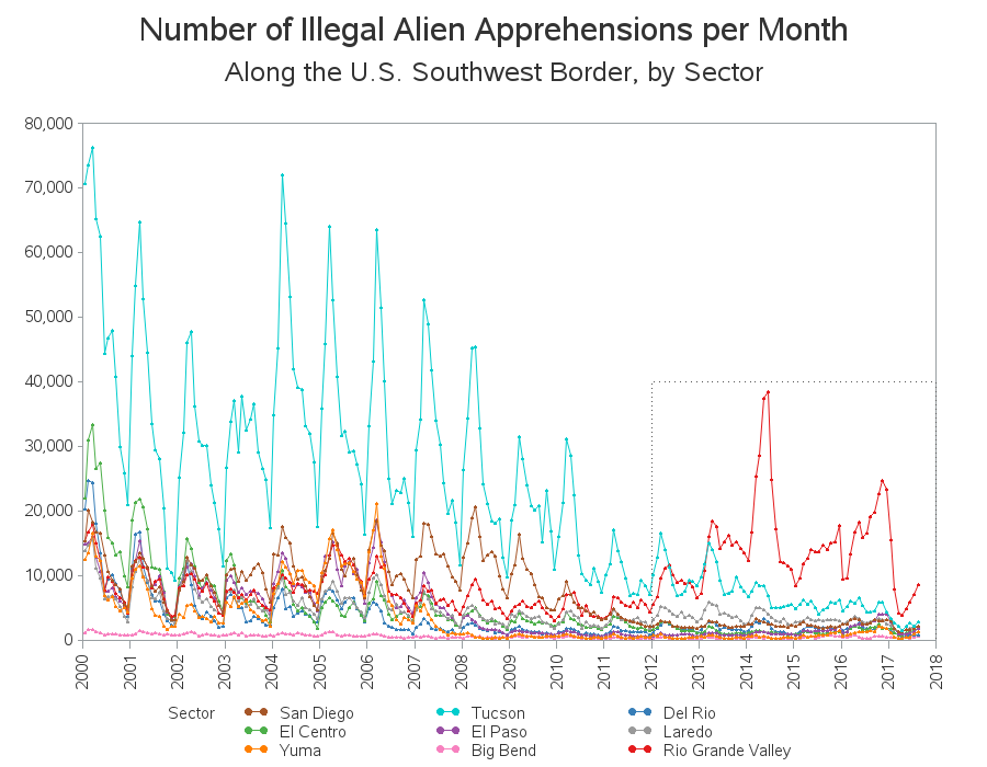
What about the years before 2012? I re-plot the graph, going back to year 2000 (and drew a box around the previous graph's extents with a dashed line). In this graph, you can see that Rio Grande Valley had lower numbers in previous years, and Tucson had higher numbers. An NPR article suggests that more illegals are crossing in the Rio Grande Valley sector (the red area in the map above) because the borders in California & Arizona have become more militarized (and more difficult to cross), and it is also the closest route to Central America (apparently more of the illegals are coming from Central America lately than from Mexico).
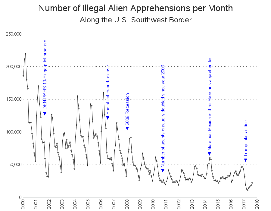
But I guess what's really important is the total number of apprehensions, eh? So for my final plot, I plotted the total number of apprehensions per month, back to the year 2000. As I was doing research on this topic, I found several bits of information that might explain some of the trends in the plot, and I thought it might be useful to annotate that info on the graph. (Click the graph below to see the full-size version, with HTML mouse-over text). It might not be a perfect graph, and perfect data, but it does show that the number of illegal immigrant apprehensions has declined noticeably since January 2017.
In case you find it difficult to read the blue vertical text labels in the graph above, here's a list of them, along with links to articles with more details:
- IDENT/IAFIS 10-Fingerprint program (here's an FBI article)
- End of catch-and-release
- 2008 Recession
- Number of agents gradually doubled since year 2000
- More non-Mexicans than Mexicans apprehended
- Donald Trump takes office as President of the US
More Questions:
I find this data interesting, but I've also got some questions related to it... I assume that the number of apprehensions it the best number we've got, but I'm thinking we can't really make a fair comparison over the years, because other things are changing. For example, with the doubling of the number of agents, I'm assuming it's more likely illegals will get caught ... which means we can't use the number of apprehensions as a measure of the number of people trying to illegally cross the border. Also, I had read that with the catch-and-release program, the same people were often caught (and released) several times - and now with less catch-and-release, I'm assuming that has probably reduced the incidence of people that were getting counted (caught-and-released) multiple times in the past(?) Also, if the border agents thought the people in charge didn't care about illegals crossing the border, perhaps the agents didn't try very hard to catch them (knowing the illegals would just be released again) - so perhaps a lower number of apprehensions during certain years doesn't necessarily mean a lower number of illegals crossing the border(?) And of course the big question - how do you count the number of illegal immigrants who are not caught?
If you've got deeper insight into these (and other) questions about this data, please feel free to share your knowledge in the comments section!
The virtual wall along the US/Mexican border. Share on X




5 Comments
I have read that the economy also impacts the numbers. When the US economy is hot there are lots of jobs so lots of border crossings. During a US recession the numbers drop.
That last graph shows a spike around March or April of each year. Is this seasonality related to weather? Although it seems to go down after that.
Perhaps more jobs are available in the warmer months, when they're planting/growing/harvesting crops?
Perhaps people from warm climates (Mexico & Central America) don't want to come to the US in the winter, when the weather is a lot colder than they're used to?
Well done. Certainly gives food for thought. Would be great if this trend continues.
Nice picture of "South of the Border" in Dillon, SC