Remember when the popular catchphrase, “We have an app for that,” was the new big thing?
You might not if you’re as young as the NC State University students who recently participated in the 11th annual SAS-NC State Design Project, but back when we could still count 21st-century years in single digits, smartphone apps were emerging as quite the phenomenon.
Of course, now we have apps for pretty much anything you can think of, and they’re a routine part of our daily lives. But maybe not so much when it comes to data- and AI-powered analytical apps. And that’s where this story begins.
Bespoke: Designing apps using SAS® App Factory
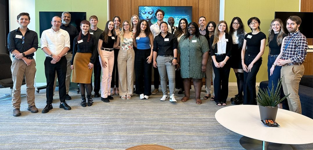
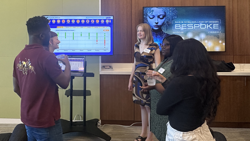
For this year’s project, the NC State College of Design students were tasked with creating analytical apps using SAS’ newly released SAS® App Factory product, which enables even analytics neophytes to easily create cloud-hosted, full-stack, AI-driven applications for a wide range of purposes and users. On April 18, the students presented the results of their work: five product prototypes, one for each of five different industries:
- Education.
- Social media.
- Gaming.
- Retail.
- Media and entertainment.
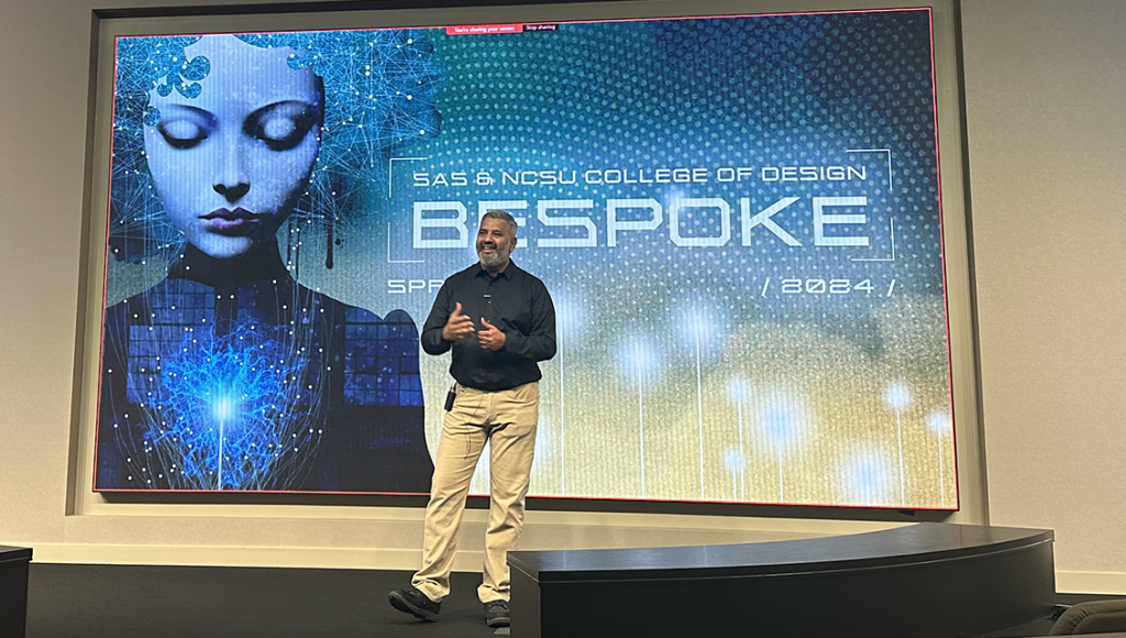
SAS Head of Product Design Rajiv Ramarajan opened the event by welcoming attendees and thanking participants and supporters. He also discussed the impetus behind this year’s project assignment.
“More and more people are using analytics, and many of these people are not necessarily experts,” Ramarajan said. “However, they expect well-designed, easy-to-use tools and interfaces to use analytics. So this year’s student project, Bespoke, is trying to envision analytical applications that can be built from a product called SAS App Factory.”
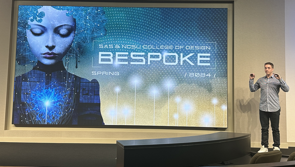
Next up, Professor Jarrett Fuller of NC State’s Graphic and Experience Design program took the stage and expanded on Ramarajan’s project overview, which he began with a humorous bit of irony.
“I get the sort of weird challenge that I get to explain App Factory back to the team that made – App Factory, so go easy on me, OK?”
Nevertheless, Fuller did a fine job of breaking down the different tools App Factory comprises, which he characterized as fitting into roughly three categories: tools for creating interfaces, including templates, protocols, APIs, etc.; functions—tools to host logic like algorithms, models and AI; and storage.
“Between each of these different types of tools, a developer or engineer could plug-and-play different things, so they don’t have to build all of this stuff from scratch. It makes it easier to deploy really beautiful, well-made apps very, very easily,” Fuller said.
As for the students and this assignment? “They’re using all the functionality of App Factory – everything App Factory has to offer – to make brand new applications,” Fuller added.
He went on to describe the students’ design process, which, in itself, could fill an entire article and which comprised the following stages:
- Concept development.
- Competitive analysis.
- Persona creation.
- Task flows.
- Wireframes.
- Visual exploration and branding.
- High-fidelity prototypes.
Not lost on Fuller, nor should it be on anyone who sees these presentations, is not only the quality of the student’s work but also how quickly they grasped the concepts and went from ideas to prototypes in less than a full semester.
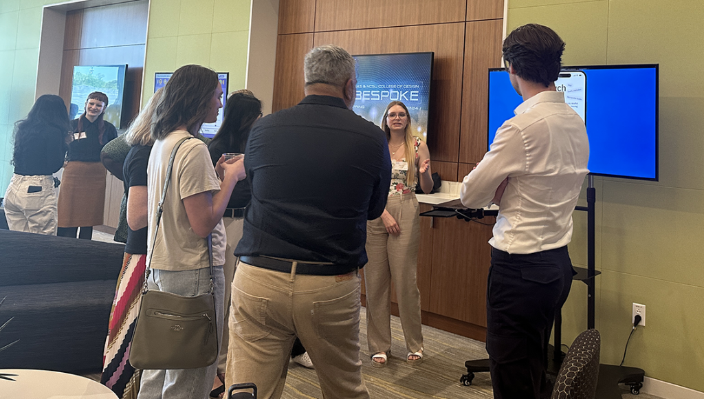
“So what you’re about to see are a series of applications that were conceived, designed, marketed, branded – and also a tech stack considered – in the last 11 weeks,” Fuller said before turning the stage over to the students.
Once the students were finished presenting, Product Design Manager Macklin Frazier, who led the project from the SAS side, took the stage, thanked all involved and offered some closing remarks.
“From a napkin brainstorming session … to what we’re seeing on the screen is incredible, and I want to reinforce the complexity of analytics. It’s not just a pick-up-and-play if you’re not familiar with it, so I think it’s incredibly impressive, demonstrating the students’ minds but also the power of the design process. They’ve never used or had to design for analytics before, and the fact that they can do so in 10 or 11 weeks so proficiently, I think that’s something to celebrate, so fantastic job, everyone.”
Pictured left to right: Rajiv Ramarajan, Jarrett Fuller and Macklin Frazier.
Student presentations
The following sections provide high-level summaries of the student’s designs, but unless you just really prefer text to video, do yourself a favor: Stop reading and go watch the video to fully appreciate what these remarkable future designers produced, as the descriptions can’t possibly do the presentations justice.
Education group – Homework Wizard
Team members: Seraphina Bieniek, Kadamma Jackson, Megan Mersch.
Student pitch: Homework Wizard is a digital platform for educators to track students’ progress, identify learning gaps and assign personalized homework. It generates custom questions, offers insight into student responses and adapts to content-based learning patterns.
The App Factory tech stack they used:
- GenAI – to write questions tailored to each student.
- Machine learning – to analyze student’s strong and weak points and tailor assignments accordingly.
- Data storage, extraction and visualization – to store student profiles (incl. grades, prior answers, weakest subjects and preferred learning styles) and to easily create data visualizations to show grade averages, trends and outliers.
User persona: Mrs. Anderson, a third-grade teacher with 15 years of experience. She has 26 students and is using Homework Wizard to identify and close learning gaps and streamline her workload.
Walkthrough
The walkthrough video begins with one of Mrs. Anderson’s students, Harper, checking her homework dashboard. The dashboard displays all her assignments—tailored specifically for her based on her profile—and Harper’s progress on each. As Harper answers questions, the system indicates whether the answer is correct and provides additional information.
If Harper takes too long to answer, “Mr. Wiz,” an onscreen AI assistant, begins to glow, indicating that a hint is available. Once Harper completes the assignment, she is provided with a review of her performance.
The next morning, Mrs. Anderson logs in to check the previous night’s homework and plan future assignments based on the results. Mrs. Anderson’s dashboard provides graphical representations of the student’s understanding of the various subjects, informed by factors such as time to complete assignments, number of correct vs incorrect answers, how many times hints are requested and more.
A “Magic Wand” button reveals AI-generated insights about the students’ performance. Mrs. Anderson can then drill down for more detail, identifying student strengths and weaknesses (as a class and individually). She can view such details by date or date range. With this information, Mrs. Anderson can identify and devote more time and effort to concepts the students are struggling with.
Feature highlights
- Analytics and visualizations.
- Student help.
- Ability to manage topics within subjects.
Future opportunities
- Expanding assignments to include tests and quizzes.
- Adding accessibility accommodations for learning disabilities and visual impairments.
Social media group – Aizel
Team members: Natalie Jolley, Grace Xiang and Julie Monjanel-Townsend
Student pitch: A smart AI social media manager for small businesses that helps enhance their online presence. Aizel allows businesses to analyze social media usage and trends to implement marketing and communication recommendations.
The App Factory tech stack they used:
- Data visualization – to show platform performance.
- Decisioning assistant – to provide insights.
- GenAI – to help during the posting process.
- Forecasting – to provide recommendations to the user.
User persona: Cameron, a coffee shop owner in Raleigh, is trying to expand her small business through online media.
Walkthrough
With the holiday season quickly approaching, Cameron has been developing new seasonal drinks and wants to get the word out through social media. Cameron opens her Aizel dashboard, which presents her with recommendations for social posts split into four categories: time-based, trend-based, personalized and general. She clicks a time-based recommendation for a Christmas post to open an editing screen, which Aizel’s AI has pre-populated with suggested platforms to post to, a caption, hashtag, her business’ URL, target audiences and more.
From here, she can have Aizel generate media content or upload it herself. Aizel provides a preview of the post, along with a data—and analytics-derived strength rating. The various fields are editable, so Cameron tweaks the Aizel-generated caption and target URL. After Cameron’s changes, the post’s strength rating went down, and a subsequent notification explains why.
Cameron then regenerates the caption and Aizel expands it, thus raising the strength rating again. Satisfied, Cameron clicks the Post button to schedule the post. Returning to the dashboard, Cameron can explore other post recommendations or review the analytically generated results from her social activity.
A week later, Cameron logs in to Aizel to see how her holiday post has been performing. The Analytics section of the dashboard provides interactive visualizations of her platforms that can be filtered by date range and sorted by engagement, spending, views and likes. Cameron can also see all her prior posts, and she clicks on the Christmas post to display all the metrics related to that post.
Feature highlights
- AI assistant – An AI chat feature for posting ideas, questions, etc.
- Post objectives – Allow users to select an objective for which Aizel will target its auto-fill suggestions.
- Specific target audiences – These are set up during the onboarding process.
Future opportunities
- Greater customization for data visualization and tracking.
- Photo and video editor.
- User and accessibility testing.
Gaming group – Vaux 27:51
Team members: Terry Dickens, Ellie Bruno, Vy Hoang.
Student pitch: Vaux is a highly customizable, noninvasive gaming companion that provides AI-generated narration and captions for story-based PC games.
The App Factory tech stack they used:
- LLMs – for human-sounding voices.
- GenAI – for accurate captions and narration.
- Database management – for external APIs.
- Predictive modeling – for custom settings generated for each user.
User persona: Becca, a 19-year-old casual gamer who is legally blind. She likes playing story-based games but struggles with limited accessibility features in games with a smaller budget.
Walkthrough
Becca launches her Vaux app for the first time and connects Vaux to her Steam account, which allows her Steam games to auto-populate in the Vaux dashboard library. During the onboarding process, Becca can select features she’s most interested in, like accessibility, narration or captions.
She is now ready to play and selects “Undertale,” one of the games in her library. “Undertale” is a caption-heavy, non-narrated game that Becca has had difficulty with in the past due to its lack of audio. With Becca’s feature preferences set during onboarding, Vaux can auto-populate the game settings, and, via AI, will narrate the captions to her.
As she begins to play, Becca decides that the default narrator voice isn’t exactly what she wants, so she opens the in-game taskbar. From there, players can turn auto-narration on or off, open a basic audio menu, or open the in-game dashboard for more controls.
From the dashboard, she adds and selects a new narrator and resumes play. Finally, unsatisfied with the pace of narration, Becca reopens the taskbar and adjusts the speed control in the audio menu.
Other feature highlights
- Marketplace – A Vaux user community for sharing news, events and voice packs created by community members.
- Captioning – Users can add custom captions specific to their needs, and they can edit the appearance of the text, the font and how fast the captions move.
- Customizable taskbar – This taskbar is generated via predictive modeling using the users’ answers during the smart setup process. It can be edited by the user at any time.
Future opportunities
- Language translation for captions and narration.
- Expanding the app’s capabilities to include a wider range of games.
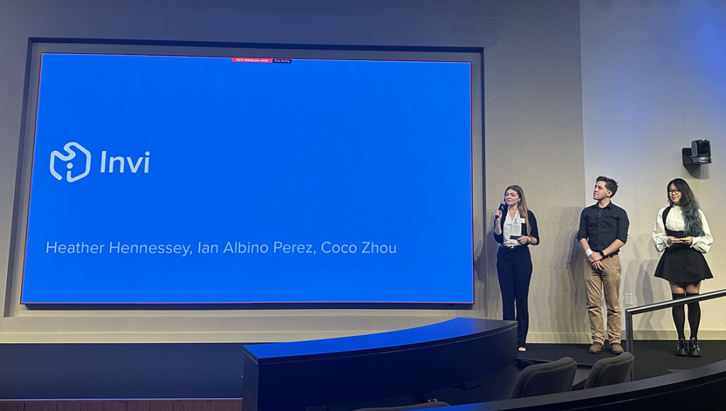
Retail group – Invi
Team members: Heather Hennessey, Ian Albino Perez, Coco Zhou.
Student pitch: Invi is a mobile inventory management hub that helps small businesses with ordering, organizing and logging stock by learning from the user to streamline those processes.
The App Factory tech stack they used:
- Decisioning assistant – Helps users make choices about products, from determining the best distributors to analyzing entire categories of stock.
- Forecasting – Estimating how a product will sell based on historical data and how the product sells in surrounding stores.
- Database management – Pulls together information to help power the decisioning assistant and forecasting elements.
User persona: Jaz King oversees the operations of a family-run corner store with two local locations: one in Raleigh, NC, and one in Wendell, NC. She wants to easily manage stock at those locations and transfer stock between them when needed.
Walkthrough
Invi sends Jaz an alert on her phone indicating that her Wendell store is running low on cold snacks and that she should restock them, as the weather is getting warmer and those items sell well in the heat. When Jaz opens the alert, Invi displays some best-selling cold items that are running low. Pressing one item, Firecracker Popsicles, displays additional information about that item, including price and a recommended order quantity based on how that item has performed in the past.
She agrees with Invi’s recommendation and selects Add to Purchase Order. On the Purchase Order screen, Invi displays details about Jaz’s pending popsicle purchase. Still, it also displays a recommendation indicating that her Raleigh location has an abundance of FunPops, which is another item the Wendell store is running low on, and that she should consider transferring some from Raleigh to Wendell. Pressing the alert provides more information about the stock transfer, and Jaz agrees with the suggestion, so she adds the transfer to the purchase order.
Returning to the Purchase Order screen, Jaz sees that the stock transfer has been added. She then continues to the Order Summary screen, where she sees an itemized summary of her order along with payment options. Satisfied, Jaz places the order. Invi then displays an order confirmation, from which Jaz can return home or view all of her orders. She chooses the latter, which displays status information on her orders. Jaz can filter this screen to display all orders, incoming orders, outgoing orders or transfers. When she’s done, Jaz returns to the home screen.
Feature highlights
- Home screen – Shows items needing attention and all types of orders being filled for the day.
- Smart alerts – Ensure the business owner is aware of inventory issues that need attention. These alerts can also be expanded to provide the rationale behind them.
- Item logging – Makes it easy to log in new stock via smart object recognition, database importing or barcode scanning.
Future opportunities
- Desktop version that integrates with the mobile app to handle larger tasks and data sets.
- Permissions system to provide multiple access levels, based on employee roles.
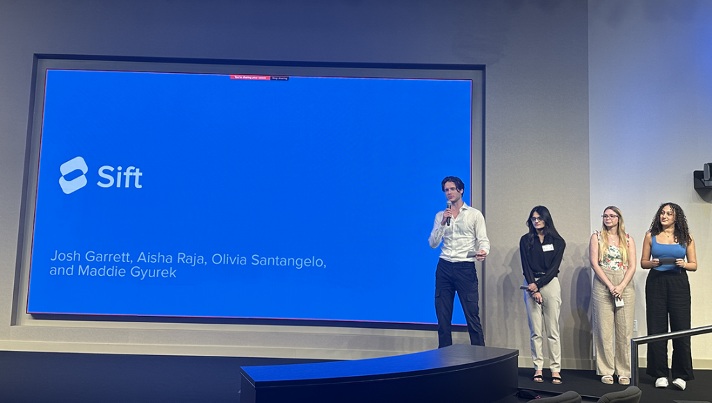
Media and entertainment group – Sift
Team members: Josh Garrett, Aisha Raja, Olivia Santangelo, Maddie Gyurek.
Student pitch: Sift helps users take control of their media consumption by curating personalized daily recommendations, mitigating the overwhelming media and entertainment options.
The App Factory tech stack they used:
- LLMs – connect text descriptions with user interaction data.
- Recommendation engines – use machine learning to make daily suggestions.
- Database (local + network) – stores the user data and aggregates content from multiple streaming services.
Under persona: Liam, a software engineer yearning for a better work-life balance. He seeks a media/streaming solution that respects his limited free time, offering quick and targeted suggestions.
Walkthrough
Arriving home after a long day at work, Liam wants to unwind and relax, but without having to first scroll through all his various streaming options to find something he likes. He opens his Sift app, which displays its daily recommendations based on Liam’s preferences, including entertainment categories (music, movies, TV, etc.) that he set up during onboarding. Quickly flipping through the day’s recommendations, the movie Glass Onion catches his eye.
Tapping the recommendation card displays additional details about the suggestion, including an explanation of why Sift thinks Liam will like it based on his viewing history and preferences. He taps out of that screen and, as he continues flipping through the day’s recommendations, Sift displays a “Wildcard,” an occasional recommendation that gives Liam an opportunity to explore something outside his usual preferences.
The wild card is for a podcast; Liam is interested in it, but he currently prefers to watch a movie or a show. Tapping the wildcard produces icons Liam can use to flag the recommendation as “Don’t show again,” “I’ve seen this,” or the one he selected, “Maybe later,” which will cycle the suggestion back at another time. Going back to the Glass Onion recommendation, Liam taps it and is automatically directed to Netflix to begin watching the movie.
After watching Glass Onion, Liam returns to Sift, swipes up on the home screen to display his history and swipes right on Glass Onion to indicate that he enjoyed it. Pinching in on the history screen displays the months' view, where he can filter and search. In this case, he recalls watching Daniel Craig, the star of the movie Glass Onion in a number of James Bond films in February but wonders if he’s seen them all. So, he opens the February card and searches for “Daniel Craig, James Bond,” and discovers that he’s seen four out of five.
He saves the one he hasn’t watched for tomorrow. As he is about to begin preparing dinner, Liam returns to the home screen and plays the day’s recommended music selection so he can listen to it while he cooks.
Feature highlights
- Onboarding process – Upon downloading the app, the user can personalize it by linking it to their favorite media and existing streaming services and setting up their preferences.
- Smart archive – This feature helps users easily track and manage their media consumption. Users can like and dislike content in the archive to help Sift better understand their preferences.
- Smart search – Users can search through an ad filter making it easy to locate and connect content that is not through one of their connected apps.
- Monthly recap – Showcases, in a dynamic and engaging visualization, trends and patterns in users’ consumption data, offering valuable insights into their viewing habits and preferences.
Future opportunities
- Integrated social media features – Helping users to effortlessly share their media consumption with friends, fostering a sense of community and facilitating discussions and shared interests.
- Journaling capabilities – enabling users to add personal notes and reviews of media they’ve consumed, promoting self-reflection and enhancing their overall experience.
