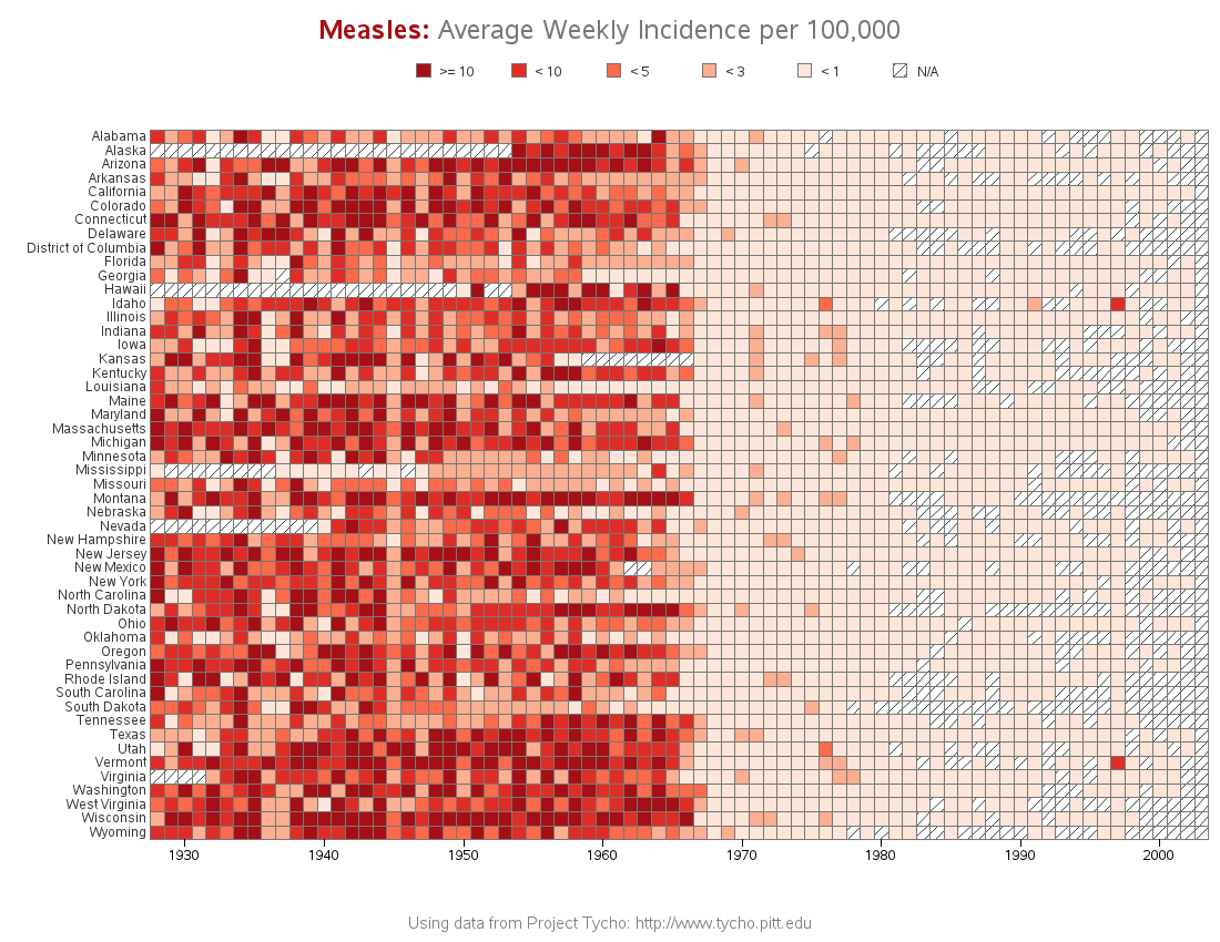
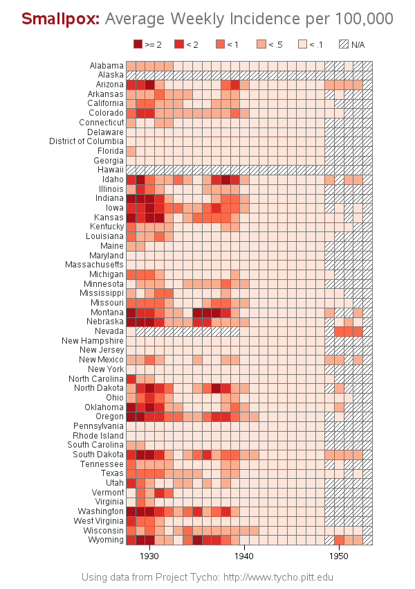
The Wall Street Journal recently published some graphs about seven infectious diseases, and I tried using SAS to improve the graphs ... it's a veritable infectious disease (graph) bake-off! Let's start with Measles ... here's a screen-capture of WSJ's measles graph: In general, their graph is eye-catching, and I learned a lot
Life Sciences
How to make infectious diseases look better
Are you at risk? Which blood types do vampires prefer?
SAS software has long been used to help analyze 'risk' - what about using it to help determine your risk of being attacked by a vampire?!? On a previous Halloween, I was the victim of a Vampire attack. Here's the photographic proof... Being the most common O+ blood type, I
32 SAS graphs for health and life sciences
"It slices, it dices ... it helps test laboratory mices!" In a joking way, this is a perfect description of SAS software, don't you think!?! :) And to prove it, this blog contains a collection of 32 examples, showing a variety of ways SAS can be used to graph data