Hospitality

Data Visualization
Sanjay Matange 0
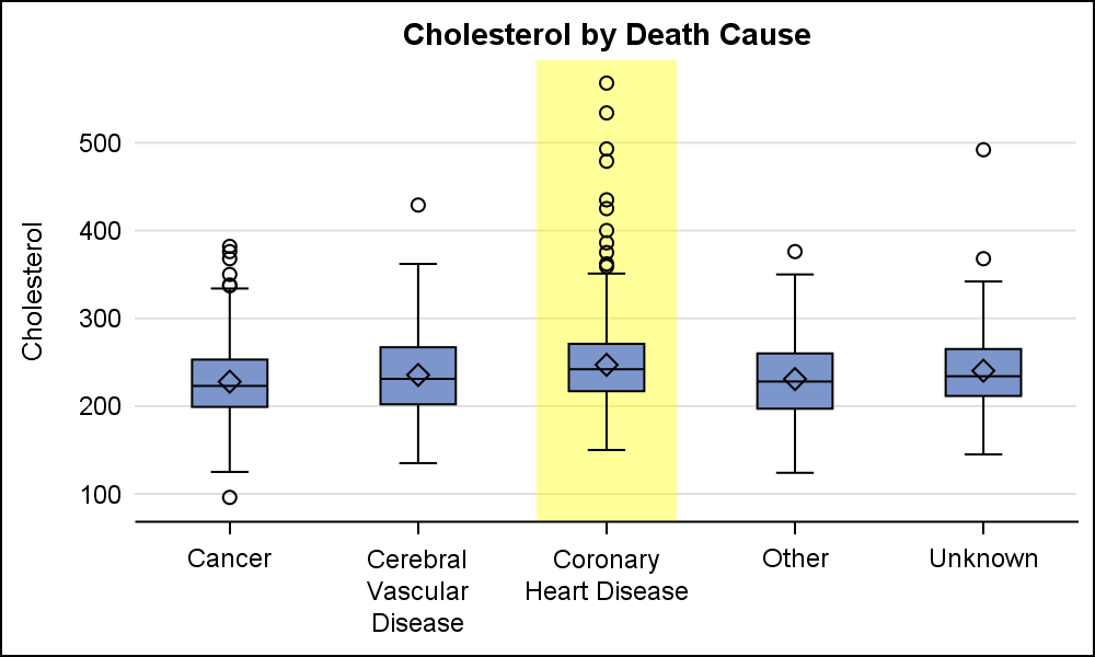
Category highlighting

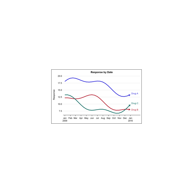
When presenting information in form of a graph we show the data and let the reader draw the inferences.  However, often one may want to draw the attention of the reader towards some aspect of the graph or data.  For one such case, a user asked how to highlight one

Advanced Analytics | Analytics
Toby Text 0
Auf und ab wie im Paternoster - aktuelle Trends in Samt und Seide von der KSFE in Krefeld

Auf der diesjährigen KSFE (Konferenz für SAS Anwender in Forschung und Entwicklung) gab es wieder viele überraschende Entdeckungen zu machen: Zunächst lernten die von außerhalb anreisten Teilnehmer, dass Krefeld die „Samt- und Seidenmetropole“ Deutschlands war. In ihrer Blütezeit vor dem Strukturwandel der Jahrtausendwende wurden dort 90 % aller in Deutschland gefertigten

Data Visualization
Sanjay Matange 0
Getting Started with SGPLOT - Part 4 - Series Plot

This is the 4th installment of the Getting Started series.  The audience is the user who is new to the SG Procedures.  Experienced users may also find some useful nuggets of information here. Series plots are frequently used to visualize a numeric response on the y-axis by another numeric variable on

1 17 18 19 20 21 32