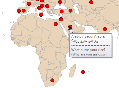
Education

Analytics | Data Visualization
Georgia Mariani 0
Data visualization helps University of Louisville achieve its 2020 strategic plan

When senior leaders at the University of Louisville (UofL) approached Vice Provost Bob Goldstein in early April 2016 with a request for a fully functioning data visualization platform by start of the 2016 fall semester—just four months away—he did not panic. Instead, Goldstein, along with Becky Patterson, Executive Director of

Data Visualization
Sanjay Matange 0
Getting Started with SGPLOT - Part 4 - Series Plot

This is the 4th installment of the Getting Started series.  The audience is the user who is new to the SG Procedures.  Experienced users may also find some useful nuggets of information here. Series plots are frequently used to visualize a numeric response on the y-axis by another numeric variable on

1 87 88 89 90 91 119