Have you ever run a regression model in SAS but later realize that you forgot to specify an important option or run some statistical test? Or maybe you intended to generate a graph that visualizes the model, but you forgot? Years ago, your only option was to modify your program
Tag: Data Analysis
In machine learning and other model building techniques, it is common to partition a large data set into three segments: training, validation, and testing. Training data is used to fit each model. Validation data is a random sample that is used for model selection. These data are used to select
A quantile-quantile plot (Q-Q plot) is a graphical tool that compares a data distribution and a specified probability distribution. If the points in a Q-Q plot appear to fall on a straight line, that is evidence that the data can be approximately modeled by the target distribution. Although it is
When you overlay two series in PROC SGPLOT, you can either plot both series on the same axis or you can assign one series to the main axis (Y) and another to a secondary axis (Y2). If you use the Y and Y2 axes, they are scaled independently by default,
Numbers don't lie, but sometimes they don't reveal the full story. Last week I wrote about the most popular articles from The DO Loop in 2018. The popular articles are inevitably about elementary topics in SAS programming or statistics because those topics have broad appeal. However, I also write about
Deming regression (also called errors-in-variables regression) is a total regression method that fits a regression line when the measurements of both the explanatory variable (X) and the response variable (Y) are assumed to be subject to normally distributed errors. Recall that in ordinary least squares regression, the explanatory variable (X)
Last year, I wrote more than 100 posts for The DO Loop blog. Of these, the most popular articles were about data visualization, SAS programming tips, and statistical data analysis. Here are the most popular articles from 2018 in each category. Data Visualization Visualize repetition in song lyrics: In one
I regularly see questions on a SAS discussion forum about how to visualize the predicted values for a mixed model that has at least one continuous variable, a categorical variable, and possibly an interaction term. SAS procedures such as GLM, GENMOD, and LOGISTIC can automatically produce plots of the predicted
Many data analysts use a quantile-quantile plot (Q-Q plot) to graphically assess whether data can be modeled by a probability distribution such as the normal, lognormal, or gamma distribution. You can use the QQPLOT statement in PROC UNIVARIATE to create a Q-Q plot for about a dozen common distributions. However,
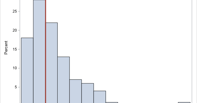
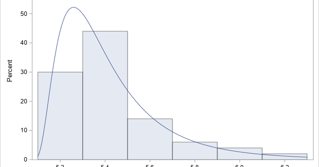
Recently a SAS programmer wanted to obtain a table of counts that was based on a histogram. I showed him how you can use the OUTHIST= option on the HISTOGRAM statement in PROC UNIVARIATE to obtain that information. For example, the following call to PROC UNIVARIATE creates a histogram for