The DO Loop
Statistical programming in SAS with an emphasis on SAS/IML programs
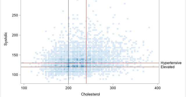
Data tell a story. A purpose of data visualization is to convey that story to the reader in a clear and impactful way. Sometimes you can let the data "speak for themselves" in an unadorned graphic, but sometimes it is helpful to add reference lines to a graph to emphasize

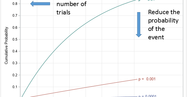
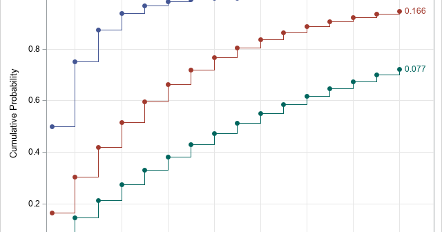
Every day we face risks. If we drive to work, we risk a fatal auto accident. If we eat red meat and fatty foods, we risk a heart attack. If we go out in public during a pandemic, we risk contracting a disease. A logical response to risk is to

I have written several articles about how to work with continuous probability distributions in SAS. I always emphasize that it is important to be able to compute the four essential functions for working with a statistical distribution. Namely, you need to know how to generate random values, how to compute
