A colleague posted some data on his internal SAS blog about key trends in the US Mobile phone industry, as reported by comScore. He graciously shared the data so that I could create a graph that visualizes the trends.
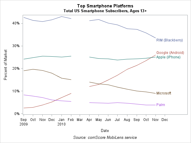
The plot visualizes trends in the data: the Android phone is gaining market share, primarily at the expense of the Blackberry, while the iPhone is holding steady.
Plotting the essential features of the data requires only two statements in the SGPLOT procedure:
title "Top Smartphone Platforms"; title2 "Total US Smartphone Subscribers, Ages 13+"; footnote "Source: comScore MobiLens service"; proc sgplot data=Mobile; series x=Date y=Pctval / group=Type break curvelabel; xaxis interval=Month; run; |
- The SERIES statement plots the lines.
- The GROUP= option groups the lines according to the platform and automatically assigns unique colors for each platform.
- The BREAK option is used because the data contain a missing value for March of 2010. (The missing data is what makes this plot unusual!) If you omit the BREAK option, each line continues from the February value to the April value without interruption.
- The CURVELABEL option labels each curve in the plot. Without the option, the SGPLOT procedure would automatically insert a legend.
- The XAXIS statement causes the horizontal axis to display tick marks for each month. This statement is optional, but without the statement the plot displays ticks every three months, which I don't like.
A comment that I received about a previous data analysis reminded me that some SAS customers are just now upgrading to SAS 9.2, and might not have much experience with PROC SGPLOT. For me, PROC SGPLOT has become a favorite tool for creating static images with minimal effort. Of course, for dynamically linked graphics from SAS/IML programs, I use SAS/IML Studio.

1 Comment
One nice benefit of CurveLabels is the direct labeling of each series with the name of the group. Using this instead of a legend reduces the amount of eye movement necessary to determine which curve represents which data. Direct labeling facilitates faster decoding of the data presented in the graph.
Clearly, there are use cases where direct labeling may not be feasible, in which case a legend is needed. In such cases, placing the legend as close to the data as possible (reduce eye movement) would be preferred.