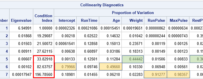
I was recently asked about how to interpret the output from the COLLIN (or COLLINOINT) option on the MODEL statement in PROC REG in SAS. The example in the documentation for PROC REG is correct but is somewhat terse regarding how to use the output to diagnose collinearity and how

