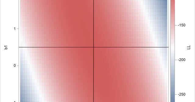
A statistical analyst used the GENMOD procedure in SAS to fit a linear regression model. He noticed that the table of parameter estimates has an extra row (labeled "Scale") that is not a regression coefficient. The "scale parameter" is not part of the parameter estimates table produced by PROC REG


