In the previous section of this series we looked at basic summary statistics. In this article we start to consider the relationships between variables in our dataset.
As part of your Explanatory Data Analysis it is worth looking for correlation between variables. Generally, when referring to correlation we mean the linear correlation between two variables, which is typically quantified by the Pearson Correlation Coefficient. A nice way to quickly visualize this is to use a Pair Plot which shows us both the correlation between two variables and the distribution of each variable in a visual matrix, as shown in Figure 1. This works best when you don’t have too many features to compare, and for very wide datasets it may make sense to do this step later in the EDA process when you have a better idea of which variables you want to retain or investigate.
Correlation analysis can be useful for a few reasons. Firstly, if you have a numeric target it can be a really useful way of assessing the direct relationship between the dependent and independent variables of your dataset. This is still useful with a categorical target as you can colour the scatter plot by class, effectively visualizing three dimensions. We can see this below with our HMEQ dataset.

Once again, we can assess the skewness and kurtosis in our histogram plots. We can also see the linear relationship between numeric attributes. In a regression analysis we could assess the relationship between a numeric target and other numeric attributes, however, in this classification context we can assess whether there is a pattern by adding our target class as a third dimension to the scatter plots. There does not appear to be any strong relationship for our target variable in these scatter plots – though the data is a bit too dense to see anything clearly.
Another reason correlation analysis is useful is to look for collinearity in your data. Collinearity is where one input (independent variable) has a strong linear relationship with another model input.
For example, if we wanted to build a regression model to predict LOAN, we have two numeric inputs which exhibit collinearity, i.e. MORTDUE and VALUE have a strong positive linear correlation. This is intuitive since MORTDUE is an applicant’s outstanding mortgage amount, and VALUE is the market value of their property, it is reasonable to assume that not many loan applicants will have already paid off their mortgage and that if your property is worth more than the average property you would also have an above average outstanding mortgage amount.
In the case of a regression model collinearity between inputs can cause instability in the model. When considering inputs with collinearity it may be worth removing the input which is less likely to improve model performance. In this case we might assume the model would be better predicting the LOAN amount based on an applicant’s outstanding mortgage amount. It may also be that both inputs are useful and we want to retain that interaction between them, in which case we could perhaps derive a new input using outstanding mortgage amount as a ratio of the applicants property value (i.e. MORTDUE/VALUE). This would also have the benefit of being a percentage scale between 0 and 100, so we may not need to further standardise this.
Alternatively, there are generalised models which can help to counter collinearity in models such as Lasso and Ridge Regression by effectively penalising model coefficients in order to make the regression model more robust.
You can also use Feature Engineering techniques, such as Principal Component Analysis or Auto Encoders, but this then loses a lot of meaning in the model as you are effectively creating new, synthetic model inputs.
Classification techniques such as Logistic Regression or Support Vector Machines may also be affected by collinearity since these are (generally) linear based models. In these cases, again you can look to exclude collinear inputs, or use a non-linear model such as a Decision Tree based technique.
Limitations of correlation and the use of information gain
You may have noticed already, but there are clearly some limitations assessing the correlation above to determine an explanatory relationship between two variables. Firstly, we are only working with numeric attributes, for our classification example we treat our target BAD_CLASS as a categorical variable so we cannot directly assess the linear relationship between it and numeric attributes using a correlation coefficient, likewise we may expect a categorical input (such as job role) to have a significant relationship with the risk of defaulting on a loan. Secondly, the Pearson Correlation Coefficient only assesses the strength of a linear relationship between two variables, when there may be a valid non-linear explanatory relationship between variables.
One technique you can use to generalise the relationship between variables is to consider Information Gain. The Mutual Information statistic gives a measure of the mutual dependence between two variables and can be applied to both categorical and numeric inputs. This dependence helps to describe the information gained in understanding a variable based on its relationship with another.
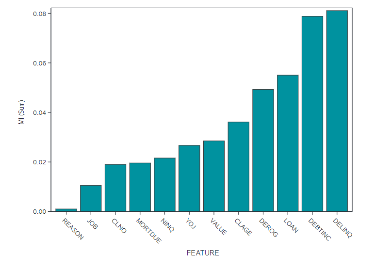
We can do this very easily in base SAS if we access the CAS API for the dataSciencePilot. This generates a correlation analysis for us, and we simply specify which statistics we want generated. Figure 2 shows an ordered plot for the Mutual Information for the relationship between each input and our target BAD_CLASS. We can see here clearly that loan delinquency (DELINQ) and indebtedness (DEBTINC) clearly have a dependence with BAD in such that information in one helps explain information in the other. This indicates that these may be important features to include in any predictive model we build.
Decision Tree Models for Attribute Importance
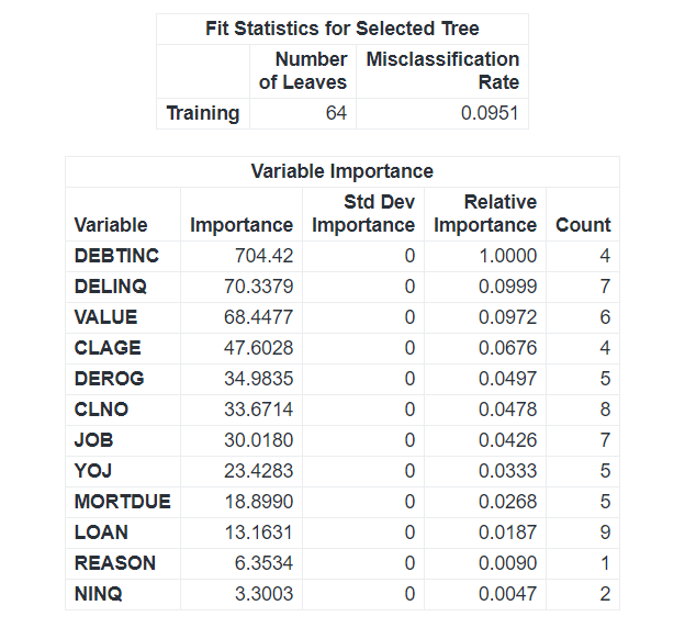
For completeness, we can compare this to the Attribute Importance model generated by the TREESPLIT procedure. If we use the default ‘Information Gain Ratio’ we see that we get a very similar output to our Correlation analysis, this is because Mutual Information is a measure of Information Gain. Looking at Figure 3 we can see that, once again, DEBTINC, DELINQ, and DEROG are possibly quite important explanatory variables.
In practice, it can be quite a useful way to save time to just skip ahead to building a basic Decision Tree on your dataset to assess Attribute Importance. A basic model on its own will not be a useful predictor as it will probably overfit the data, however the Attribute Importance model generated is a useful approximator to help with selecting model inputs. When we look at building Predictive Models we will spend some time discussing Feature Selection techniques. As we saw already with comparing the Mutual Information and Attribute Importance models, any model is likely to differ slightly on the exact ordering of feature usefulness. SAS Viya offers several automated techniques to do this, and by using multiple methods you can apply a voting or averaging principle to select the best overall inputs for a model which will generalise well for inference.
In the next section we discuss the impact of missingness in data.
Take a look at the ebook “The Modeling Meling Pot” on Model Management with SAS and Open Source.