Get the right information, with visual impact, to the people who need it
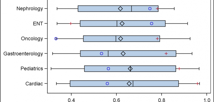
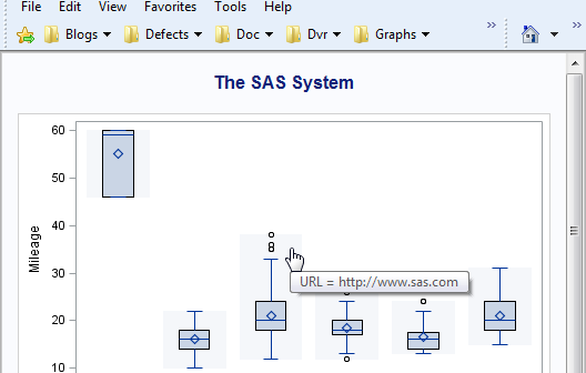
A common request we have been often hearing is for display of the distribution of data as a box plot, along with some detailed information overlaid. For example, one may have ratings data of all the hospitals in a region by different specialty, and you want to view this distribution

