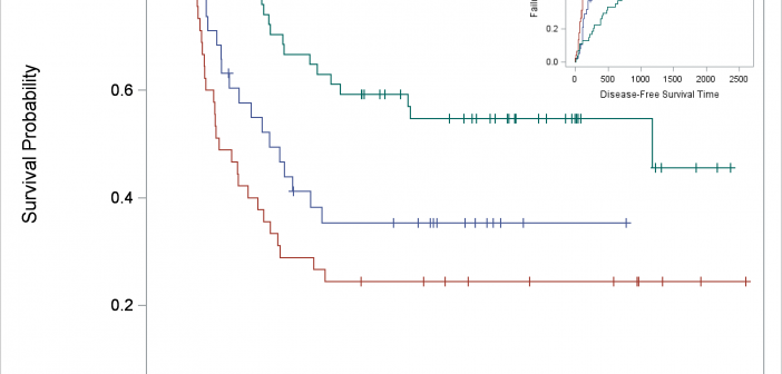
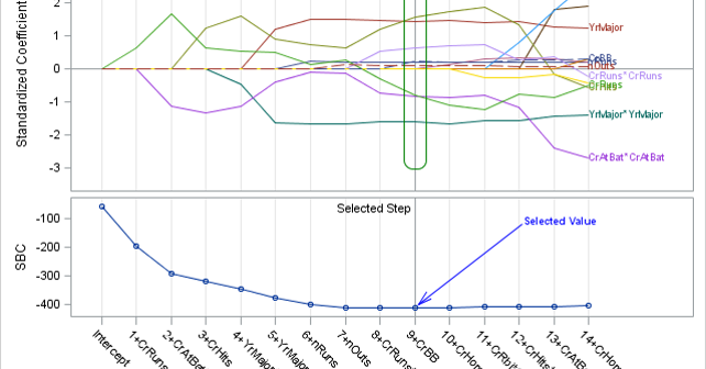
You can use SG Annotation (and its GTL equivalent) to display one graph inside another.

You can use SG Annotation (and its GTL equivalent) to display one graph inside another.
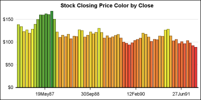
Bar charts in SGPLOT procedure have some new features that everyone may not be familiar with. In this article we will create bar charts with color response on linear axes. Normally, the VBAR statement treats the x-axis as discrete, placing each unique value by itself, equally spaced on the x-axis.
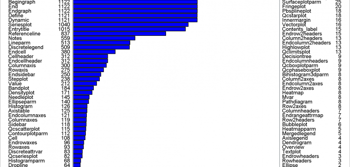
This post shows a variety of techniques including how to use PROC TEMPLATE and the SOURCE statement, PROC SGPLOT with multiple Y-axis tables, create comparable axes in two side-by-side graphs, create a broken axis, write and use a table template that wraps text, and find and display examples of certain statements in graph templates and fonts in style templates.
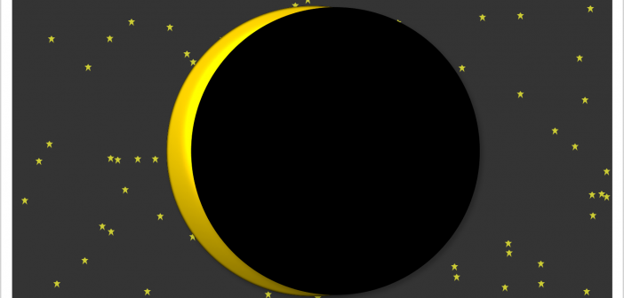
This example shows how to create two coordinated range attribute maps and use them in creating an animated gif of the eclipse.

Motivated by Ted Conway's post on creating a sequence of graphs showing the Solar Eclipse, I thought it would be fun to extend his code and create a gif animation. I used a frame count to 81, and used the printerpath feature to create the animation using SGPLOT with BY
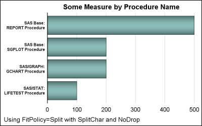
Long category values occur frequently in real world use cases. This can happen with graphs for analysis of clinical research data, and also for graphs showing survey data where the question asked may be long (even a paragraph). Managing such long categories on the x or y axis is always
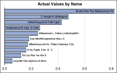
A few days ago, I posted an article on displaying first N bars from a data set. This is useful when the data is sorted by descending response, and only the first few values are significant. There were a few interesting comments, including one that was regarding the treatment of
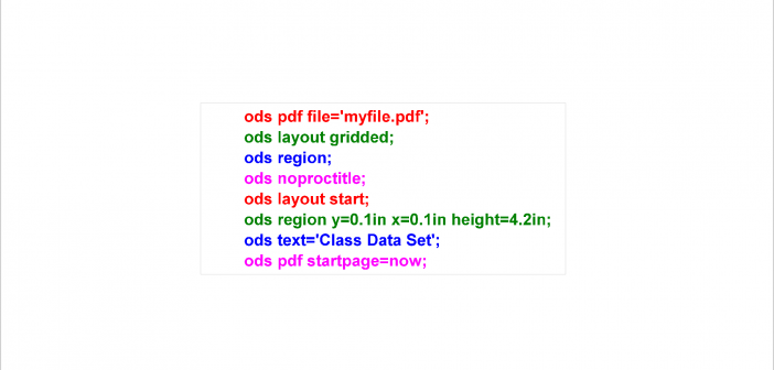
PROC SGPLOT displays titles inside the graph. If you want to display a title inside the graph and a different title outside the graph, you can use the ODS LAYOUT or the GTL. The ODS LAYOUT gives you precise control over your output and enables you to display multiple graphs and tables in each page.
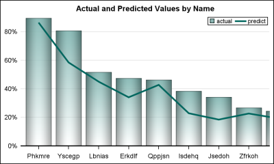
Often we have a graph with many bars (or categories) on the x or y axis. These categories may be sorted by descending response such as frequency of a % value. An example with simulated data is shown below. title 'Actual Values by Name'; proc sgplot data=bars2 noborder; vbar name /
SG annotation is a powerful technique for adding text, lines, arrows, shapes, and images to graphs. This post provides a macro that can help you when you make a mistake in writing the annotations.