Tips and Tricks

Data Visualization
Sanjay Matange 1
Attributes Map - 2

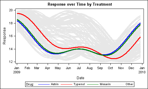
Last week I wrote about how you can use the Discrete Attributes Map to ensure that group values with specific names are represented in the graph with specific colors or other visual  attributes such as marker symbol or line pattern. This attributes map also supports a special keyword "OTHER" which can be used to

Data Visualization
Sanjay Matange 6
Custom Box Plots

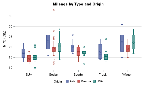
A frequent question we get from users is how to create a box plot with custom whiskers lengths.  Some want to plot the 10th and 90th percentile, while other want the 5th and 95th percentiles.  The VBOX statement in the SGPLOT  procedure does not provide for custom whiskers.  Also, unlike GTL,

Data Visualization
Sanjay Matange 4
Box with Scatter Overlay

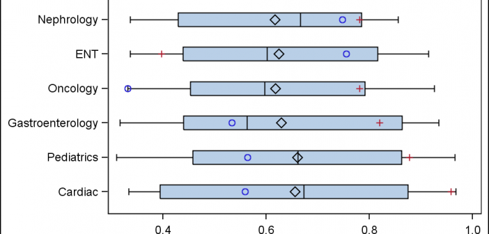
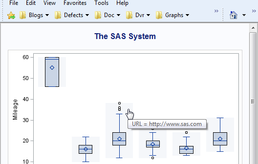
A common request we have been often hearing is for display of the distribution of data as a box plot, along with some detailed information overlaid.  For example, one may have ratings data of all the hospitals in a region by different specialty, and you want to view this distribution

Data Visualization
Sanjay Matange 3
Parametric Bar Charts

A parametric bar chart in SG Procedure and GTL parlance is a simplified version of the regular bar chart, where the data is assumed to be summarized prior to its usage inside the SG procedures or GTL.  So, multiple occurrences of the same category and / or group combination is

Data Visualization
Sanjay Matange 4
GTL Layouts

The Graph Template Language (GTL) provides you the ability to create complex graphical layouts. We have seen how to create a regular grid of cells based on one or more classification variables using the SGPANEL procedure.   Each cell contains the same type of plot.  This topic was covered in Dan's article on

Data Visualization
Sanjay Matange 3
Percent VBar

Recently a reader chimed in with a question on the Do Loop article by Rick Wicklin on how to create a bar chart with percent statistics.  Rick used SAS 9.3  and the reader wanted to do the same with SAS 9.2. For the basic (non-grouped) bar chart, the process is the

Data Visualization
Sanjay Matange 1
AE Timeline by Name

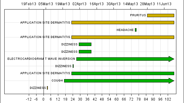
In my previous article on Adverse Event Timeline Graph, I wrote about how to create the AE timeline using SAS 9.2 code, using VECTOR plot and the MARKERCHAR option in SCATTER plot.  I  described a better way to place the labels at the lower end of the vectors. SAS 9.3 provides an easier way

1 25 26 27 28 29 35