Often we have the need to see the data by two different classifiers at the same time, as requested by a recent query on the SAS Communities page.
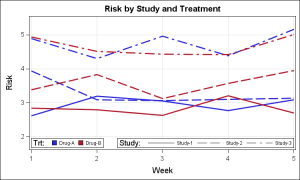
In this example I have simulated a response over time for patients by study and treatment. We want to create series plots over time for each "id", where the color of the series represents the treatment (Blue for Drug A and Red for Drug B) and the line pattern represents the study.
Here is the graph and the SAS 9.3 GTL code. Click on graph for bigger view.
SAS 9.3 GTL Template Code:
proc template; define statgraph PowerSeries; begingraph; entrytitle 'Risk by Study and Treatment'; layout overlay / xaxisopts=(griddisplay=on) yaxisopts=(griddisplay=on linearopts=(viewmin=2) offsetmax=0.1 offsetmin=0.1); seriesplot x=week y=risk / group=id linecolorgroup=trt linepatterngroup=study lineattrs=(thickness=2) name='a'; discretelegend 'a' / title='Trt:' type=linecolor location=inside halign=left valign=bottom valueattrs=(size=7) opaque=true; discretelegend 'a' / title='Study:' type=linepattern location=inside halign=right valign=bottom valueattrs=(size=7) opaque=true; endlayout; endgraph; end; run; run; |
The key element here is the use of the SERIESPLOT statement that supports the options LINECOLORGROUP and LINEPATTERNGROUP with SAS 9.3. This feature is supported only for Series plot and was specially created for use by the POWER procedures. The following conditions are necessary for this to work:
- The GROUP variable is used to connect the points of a series.
- The LINECOLORGROUP variable is used to assign the color (only).
- The LINEPATTERNGROUP variable is used to assign the line pattern (only).
- The GROUP variable must have the smallest granularity to ensure connectivity for each plot.
- The DISCRETELEGEND has an option (TYPE) to draw only one aspect of the line or marker.
The upper visual is necessary when all the curves need to be compared to each other.
Full SAS 9.3 Code: MultiGroup_93
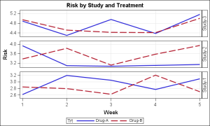
Small Multiples: If the comparisons to be made are among different treatments across the studies (independently), an alternate way is possible using the idea of "Small Multiples" as popularized by Edward Tufte. This also helps reduce some of the clutter.
Here is the graph and SAS 9.2 SGPANEL Procedure code.
Note, in this graph, each study is shown in its own cell. The data and Y data range for each cell comes only from the data that falls in that cell. Comparison of data between studies is harder as the Y overlap between Study 1 & 2 is not seen.
SAS 9.2 SGPANEL Procedure code:
title 'Risk by Study and Treatment'; proc sgpanel data=study; panelby study / layout=rowlattice onepanel novarname uniscale=column spacing=20; series x=week y=risk / group=trt lineattrs=(thickness=2); rowaxis grid; colaxis grid; run; |
Full SAS 9.2 code: SmallMultiples_92


