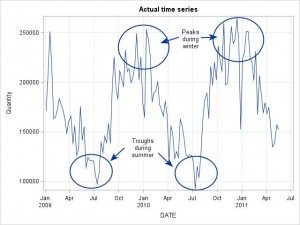
Look at the following graphs showing one weekly time series. The left hand shows the actual time series plot.
To the less statistically inclined this plot might indicate that the data is seasonal due to the troughs during summer and the peaks during winter. However, if you were to use a seasonal statistical forecasting model you would probably get poor results.
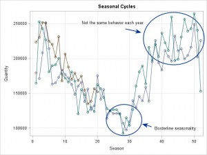
The reason is shown in the right hand side of the panel. This graph shows the seasonal cycles in the time series. Since this is weekly data there are 52 values on the x-axis. Compare this graph to the graph shown in Part 1, and it is quite clear that the lines are far from parallel – and hence no visual indication of the presence of seasonality in the data.
One reason for the confusion could be that the concept of seasonality in statistical forecasting is dealing with cycles of fixed lengths whereas we all know hardly anything in the business world is of fixed length.
One could argue that when it comes to statistical forecasting we would be better off if seasonality was called something like “cyclicity” instead. One reason why this is not the case could be that in early days of statistical forecasting the frequencies being considered were monthly and quarterly where seasonality and “cyclicity” coincide.
The challenge then becomes one of communication. How do you communicate that using seasonal forecasting models on seasonal data is probably not advisable?


