Tips and Tricks

Tips and Tricks

Data Visualization
Sanjay Matange 0
Should we move to Ireland?

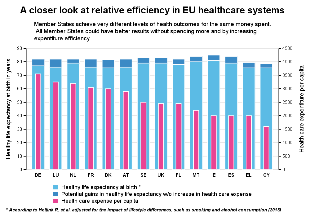
Recently, while browsing health care data, I came across the graph shown below.  The graph includes the healthy life expectancy at birth by countries in the EU, along with the associated per capita expenditure.  The graph also shows estimate of potential gain in life expectancy by increasing expenditure efficiency. The

Data Visualization
Sanjay Matange 0
Diagonal tick values

Fitting of long category values on a x-axis is usually a challenge.  With SAS 9.4, the SGPLOT procedure tries to fit the values by first splitting the values at white space to see if the values will fit in the space available.  This normally works well for a small number

1 28 29 30 31 32 114