Feature du jour
New features with SAS 9.40 M5

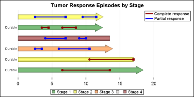
SAS 9.4 maintenance release 5 was released on Sept 19, 2017. This release includes many new items including integration with SAS Viya and SAS Studio, a web application for SAS development. Also Included with this release are some cool new features in the graphics domain, some of which were requested
Banking | Energy & Utilities | Government | Health Care | Hospitality | Insurance | Life Sciences | Manufacturing | Retail | Travel