Feature du jour
Spark grid

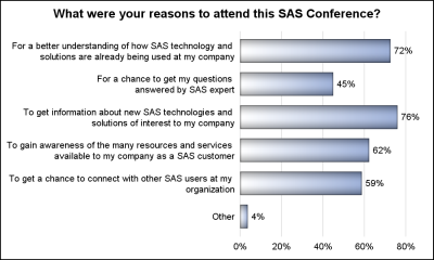
The 25th annual SESUG conference was held at in the SAS campus this week. I had the opportunity to meet and chat with many users and attend many excellent presentations. I will write about those that stood out (graphically) in my view. One excellent presentation was on "Methods for creating