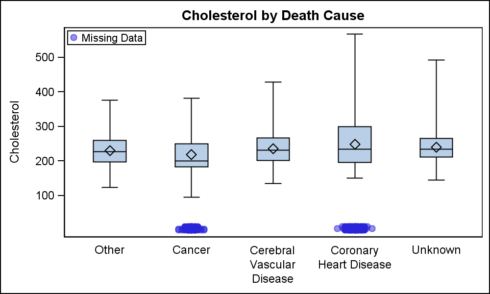
Margin Plots

Last week a user wanted to view the distribution of data using a Box Plot. The issue was the presence of a lot of "bad" data. I got to thinking of ways such data can be visualized. I also discussed the matter with our resident expert Rick Wicklin who pointed