It may never crossed your mind, but there are real-life cases when reversing graph axes make sense. For example, when Y-axis represents a depth under the sea level or depth of oil well drilling, it makes perfect sense to have zero on top and positive numbers increasing from top down. Or, when X-axis, represents time elapsed from some events in the past before some anchor event occurred, it make sense to have zero time on the right and positive numbers increasing going to the left.
This very useful feature of reversing axes in graphs is available in SAS Visual Analytics. It’s a process that involves creating a custom graph template and then applying that template to your data in SAS Visual Analytics Report Designer. Here’s how in two quick steps:
Step 1. Creating a custom graph template
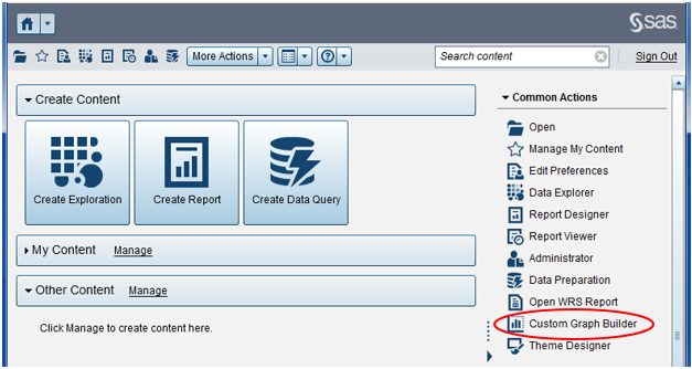
Open the Custom Graph Builder found in the right pane of the SAS Visual Analytics Home page:
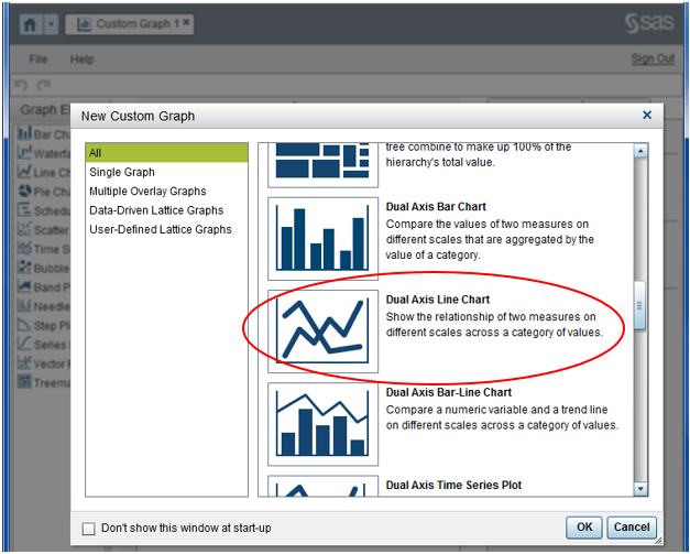
Then in the New Custom Graph window, select type of the graph that you want to build; for example, I selected Dual Axis Line Chart:
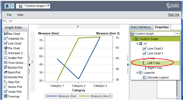
Select Properties tab in the right pane and then from the drop-down list select the object (axis) you want to change direction for. In the screenshot below, I selected Left Y Axis:
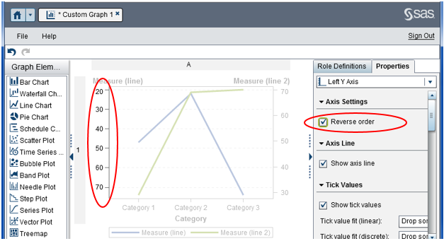
At this point, we are almost there; the solution is in plain view. Just check the Reverse order check box. Notice how left Y-axis changes its direction from top to bottom.
Save your graph template and close out the Custom Graph Builder. At this point, you are back to the SAS Visual Analytics Home page. Now, you can build your report.
Step 2. Applying the template to your report
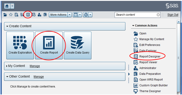
From the SAS Visual Analytics Home page, open the Report Designer by clicking on one of the following – a Report Designer icon on the toolbar, Create Report button in the main area, or Report Designer link in the right pane:
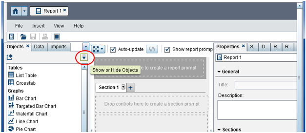
When your Reports Designer opens, you might be disappointed when you see your newly created report template nowhere to be found. Here is a little help.
Click on the “Show or Hide Objects” icon in the top right corner of the Objects tab:
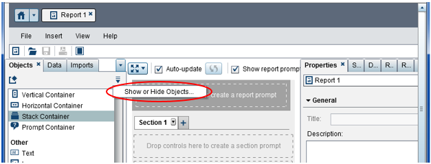
Then select “Show or Hide Objects…” as shown in the next screenshot:
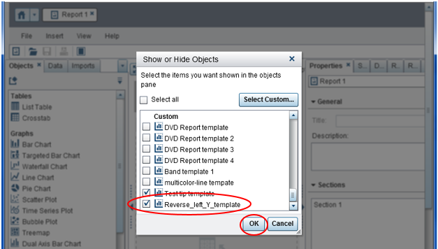
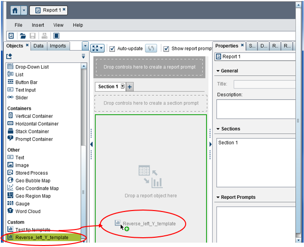
In the Show or Hide Objects pop-up window, find and check your newly created graph template, Reverse_left_Y_template, in the Custom section (you need to scroll down the window to find it) and press OK button:
After you return to the main Graph Builder window, you will be able to find your template in the very bottom of the Objects tab in the Custom section. Drag this report template and drop it to the report canvas:
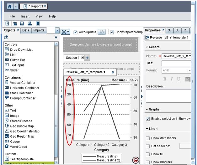
Now you will have your left Y-axis in the reverse order (increasing from top to bottom):
At this point, all you need to do to complete your report is to define your data and assign roles, styles and other attributes for your report. Happy reporting!

2 Comments
Thank you for sharing this useful feature. It was very thoughtful of SAS Visual Analytics developers to implement it.
Thank you for your kind feedback.