It's easy to plot events that happened at a certain time, but what about events that extended over a range of dates, such as recessions? ... This blog post teaches you a nice trick to use for that!
Let's say you have a plot of the labor force participation rate over time, and you want to also see when the recessions started and ended. Here's the way I would plot it:
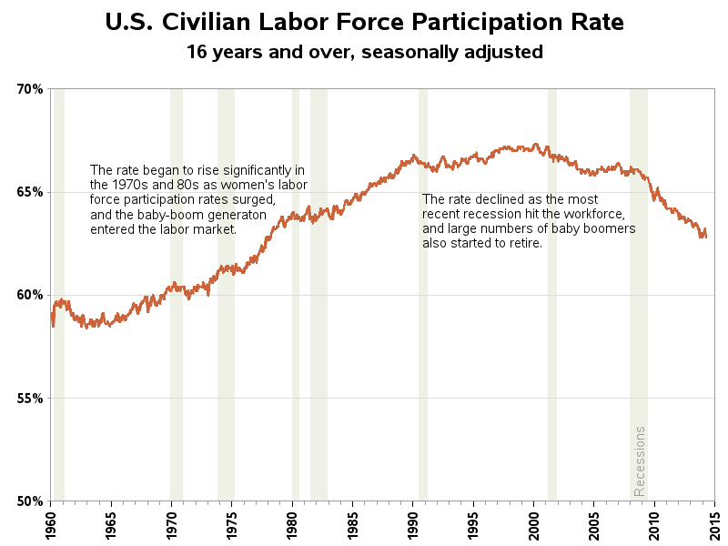
How do you do that in SAS? If you've seen any of my previous blogs, you probably know that the trick I use to add things to graphs is almost always annotate. Annotate gives you a way to programmatically 'draw' extra things on a graph. And in this case, I use it to draw a colored box behind the graph, extending in the left/right direction from the start date to the end date of each recession, and extending in the up/down direction from the bottom of the axis to the top.
Here's a short example that shows how to code it. Notice that I use the data coordinate system for the x direction (xsys='2') so I can specify the dates, and I use a %-based coordinate system for the y direction (ysys='1') so I can simply specify the values 0 and 100%. The when='b' draws the solid-colored bar before (ie, behind) so it doesn't obscure the plot lines.
data anno_recessions; xsys='2'; ysys='1'; when='b'; x='15apr1960'd; y=0; function='move'; output; x='15feb1961'd; y=100; function='bar'; color='cxf0f1e6'; style='solid'; output; run; |
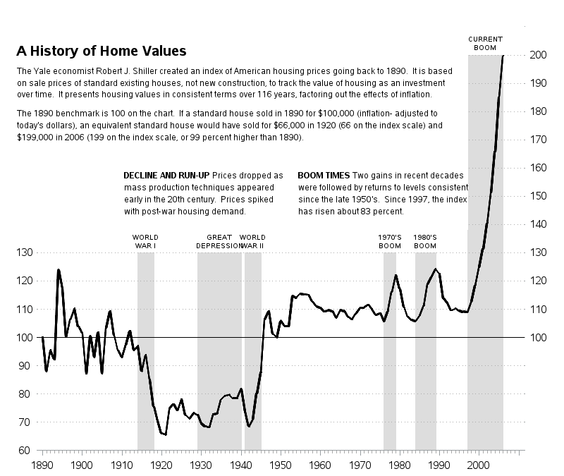
What about events other than recessions? - Certainly! It could be any event with a start date and end date. And if it's not obvious what the event is, just stick a label on it!
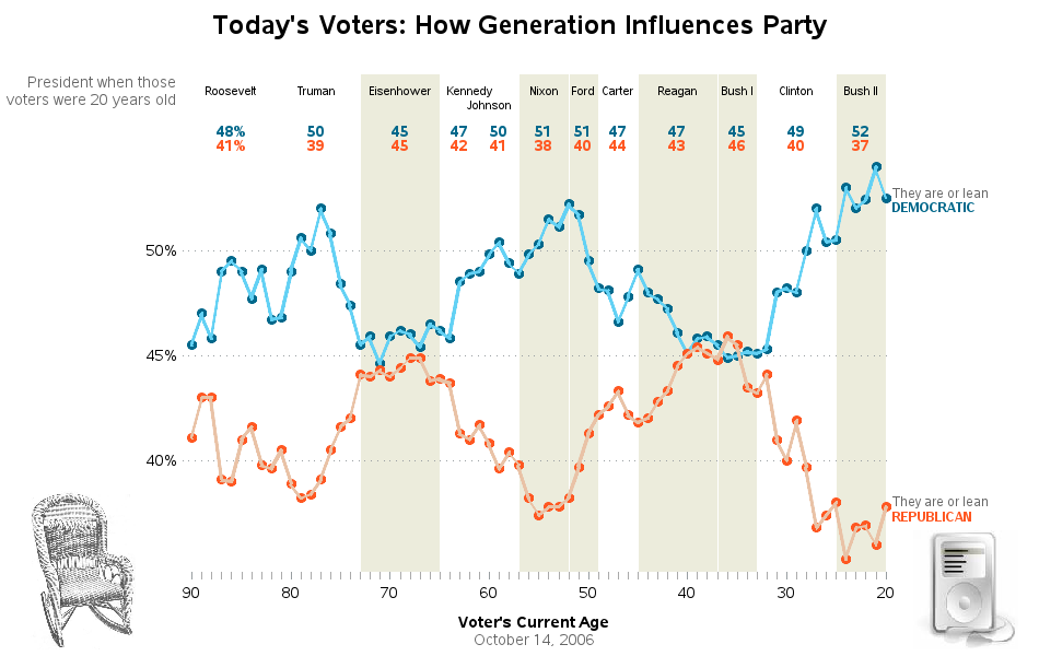
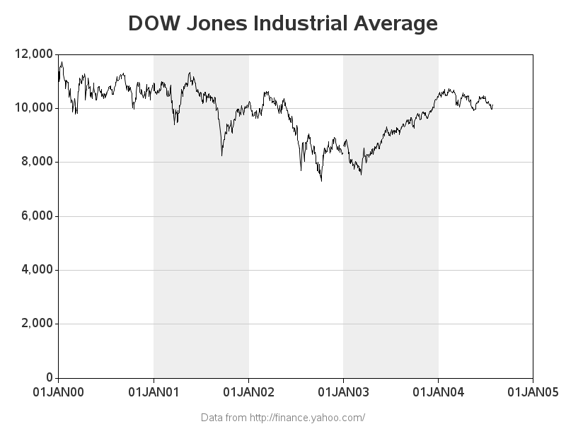
Or what about which president was in office? Yep - you can use the same trick to show that!
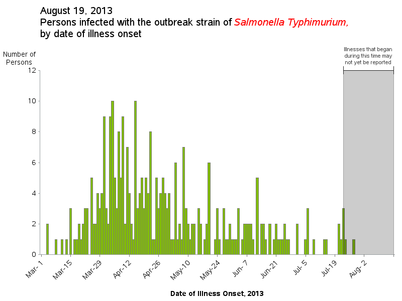
What about "graying out" a special region of a Salmonella chart? Sure! With a slight modification, you can use an alpha-transparent gray color, and annotate it after the graph (when='a' so it is drawn on top).
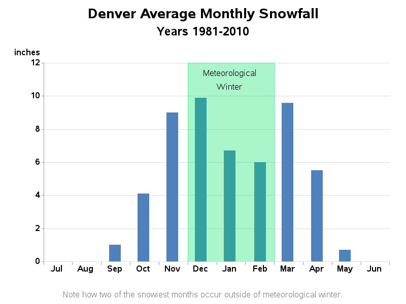
What about showing a season of the year, such as 'winter'? ... You betcha!
You can even use this technique to simply alternate a background color (like the old green bar paper) instead of using reference lines.
I've set up each of the graphs above so you can click on them to see the 'info' page which has a link to the SAS code used to create the graph. Feel free to download the code, and modify it to work with your data.
Now it's your turn - do you have any tricks that you'd like to share for enhancing time series plots? If so, leave a comment below!