Being an Eagle Scout, the data for good movement caught my attention. I wondered if I could apply my computer skills in a way that might help. How about showing people better ways to visualize HIV/AIDS data - that might help doctors better understand the data, and therefore better treat and prevent the disease! Let's start simple, and then step-by-step build a better map...
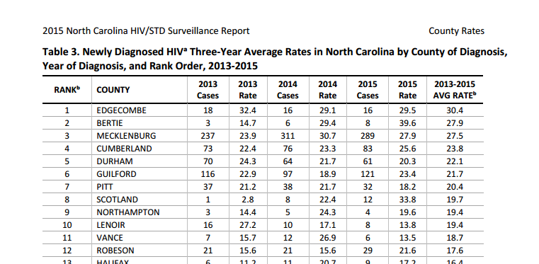
I did some Google searches and soon found a report with lots of data for my state, North Carolina. The report had data at the county level, but the values were in tables (see partial screen-capture below) - no geographical maps at all. It was very difficult to look at the tables and try to identify the geographical relationships and trends (I doubt many people even know where all 100 NC counties are located). This data was begging to be plotted on a map!
So I copy-n-pasted the data from the pdf report into a text file, and read it into a SAS dataset. I then used Proc GMap to create a map. I started with the most basic color binning for the legend, specifying the midpoints=old option so GMap would use the simple Nelder algorithm (this was the default prior to SAS 8.2). I used the default color gradient that comes with style=htmlblue. With this map, you can easily see that some parts of the state have a much higher rate of new HIV cases - it's so much easier to see this in a map, than looking at 100 values in a table!
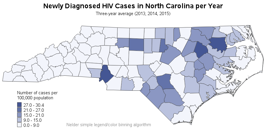
Now, instead of the simple Nelder algorithm, let's use quantile binning to assign the colors to the counties. By specifying levels=5 in Proc GMap, you get 1/5 of the counties placed into each color bin. This makes it easy to identify the best or worst fifth (or 20%) of the counties.
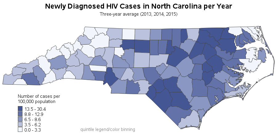
But using the default light-to-dark blue color gradient didn't seem quite right for this data. Using this color gradient (to me, at least) seems to only convey the "level of badness" of the HIV rate. I wondered if it might be better to use a divergent color scheme, which might provide a way to intuitively convey that low values are good, and high values are bad. Here's what a divergent color scheme (from the colorbrewer website) looks like on the map.
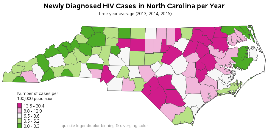
The divergent color scheme was a step in the right direction ... but it didn't quite fit the data. Are the counties with the lowest 1/5 of the HIV rates all good? They're all green in the map. A rate of 0 is definitely good, but is a rate of 3.3 also good? I think making them both green might be misleading.
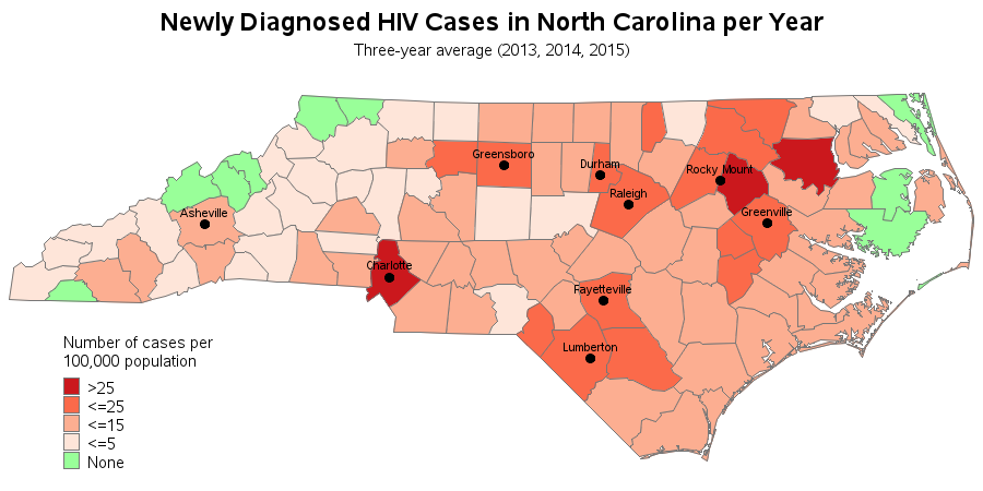
So I decided to go with custom legend/color binning. In my custom map, the only good value is zero (which I make green), and all non-zero values are levels of bad (shades of red). And rather than using quantile binning, or simple Nelder binning, I looked for natural breaks in the distribution of values in the data, and assigned legend bins manually using 'if' statements and a data step. I'm starting to like this map!

And now for one last finishing touch ... If you click the map and view the interactive version, you can hover your mouse over each county and see the county names. But many people don't really think in terms of counties. Quick quiz - where's Jackson county NC? (... see what I mean!) Therefore I annotated labels on some of the major cities to provide additional reference points. And now I really like this map!
I'm not saying that I've created the perfect map, but I think it's certainly a step in the right direction. I'm happy to share the SAS code, if you'd like to improve it and send me some suggestions.
And now let's go on a little visualization tangent ...
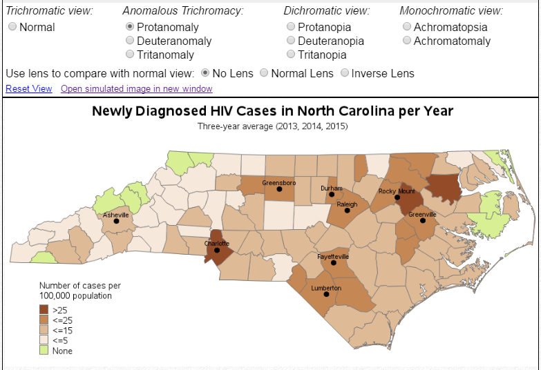
Sometimes when I create a graph with reds & greens, someone comments that colorblind people might not be able to distinguish between the colors. Well, with colors "the devil is in the details" - especially when dealing with mixtures of colors (you can see in the RGB codes in the pattern statements that these aren't pure reds and greens, but rather mixtures of RGB codes). Therefore you can't just conclude "This map looks like it has reds and greens in it, therefore someone who is colorblind can't distinguish these colors." You either have to ask a colorblind person, or simulate a colorblind person.
I uploaded my HIV/AIDS map to one of the websites that lets you simulate what it would look like to people with various forms of colorblindness, and all the colors and shades used in this map are very easily distinguishable in all of the Anomalous Trichromacy and Dichromatic colorblind simulations. It's actually pretty cool & fun, and I encourage you to try it with some of the graphs you create.
Here's a screen-capture of one of the simulations for my map: