When you were growing up, did you ever imagine that the most popular show on TV would be 24-hour coverage of a storm?!? Yes, for better or for worse, the weather has become our new reality TV.
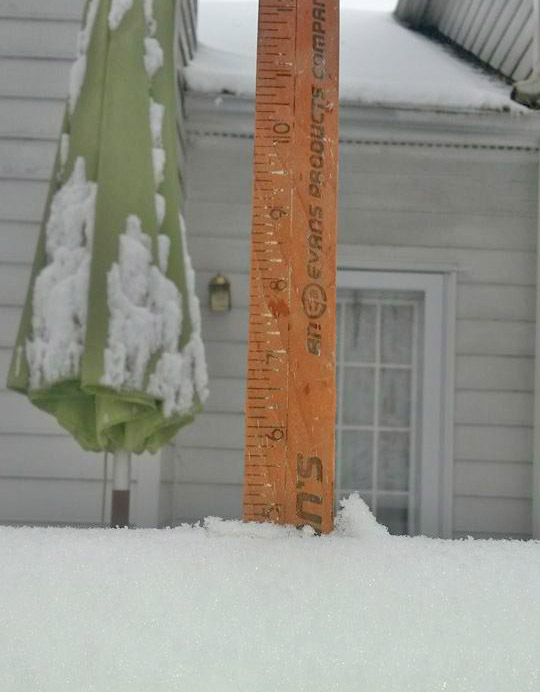
And as you watch the weather coverage, you probably see all the weather reporters showing the same old weather maps. With all the data available these days, it seems like they'd be able to provide something a little more in-depth or customized, eh? And speaking of in-depth (pun intended!), here's a photo from my friend Paul, who was doing his own analytics on a recent snowstorm ...
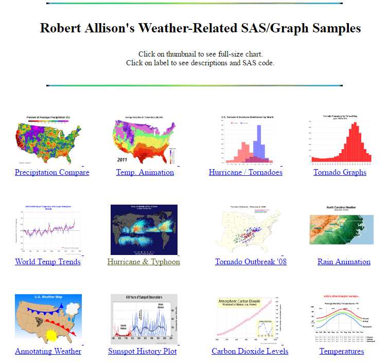
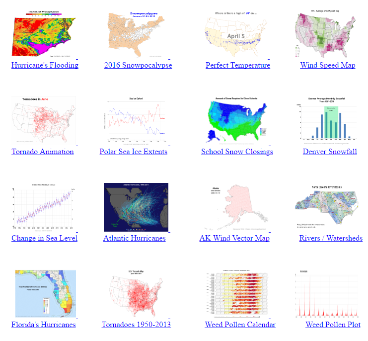
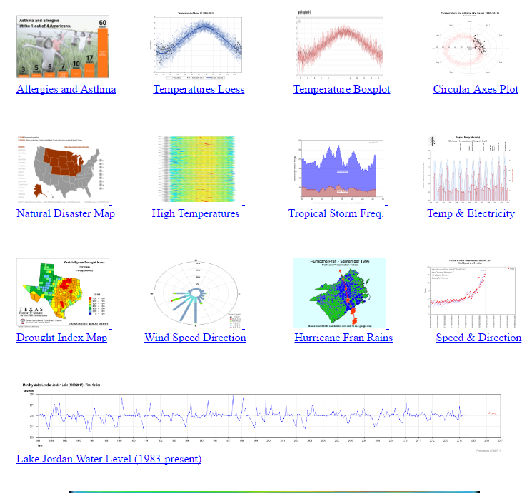
Well, that's what this blog post is about - taking the reams of weather data, and creating custom visualizations using SAS software. Rather than writing a lot of text about my weather-related examples, I'll just show them to you. I've set up an index page that will let you see them all (and download the SAS code used to create them). Click the screen-capture below to go to the index page:
And what better way to end a blog post than with a nice rainbow. This picture is from my old college friend Mubarra.