Saturday Night Live has been on television for about as long as most of us have been old enough to stay up and watch it (since 1975). Therefore, when I saw that Rolling Stone had ranked all the cast members throughout the show's history, I knew this was going to be an interesting chunk of data to analyze!
I assume that if you're reading this article, you have watched Saturday Night Live (SNL) before. And if you're an SNL fan, you will thoroughly enjoy the Rolling Stone article ranking all 141 cast members -- it's a great read, and contains lots of interesting and entertaining information. But, it only contains text and photographs ... all this data, and no graphs.
So I rolled up my sleeves, and got to work. First I went through the entire article and copy-n-pasted the data for each cast member into a text file that I could read into SAS (as with many graphs, getting the data is the tedious part). Note what the article says about the ranks -- "We're not ranking their careers, merely their stints on SNL."
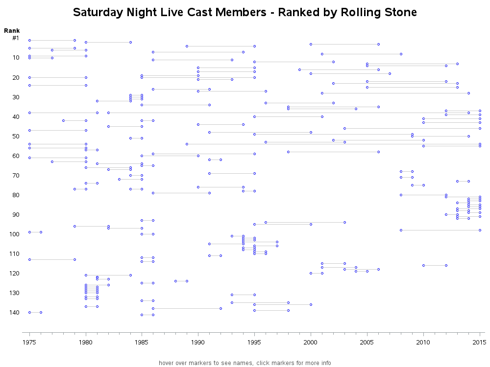
For my first graph, I wanted to show the range of years for each cast member, as well as their rank. I did this by plotting a marker at their starting and ending years, and annotated a line to connect them. In general, it seems that the ones with better rankings had longer tenures, and there seem to be several 'clusters' of short-tenure cast members. Also, there seem to be fewer very-low ranking cast members in recent years. (You can click the image below to see the interactive version, with html hover-text for each of the plot markers.)
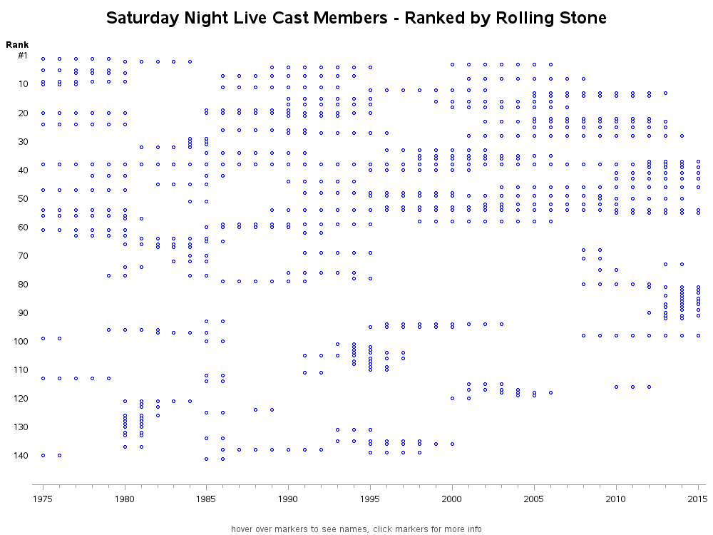
Next, I replaced the connecting lines with plot markers, such that there was a separate marker for each year. This creates more of a scatter plot, and is a stepping stone to performing some additional analytics on the data:
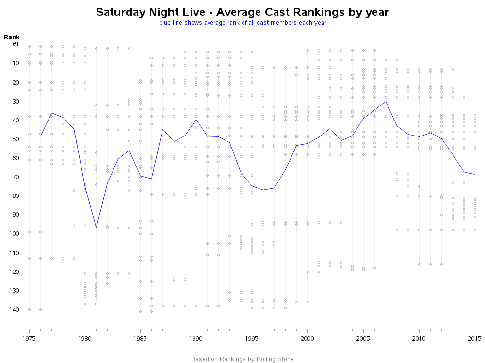
If you're like me, there were certain years that you tended to watch SNL. And I wanted to see how "my years" and "my cast members" stacked up to the others. So I created another version of the graph, and calculated the average cast member ranking for each year (represented by the blue line).How do your favorite #SNL cast members stack up? #analytics Share on X
The yearly average was interesting, but it didn't seem to capture the 'essence' of each year. Therefore I consulted my friend Rick Wicklin, who is an expert in computational statistics, and he came up with an alternate idea which I think better summarizes the data.
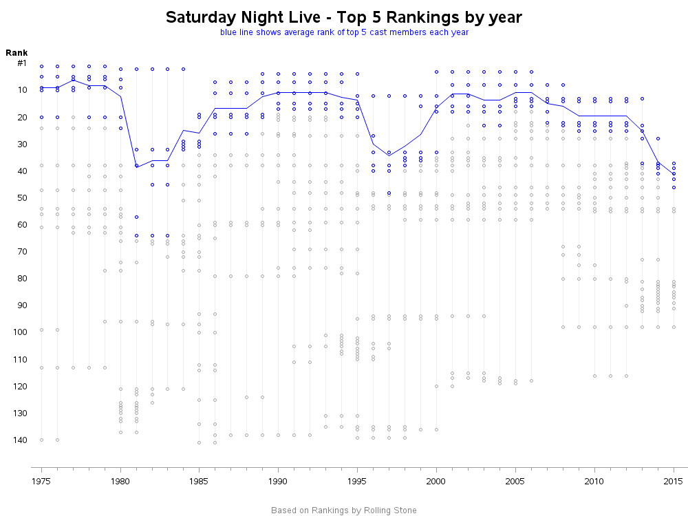
Rick proposed that ... "People remember the stars, not the average or below-average performers. Also, the not-so-great cast members often play the supporting roles whereas the stars get the big roles like anchors on Weekend Update, or weekly roles as recurring characters like Coneheads, Church Lady , Wayne’s World, etc. I would use a scoring technique like they use at cross-country races. In a cross-country race, only the first five runners score points for the team. The team’s point total is the sum of the ranks of the first five runners on that team. Although cross-country uses sums of ranks, the mean of the top-five ranks is an equivalent measure."
So I created a new version, using the technique Rick recommended. The blue line represents the mean of the 5 highest-ranked cast members each year. I also made the top 5 markers blue, so you can easily see which markers the blue line is summarizing. As a sanity-check, see if you think the new graph corroborates the following statement from the article: "Eddie Murphy is the only reason SNL survived the five-year wilderness without [SNL producer] Lorne Michaels."
I used lots of little code tricks to make subtle customizations to these graphs, to get them exactly the way I wanted. If you'd like to have a look at these tricks (and possibly re-use them), here is a link to my SAS code.
How did your favorite cast members do in the ranking? And how did "your years" do in the yearly average analysis? What other techniques would you recommend using to analyze the data from the article? And what additional data would be nice to have, to perform additional analyses? [Feel free to leave your answers, or more questions/suggestions, in comments!]