Human brains are hardwired to build maps. We navigate the world around us through the creation of mental maps. Maps that assemble abstract landmarks and build spatial relationships between them. If you think about how you navigate through your house, even in the dark, it is quite amazing. Maps have been found dating back 25,000 - 30,000 years ago, and the 2014 Nobel Prize for physiology was awarded to scientists who discovered the brain’s “GPS System”. While lines, bars, and pies are worthy data visualizations, maps offer a certain artistry, visual acuity, scientific backing, and general appeal.
Everything happens somewhere, and much of our business data includes location information. Internet of Things (IoT) sensors include x, y coordinates in their data, and the mobile apps we depend on use your device location to provide a personalized, targeted experience that addresses where you are. Using location analytics and maps in your dashboard visualizations unlocks a whole new level of context in your data that you cannot access otherwise.
How are you gaining insight from location information in your dashboards and data explorations? SAS Visual Analytics embraces the hardwired appeal of maps by supporting a range of location analytics capabilities that are available out-of-the-box and through our partnership with Esri. These location analytics capabilities include:
- Displaying your data on a map represented by:
- Coordinates (latitude/longitude for plotting your data on a map)
- Regions (such as country boundaries, sales territories, floor plans, or stadium sections)
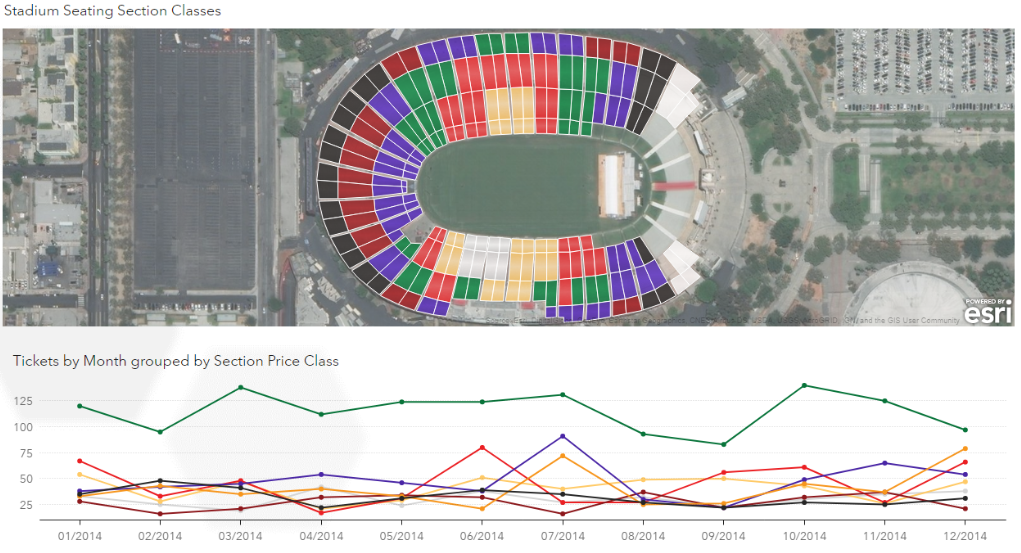 Figure 1: Using custom Geo Regions in SAS Visual Analytics to show stadium sections.
- Contour (heatmap representation of coordinate data)
- Network (origination/destination between coordinates)
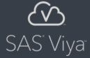
Figure 2: Using a Geo Network in SAS Visual Analytics to show connecting airports for airline flights.
- Display multiple data layers using the following:
- Color, markers, or regions that are based on a distinct category or gradient fill that is based on a continuous measure.
- Gradient fill of a continuous measure for contour maps.
- Size of a marker that is based on a category or measure.
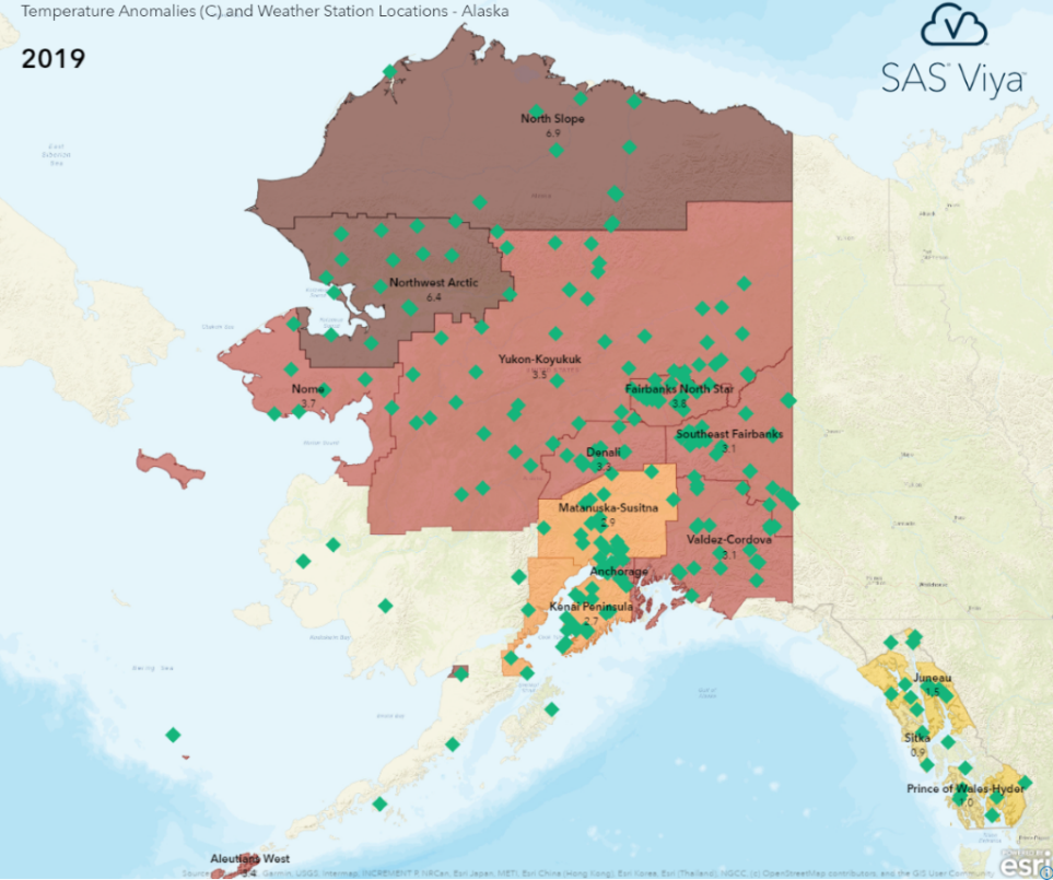 Figure 3: Region-coordinate map of weather stations and temperature anomalies in Alaska.
- Create maps that use regions that mean something to you. Out-of-the-box, SAS Visual Analytics supports pre-geocoded data sets. There is also support for adding custom regions to let you design maps that have the most impact to your users.
- Drop a pin and explore points of interest.
- Add geographic selection areas around your pins based on distance or travel time. Then, select the data points that appear within your selection area.
- Request Esri demographics information for the selected region to enhance exploration by including additional relevant information.
- Find optimal routes between points of interest or measure the straight-line distance between
- Is your data too dense to make sense of? View dense data on a map using proximity clustering, contour maps, or subset your data using data filtering or interactive filtering.
- Leverage your Esri content by embedding multi-layer web maps as interactive backgrounds with your SAS Visual Analytics data layered on top.
- Enhance your data with geographic content to perform deeper, more informed analysis using the following:
- Geocode your data by accessing the Esri Geocoding service to add latitude and longitude columns for each record in your data.
- Geo-enrich your data by joining it with Esri demographics data.
SAS Visual Analytics provides a wide range of location analytics through native capabilities and integration with Esri. Adding location analytics to your dashboards and explorations helps you better understand what your data has to say.