In May and June I will tour the Nordics presenting the new experience working with SAS Visual Analytics. It struck me how powerful visualization tools are today, easy to use, drag ‘n’ drop interfaces and with a few clicks you can do things we didn’t thought was possible just a few years ago.
Then I asked myself, what can possible go wrong with a few clicks? “Anything that can go wrong will go wrong”, but if you stick to the basics you should be alright. What do I mean?
Let’s start by looking at this nostalgic print-out I found couple of weeks ago:
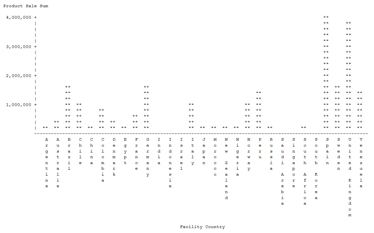
It is a typical print-out from the early 90s of a bar-chart showing sales per country. It may not be the most beautiful graph in the world, or the easiest to read, but it does the job. You can identify the best performing country (Spain) and also detect patterns in the data.
Comparing now and then
I’m really interested in the art of data visualization, so my first thought was about the differences between now and the 1990s in data visualization. The quick answer is that they are massive. For example, here is a bar chart of the same data as we would produce it now:
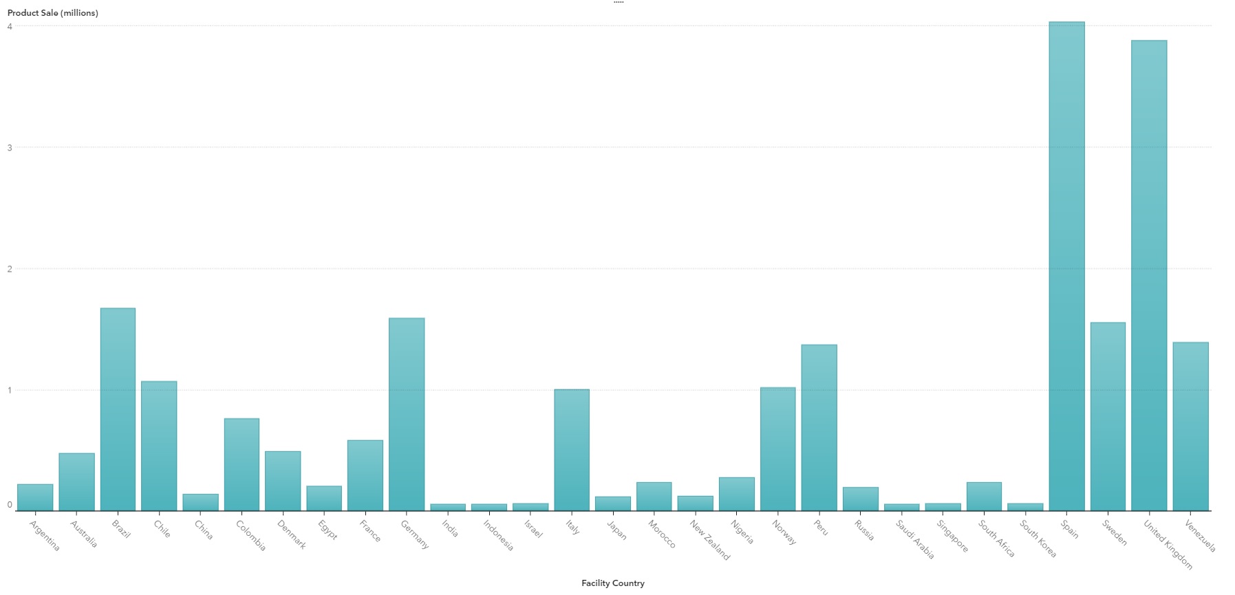
Yes, it shows the same data and patterns, and Spain is still the best performing country. But visually, it is hugely more attractive.
We have definitely seen big improvements in the visuals over the last 30 years. The technology available today makes it easier to create these kind of visuals, because we can use drag ’n’ drop interfaces with a high degree of self-service, rather than needing coding as we did in the early 1990s. This means that we can now easily create nice-looking visuals without any programing skills. We can also add interactions and navigation to make them even more powerful.
But to me, the most interesting part of my personal brainstorming session is that the purpose of data visualization is still the same. We still want to see data in the clearest possible way, meaning that the visualization must be easy to interpret. This is common sense for many of us, but are we really good at it?
Here is an example that might shed some light on this. I really like box-plots (probably best not to ask why), so here is one.
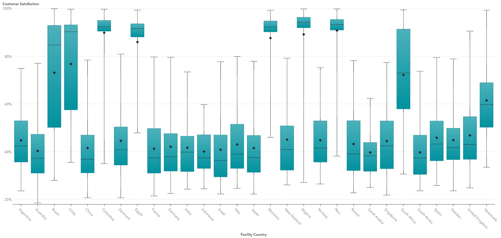
This shows customer satisfaction by country. I can interpret this kind of visual, so I can see the distribution of customer satisfaction and detect patterns and other goodies. That’s fine for me, but would this be an appropriate visual to use in a management dashboard? Probably not. In general, a box-plot is likely to be completely useless for the majority of end-users. Unless you are an analyst or data scientists, it needs too much specialist knowledge and understanding compared with a classic bar-chart.
Keep it simple…
Visualization applications today offer a wide range of visualization types, and new types of charts are surfacing all the time. I think it is important to find new ways to visualize data, and there are certainly some charts and views that can give users much better insights. But if we choose badly, and use visuals that end-users cannot understand, then our fancy interactive dashboards become useless.
We probably also have a tendency to shoehorn in as many visuals as possible into dashboards—and guess what - they get too busy and complicated, and people stop using them. Modern and powerful visualization tools mean you can do a lot in a short period of time. The tendency is probably to try to do too much, which risks confusing the message. The phrase “less is more” is perhaps never so true as in data visualization. Here, it means, essentially, “display what you need to display and nothing more”, keeping it simple by using visualizations that anyone can understand and interpret.
Yes, bar charts are boring but they do their job. I’ve often been told to use different types of visualizations, because standard bar charts or line charts “are so common and boring”. But if the topic does not need animations, and they do not deliver value to end users, why bother? If a bar chart does the job, use it.
To be fair, I have seen great dashboards that are very popular and appreciated by end-users. But what is the difference between a useless and useful dashboard or visualization? I think there is one vital ingredient: developers and end-users working together, in a more agile approach.
The rules have not changed
My conclusion is that it does not matter whether you are looking at a bar chart from the 90s or a fancy animated visualization, the rules are the same:
- Ask yourself “what is the purpose of this visualization/dashboard?”
- Know what value is expected by the end-users
- Remember to use visuals that anyone can understand and interpret
- Keep in mind that less is more and to keep it simple
- If in doubt, listen to the “Visualization Gurus”
Discover how to go from basics to big data with data visualization techniques.

1 Comment
I love box plots too!!! I think before too long it will become a standard management visual. You can now create a box plot in Excel and children today are being taught it in school...