Back in 2013, I wrote a paper for the SAS Global Forum, reviewing the attributes that go towards making a good graph. In this paper, I covered many recommendations from industry thought leaders that can help enhance the effectiveness of graphs to deliver the intended information.
 One of the aspects that is close to my heart is the recommendation to bring related items closer together in a graph.
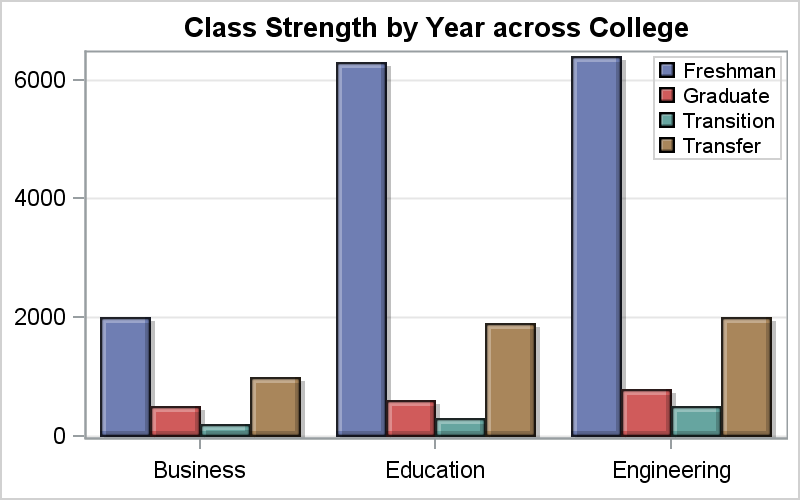
The graph on the right shows the number of students in each category in different colleges of a university. This allows comparison of number of students in each category within a college. However, if one wants to compare the number of students in each category across colleges, then this graph does not make the task easy. It is a bit harder to compare the number of "Transition" students in College of Business with Education.
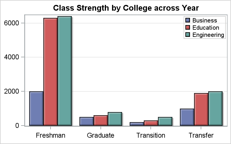 For comparison of students in a category across colleges, it is better to switch the category and group roles and get the graph on the right. Now, it is easier to compare the number of "Transition" students across Colleges.
This example is taken from the paper linked above. The main idea here is that bringing items that are to be compared closer makes the intended task easier. The key is the reduction of the eye movement required to complete the task. The less the eye movement required, the better.
Recently, while browsing the web, I came across another graph example where the delivery of the information could be improved by using the principle of "Proximity", but in a different way.
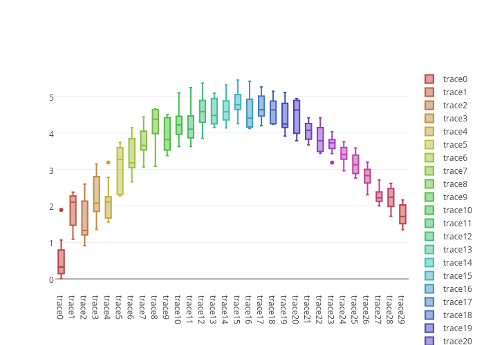 The graph on the right shows the distribution of a measure by a category "Tracexx". The category values are shown along the x-axis. the boxes are also colored by category, with a scrollable legend on the right.
In my opinion, it is relatively hard to line up and determine the category name for any particular box in the graph. The tick values are quite far away and dense. Also, the color shades are quite close so it is hard to see the category from the legend, which is also far away, with only some values visible. Making these associations requires a lot of eye movement, and it is not easy. For me, it is hard to determine which box represents "Trace11" in the graph, from the axis values or from the legend.
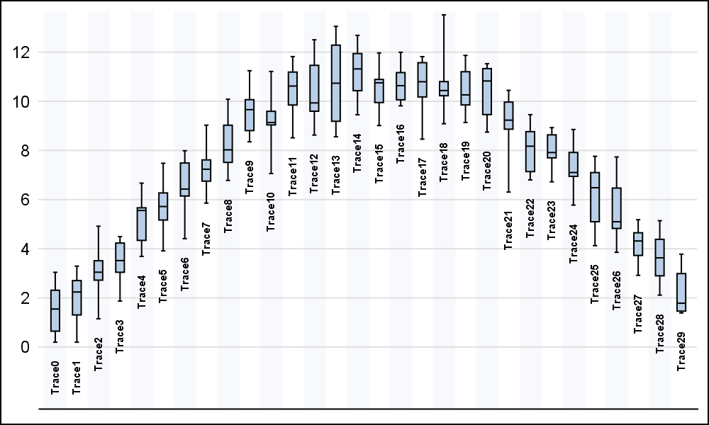 The graph on the right makes a small modification. Click on the graph for a higher resolution image. Placing the category value right next to the box makes it easier to determine which category we are examining. We have effectively moved the x-axis values closer to each box. This reduces the eye movement needed to examine the graph, thus making it easier to interpret. Note, we do not need the legend at all (other than for interactive selection).
To get this result, I saved the lowest value in each category in a variable called "Min". I retained only one value per category, making all others missing. Then, I use a Text plot to display the category value near the minimum value for each category. Note, I also added alternate light vertical bands that allow me to move the category labels a bit away to reduce clutter.
proc sgplot data=boxLabel noautolegend noborder;
vbox value / category=cat nomean nooutliers whiskerpct=0.95;
text x=cat y=min text=cat / rotate=90 position=left
textattrs=(size=6 weight=bold) contributeoffsets=(ymin);
xaxis display=(nolabel novalues noticks) discreteorder=data
valuesrotate=vertical colorbands=odd
colorbandsattrs=(transparency=0.8);
yaxis display=(nolabel noline noticks) grid integer
values=(0 to 12 by 2) valueshint;
run;
While this seems like a good solution to me, I would be happy to hear your opinion.
SAS 9.40M2 SGPLOT code: Box_Plot


10 Comments
Clever way to annotate the graph to reference the appropriate categories. A definite improvement to help interpretation. I'm curious what the color shading represents?
The original example is interactive, and the legend is really a "selector" to include or exclude categories. Colors may be for aesthetics.
Hi, I really liked the idea of putting the text closer to the values. Nice to share
I agree about proximity but in this case I am not so sure. The boxes are quite small, so the text is prominent in relation to the "data ink". As a result, the text tends to interfere with the quick visual interpretation of the graph. For me the pale coloured bands are enough assistance with alignment.
The categories are simply "trace" followed by a sequence number, so I doubt they are necessary for general interpretation of the graph. Might it be possible to put the sequence number part inside the boxes?
More generally, this example shows the limitations of printing on paper (or a screen). An interactive graphic solves the problem simply: use the axis (in case you print) but have tips appear as the cursor moves over a box.
I agree, tips could be useful here.
I think the alternating vertical bands are a good idea. Since the values of the discrete X axis are Trace0-Trace29, we really don't need the word "Trace." The X axis could have tick values 0-29 with label="Trace". I think that would eliminate a lot of the clutter and prevent the need to rotate the labels.
I like the idea or trimming the prefix to the category names in this specific case. It could lead to a less cluttered graph. However, there could be cases with real names of things on the x-axis.
I think the repetition of the word "Trace" for every label is redundant and makes the graph unnecessarily busy. You could indicate that these were "Trace" results in a title or footnote and then just printed the number horizontally under each box.
Bringing the labels in definitely helps on eye movement and comprehension.
Final step would be flipping the axes so that everything is easy to read without twisting one's head.
Also needs a label for the response axis. Maybe it's obvious to the people who work with Trace0 to Trace2x, but I don't know if these represent milli-seconds, mega-tons, or dollars/sq-ft.
If the legend is used as a selector, I'd rather keep it (and its colors - ooh, pretty!). You could make the colors easier to distinguish by repeating them - there doesn't appear to be a need for the color for every trace to be different, as long as you can tell them apart, so using half as many colors twice as often might work.