Over the past few weeks I have heard about the "Consort Diagram". This was mentioned in a Communities article, and also by a couple of users separately.
 This topic was also covered by Anusha Mallavarapu and Dean Shults from Cytel in a poster at PhUSE 2016 as shown on the right. The authors discuss an automated way to create the diagram using RTF template.
Speaking with the author, it appears that the diagram structure is relatively fixed for a set number of arms of the study. The authors showed a sample diagram for a 4 arm study shown on the right.
I thought it would be an interesting exercise to see if I could create this diagram fully in SAS, thereby reducing the complexity of using multiple tools. The diagram I created is meant to essentially mimic the diagram presented by the authors above. I have not filled in every box, but did one of each to see how we can create such a graph using the SGPLOT procedure. Other diagram structures could be defined in a similar way.
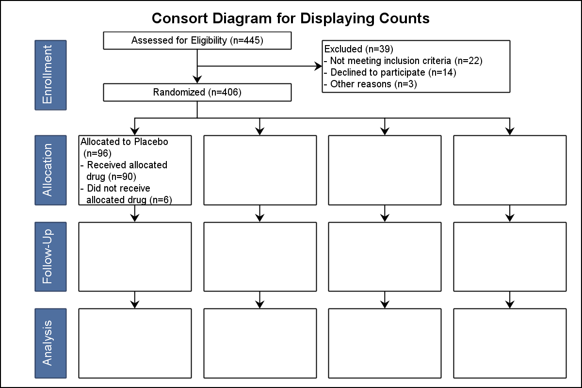 I have used the following statements with SAS 9.4M3 SGPLOT to create the diagram shown on the right. You can click on it for a higher resolution view.
- A Series plot to draw the links.
- A Polygon plot to draw the empty boxes.
- A Polygon plot to draw the filled boxes.
- A Text plot to draw the center aligned horizontal text.
- A Text plot to draw the left aligned horizontal text.
- A Text plot to draw the rotated text in the filled boxes.
The full program is linked below. The diagram is created in a 0-200 vertical and 0-100 horizontal space. Vertices for the links are defined as nodes data set with Node Id and their (x, y) coordinates based on the shape of the diagram. A Hash Object is created to hold the node ids and their x and y coordinates.
Links are defined as multi segment lines with the Node Ids as vertices. Up to 4 nodes can be used to allow for the angled links. Then, the Node Hash Object is used to get the coordinates of the vertices for the links, and written out as a series plot with multiple legs. Separate data sets are defined for the empty rectangles, and for the filled rectangles so two Polygon statements can be used to draw these, one for empty and one for filled.
While I defined the polygon vertices directly for ease of use, this could also be based on the Node Ids from the Hash Object.
Similarly, text is defined in three data sets, one for the rotated text, one for the center aligned text and one for the left aligned text. These are used with the three Text statements to draw the information. a FitPolicy=SplitAlways is used with a SplitChar="." to arrange the text. Finally, all the data sets are merged into one data set for use with the procedure.
I defined the text location directly for ease of use, but that could also be associated to the Node Ids and extracted from the Hash Object.
My goal is to show how the data should be arranged and which statements to use to draw the graph. The authors indicated that often the Consort Diagram structure and textual information (except the numbers) is static, with changing numbers. In that case, the diagram can be defined once and reused. The "N" values can likely be held in macro variables and inserted into the right places.
SAS 9.40M3 is necessary as I have used the TEXT plot statement to draw the text in the nodes. It may be possible to do this using Annotate with earlier versions, likely a bit harder. I would be interested to hear if this helps in the task, and what other details may need to be addressed. So, please feel free to chime in.
SAS 9.4 SGPLOT Code: consort_diagram


16 Comments
Thanks for this Sanjay! I was one of the users who mentioned this to you recently, when you were kind enough to come to present to the Boston Area SAS Users Group. This is exactly the sort of chart I wanted to produce. When I clicked the link to the code, I was surprised to see how little code you needed to do this. Very nice.
Yes, Quintin I remember our conversation so I tried to understand the details a little better from Anusha at PhUSE. I am happy you find this useful. The SGPLOT program code is only 10 lines and the code to setup the data is about 300 lines. The code for data setup will grow as you add more text to fill all the boxes. But I believe it is relatively well structured and easy to understand (IMHO). I think you can improve the code design by associating the locations of all items (links, boxes and text) to the node coordinates. Then, as you change the node values, all the items will shift automatically. I hope you can tell us how it works out for you. 🙂
I was playing with the code trying to get the arrowheads to be smaller (like you would see if you did the layout in RTF). It looks like there's a floor to the arrowhead size at around 0.3. I've noticed a similar floor effect when using the ARROW function in SGANNO. Is there a way to make smaller arrowheads, or is what we see in the post effectively the lower limit?
There is a known issue with ArrowHeadScale option (it does not work). 🙁 Its purpose was to scale up or down the arrowheads, but at some point it broke, and we did not catch it in time. However, an alternative will be to try Vector plot.
Sanjay, I'm looking at the documentation for the VECTOR statement in 9.4. I'm not seeing an option for adjusting the size of the arrowhead. Did I overlook something obvious? Or, perhaps you were saying that the default arrowhead is smaller in the VECTOR plot, so that is why you suggested it?
Thanks!
When I wrote the reply, I thought VECTOR had a similar option. But it does not. However, I am told it does a better job of drawing the arrowheads. Not sure if you agree. We will get the defect fixed with the next opportunity.
VECTOR does draw sharper (and smaller) arrowheads. I have adapted my code to use it. Thanks!
Sorry Sanjay, this is not quite the same information for the Consort Graph as in your example, but in this case Graphviz (http://webgraphviz.com) does it better and shorter, although it should be trivial to generate the adaptable *.dot code below with SAS:
digraph g {
start [shape = box, label = "CONSORT Graph"];
node0 [shape = box, label = "All Patients\nN=1000"];
node1 [shape = box, label = "Full Analysis Set\nN=800"];
node2 [shape = box, label = "Excluded\nN=100"];
node3 [shape = box, label = "Not Included\nN=100"];
node4 [shape = box, label = "Safety Set\nN=700"];
node5 [shape = box, label = "Not Dosed\nN=100"];
node6 [shape = box, label = "Treatment A\nN=200"];
node7 [shape = box, label = "Treatment B\nN=150"];
node8 [shape = box, label = "Treatment C\nN=200"];
node9 [shape = box, label = "Treatment D\nN=150"];
start -> node0 -> node1 -> node4 -> {node6 node7 node8 node9};
node0 -> node2;
node0 -> node3;
node1 -> node5;
}
Not surprising, Phil. There are many packages out there designed to handle diagrams that will do a good job rendering all sorts of diagrams, including the CONSORT with minimal code. SAS itself has such functionality in VA and SAS/GRAPH NV Workshop. These packages will do the work for you.
SGPLOT is NOT a diagramming package. That is why I group such examples under "Outside-the-box" category. These are graphs one does not expect to do with SGPLOT. But if you have no other way, and are willing to do some extra data step coding, you can do it. The same applies to the "Circle-Links" graph. 🙂
Could I request an automatic Consort graph type be added to ODS Graphics?
What you really want is a SGDIAGRAM procedure that will render many different types of diagrams, such as Trees, Networks, Sankey, Org Charts, and yes CONSORT. Maybe even a Circle-Link. The best way to make that happen is to express this need to Tech Support. If there are multiple users asking for this, we can justify the effort.
Graphviz is open source software and can be included in commercial software under the Eclipse Public License (EPL) with certain obligations. Without any need to develop new procedures in their entirety, Graphviz software could be included in SAS software installations and referenced by PROC SGDIAGRAM (or just PROC SGDIAG) to create any "connections" graphic, providing the connections are specified by SAS. The "dot" notation is very easy to generate in any programming language, so Org and Consort charts could become an integral part of ODS Graphics with minimal effort.
That seems the way to go for a user written macro. For a SAS written procedure, the right way would be wrap procedure syntax around code for such features that is already available in other SAS products. Such an effort will be easier to justify to management if there are specific requests from SAS users called into Tech Support for such features.
Hi Sanjay,
I am getting an error message when I run your code. I am using 9.4.
1110 /*--Draw the Consort Diagram--*/
1111 ods graphics / reset width=6in height=4in imagename='Consort';
1112 title 'Consort Diagram for Displaying Counts';
1113 proc sgplot data=consort noborder noautolegend;
1114 series x=xl y=yl / group=linkid lineattrs=graphdatadefault
1115 arrowheadpos=end arrowheadshape=barbed arrowheadscale=0.4;
------------
22
76
ERROR 22-322: Syntax error, expecting one of the following: ;, (, ATTRID, BREAK, CLUSTERWIDTH,
CURVELABEL, CURVELABELATTRS, CURVELABELLOC, CURVELABELPOS, DATALABEL,
DATALABELATTRS, DATALABELPOS, DATASKIN, DISCRETEOFFSET, FILLEDOUTLINEDMARKERS,
GROUP, GROUPDISPLAY, GROUPORDER, LEGENDLABEL, LINEATTRS, MARKERATTRS,
MARKERFILLATTRS, MARKEROUTLINEATTRS, MARKERS, NAME, NOMISSINGGROUP, SMOOTHCONNECT,
SPLITCHAR, SPLITCHARNODROP, SPLITJUSTIFY, TIP, TIPFORMAT, TIPLABEL, TRANSPARENCY,
URL, X2AXIS, Y2AXIS.
ERROR 76-322: Syntax error, statement will be ignored.
1116 polygon id=epid x=xp y=yp;
1117 polygon id=fpid x=xp y=yp / fill outline
1118 fillattrs=(color=cx4f6f9f) lineattrs=(color=cx2f3f5f);
1119 text x=xt y=yt text=htextc / splitchar='.' splitpolicy=splitalways;
----
180
1120 text x=xt y=yt text=htextl / splitchar='.' splitpolicy=splitalways position=right;
----
180
1121 text x=xt y=yt text=vtext / rotate=90 textattrs=(size=9 color=white);
----
180
ERROR 180-322: Statement is not valid or it is used out of proper order.
1122 xaxis display=none min=0 max=90 offsetmin=0 offsetmax=0;
1123 yaxis display=none min=0 max=200 offsetmin=0 offsetmax=0;
1124 run;
NOTE: The SAS System stopped processing this step because of errors.
NOTE: PROCEDURE SGPLOT used (Total process time):
real time 0.01 seconds
cpu time 0.01 seconds
Dear Sanjay, I am wondering if we can show bulletin in the textbox, instead of "-", like what originally display in Cytel's paper and how to do that? Thanks!
The special Unicode characters (for bullet) cannot be sent in through a column of the data set. However, it may be possible to do what you want by using a "User Defined Format". Unicode values can be defined in a format. So, if you put the text string "A" in the column, you can then use a UDF to format it to the full string with the "-" used for the splitting the text. Then, the "-" can be replaced by some Unicode value for the bullet.