Last week I was at PharmaSUG 2016, where I presented a 1/2 day seminar on creating Clinical Graphs using SAS. I was gratified to have a enthusiastic audience of about 28 attendees and we had a great interactive session. I also presented a paper on Clinical Graphs Using SAS. More on PharmaSUG 2016 soon.
While at PharmaSUG, I read a post by a user interested in creating KPI dials of the type that can be found on the SAS Support Page. User wanted to know if such KPI Dials can be created using GTL. Interestingly, a couple of attendees at the conference also expressed interest in it. Also, Kirk Lafler demonstrated a way to create Dashboards using Base SAS software. I figured it would be an interesting exercise to create one using SGPLOT procedure and may actually be useful for multiple applications.
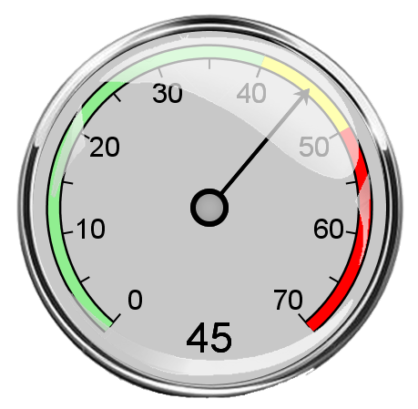 The result is shown on the right. Click on the dial for a higher resolution view. I wanted to create something that would look like a real dial, and not with a "flatland" rendered look. The dial on the right has a three zones with ticks and values, a needle showing the current value, and the value is also displayed at the bottom of the dial.
What distinguishes this from the ordinary "flatland" graphic is the nice shiny outer chrome ring, and reflective highlights on the surface of the dial simulating a glass cover. It may be nice to add a small window frame for the value.
The chrome ring is displayed using an image of a ring with transparent outer regions. The inner regions need not be transparent as it will be covered with the dial details.
 A second version is shown on the right. Here I have used a pastel shade for the dial background and set the value to 23. The intensity of the reflection map is reduced by increasing its transparency.
The full program for computing the data and the SGPLOT program is attached below. It uses two image files, one for the dial background and one for the dial reflection map. If you want to run the program, be sure to use images that will provide similar results.
It should be possible to write a macro to create such Dial KPIs on the fly, where you can define the number of ranges and their values and the value for the dial. Should be doable by converting the code attached into a macro.
SAS 9.4 SGPLOT Code: KPI_Dial_2


1 Comment
It's nifty KPI meter. Where to got two image files you mentioned?
Thanks.