Let us continue with our journey beyond standard plots and charts. Often we need to create some simple diagrams to visualize the connections between different entities such as patients and providers or even a social network.
 Many of you may not have a custom tool to create diagrams. But you have Base SAS, so let us see what we can do with the SGPLOT procedure and some Data Step coding to create simple diagrams.
Note: The emphasis is on Simple Diagrams.
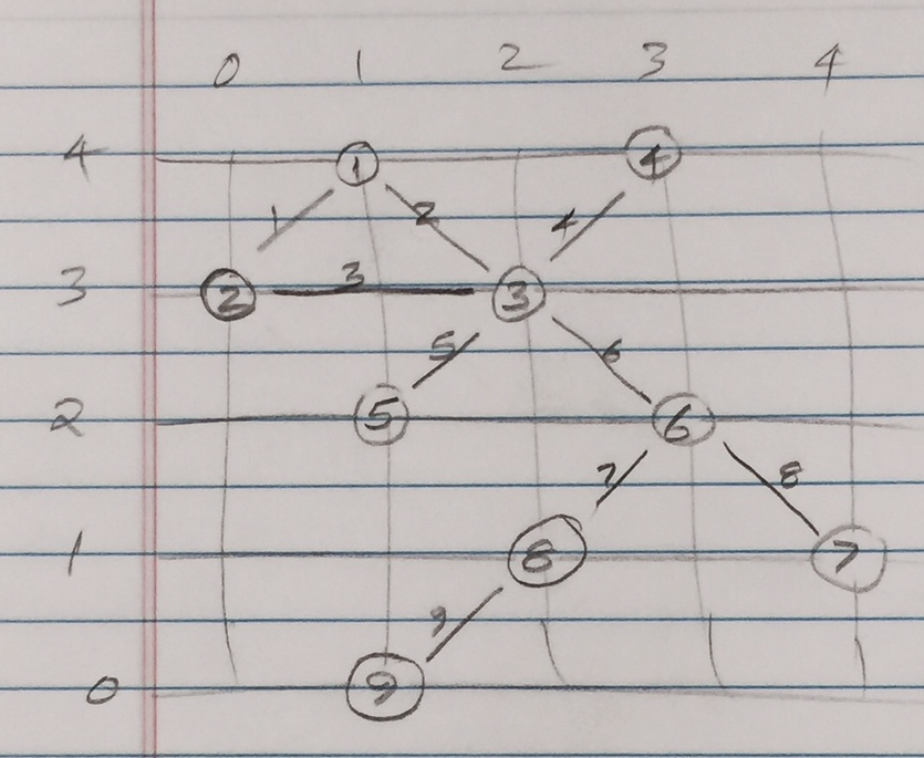
Say we want to create this simple diagram sketched on the right that I made from a display on the web. The nodes are shown as circles with node ids of 1-9. The links are shown as lines with link ids of 1-9. Nodes and links count need not be the same.
If the location of the nodes can be determined by some other process or procedure, then we can create this diagram using SGPLOT. So, let us assume the (x, y) coordinates of the nodes is known, and is as per the grid shown in the sketch.
 Generally, the links between the nodes are relationships that are known. These could represent patients and providers or social networks. Here are the two data sets.
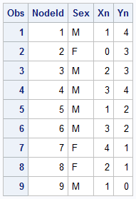
The Nodes data set contains the information about the nodes, including the unique node id, the location (x, y) of each node and other information.
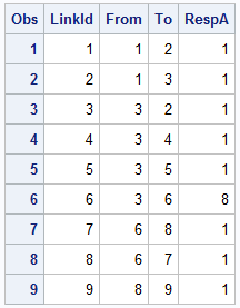
The Links data set contains only the connectivity information, including the unique link id and the "From" and "To" node. We could have other information like response that could stand for the frequency of interaction, or dollar value. Note the LinkId=6 has a high response value.
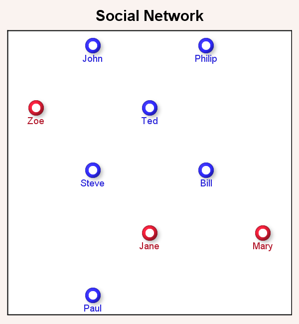
Displaying the nodes is very straightforward using a SCATTER statement. Here I have used the FilledOutlined markers along with the a data label displaying the name of the person at the bottom with GROUP=sex.
 Here is the SAS 9.40M3 code for display of nodes:
title 'Social Network';
proc sgplot data=network noautolegend aspect=1;
styleattrs backcolor=cxfaf3f0;
scatter x=xn y=yn / group=sex
markerattrs=(symbol=circlefilled size=16)
filledoutlinedmarkers markerfillattrs=(color=white)
markeroutlineattrs=(thickness=4)
dataskin=sheen datalabel=name datalabelpos=bottom;
xaxis min=0 max=4 display=none;
yaxis min=0 max=4 display=none;
run;
Now we need to add the display of the links. This can be easily done using the SERIES statement available in SGPLOT. However, note in the Links data set, we only have the connectivity of the links in the form of the "From" and "To" nodes. So, the first thing we have to do is to generate the information needed to draw the links as series plots, with line id, and the (x, y) coordinates of the two end points derived from the Nodes data set.
We do this using the Hash Object as shown in the full code below. The key aspects are as discussed below:
- First we create an ordered Hash Object with key of "NodeId", and data of "NodeId', "Xn" and "Yn".
- Then, for each link in the links data set, we find the "From" node in the Hash object, and write out the coordinates of that node as the starting (x, y) coordinates for the link.
- Then for each link in the links data set, we find the "To" node in the Hash object, and write out the coordinates of that node as the ending (x, y) coordinates for the same link.
- At the end of these steps, we have created a Links data with two observations for each link with the (x, y) coordinates of the two ends of the link.
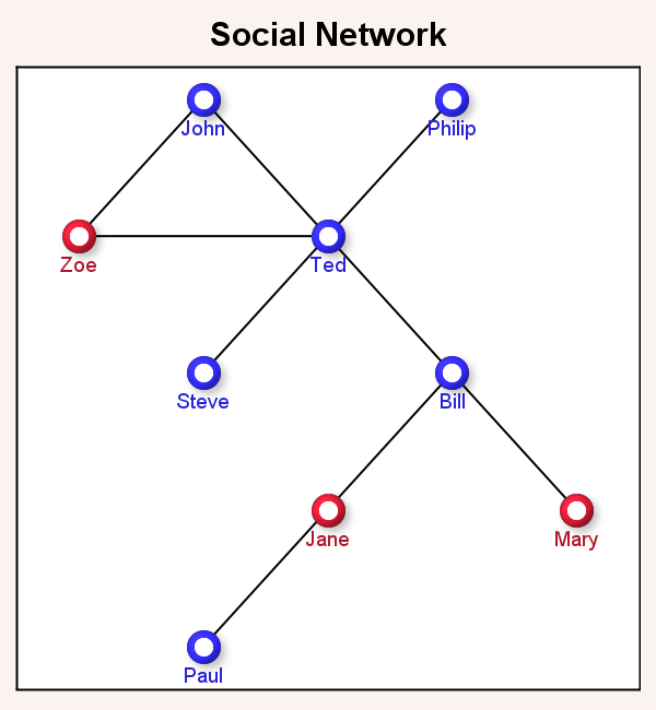 Now, we can merge the Nodes and Links data sets and use the following program to display the diagram. We added the SERIES statement to display the links. The various options of the SCATTER statement are same as before, and are trimmed here to conserve space.
title 'Social Network';
proc sgplot data=network noautolegend aspect=1;
styleattrs backcolor=cxfaf3f0;
series x=xl y=yl / group=LinkId lineattrs=graphdatadefault;
scatter x=xn y=yn / group=sex <options>;
xaxis min=0 max=4 display=none;
yaxis min=0 max=4 display=none;
run;
At this stage, we have the diagram representing the sketch I started with. Note, the links are straight lines connecting the from and to nodes.
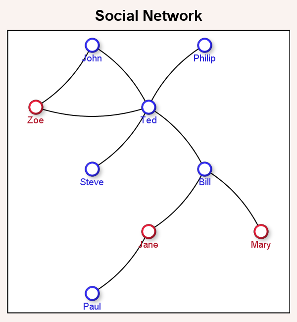 But in the title of the article, I suggested we would draw curved connecting links to make the display a bit nicer as shown on the right. This is especially true from an "Infographics" perspective as it inserts some visual interest in the diagram. The question is how do we do this using SGPLOT.
Starting with SAS 9.40M3, the SGPLOT procedure includes a new statement - The SPLINE plot. This behaves similar to the SERIES plot, except that it draws smooth splines between the vertices of the segments. The smooth curve line is guaranteed to start at the first vertex, and end at the last, but is not guaranteed to pass through any of the intermediate vertices which are "control points" that determine the shape of the curve. This is different from SMOOTHCONNECT for SERIES, where the curve still passes through all the points.
In order to get the curved shape, we need at least 3 points per curve. So far we have only two, the "From" location and the "To" location for each link. Now, we need to generate one middle point that is about half way between these two, but offset to one side a bit. This can be done by using some Vector math.
 The sketch on the right shows one link from point "1" to "2". For this link (vector), we can compute the direction cosines of the vector as Cx and Cy. Cx=(x2-x1) /L; where L is the length of the vector. Similarly, Cy=(y2-y1)/L.
Now, by vector math, the slope of the line normal to this vector (the dashed diagonal line) has Cxn=-Cy and Cyn=Cx. The center point of the vector can be computed with Xm=(x1+x2)/2 and Ym=(y1+y2)/2. The new offset point we want is x3=xm-Cyn*L*F and y3=ym+Cxn*L*F. F is a factor that moves the point further and closer along the dashed line. Here I used F=0.15 to create shallow curves.
Using this technique, we compute an extra middle point for each link to create the graph with shallow curved links shown below.
 Now, one last item. Note in the Links data set we had a column "RespA". This contains a response value for each link that could represent some measure of the importance of the link based on traffic, number of calls, number of references, or some other value. We can adjust the thickness of the link based on this response value as shown in the graph on the right. Here, "Ted" and "Bill" have more frequent communication than the other people.
The full code is included in the program linked below. The SPLINE statement has new options to control line thickness:
spline x=xl y=yl / group=LinkId lineattrs=graphdatadefault
thickresp=respA thickmaxresp=10 thickmax=4;
THICKRESP=RespA makes link thickness based on the column "RespA". THICKMAX sets the maximum thickness of a link in pixels for THICKMAXRESP setting. Here we have set THICKMAXRESP=10 and THIXKMAX=4. So if RespA has a value of 10 for any link, the line thickness will be 4 pixels. Other sizes will be proportional.
Note: Here I have shown how you can create simple network diagrams using the SGPLOT procedure. If the positions of the nodes can be determined, you can display the diagram. For simple cases, this can often be done in your code. I am not claiming this provides an alternative to products that solve the entire problem of node layout and display of the diagram. Algorithms for the computation of the of node locations can get complicated for large diagrams. Some algorithms are available on the web for MultiLevel Layout and Force-Directed Layout.
Full SAS 9.40M3 program: Network


5 Comments
This is a very nice post! I will find it useful to use and extend the ideas that you have presented here.
When assigning coordinates, I find it more natural to let the Y axis points down, so that the Y coordinate corresponds to rows or levels. For other readers who feel similrly, the REVERSE option on the YAXIS statement enables you to use decreasing values of Y.
I see you have worked hard to draw these diagrams by hand. You can share your diagrams with community where there are many diagram templates and examples
Technically, the diagram is not drawn by hand. The procedure does not have the built-in code for placing the nodes using a ML or Spring-Force algorithm. If node positions are computed by some other means, the procedure has the features to draw them as shown in the article.
Pingback: Series Plot with Response Color Segments - Graphically Speaking
Pingback: Directed Link Networks - Graphically Speaking