All axis customization features are always welcome. Especially since SGPLOT statements can often be used to create non standard graphs, having the ability to customize the axes is important. This article presents ways in which you can customize the discrete axes.
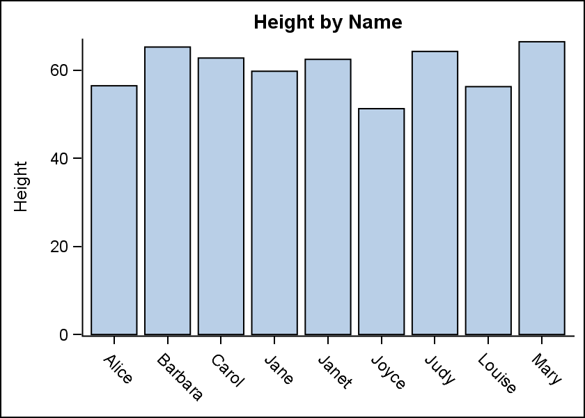 By default, the x axis will try to display the axis values so that the are legible, and avoid collisions. Here is a graph for all the Female students in the class data set. I intentionally set the width such that all the tick values do not fit without collision. The default FitPolicy is SplitRotate, meaning, split the values if possible (on a white space), and if that does not fit, then rotate it 45 degrees. This results in the rotated tick values on the axis. Click on the graph for a higher resolution view.
Many FitPolicy settings are available and some of the common useful ones are Stagger, Rotate and None.
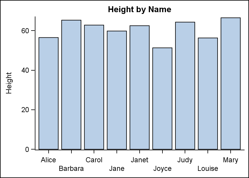 Rotated values are sometimes harder to read, and one can use FitPolicy settings to customize the arrangement. FitPolicy=Stagger will place every other tick value on a separate line. Only two levels are used for stagger, resulting in the arrangement on the right. In this arrangement, the space available for each tick value is about double of the single level.
The software determines the space available, and whether or not a collision is occurring based on the bounding box of the text string. Some allowances are made for clarity.
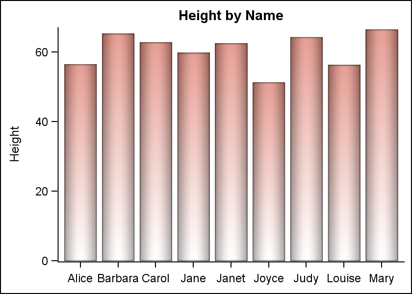 However, sometimes it is possible that the system decides there is a collision (based on the longest string), but to the eye it appears that the values could fit. In the case above, the tick values will actually fit in the space provided, even though the software may not determine so. When such a case is found, the user has the ability to turn off the fitting algorithms using FitPolicy=none. In the resulting arrangement on the right, "Barbara" does get a bit tight, but this may be acceptable for some use cases.
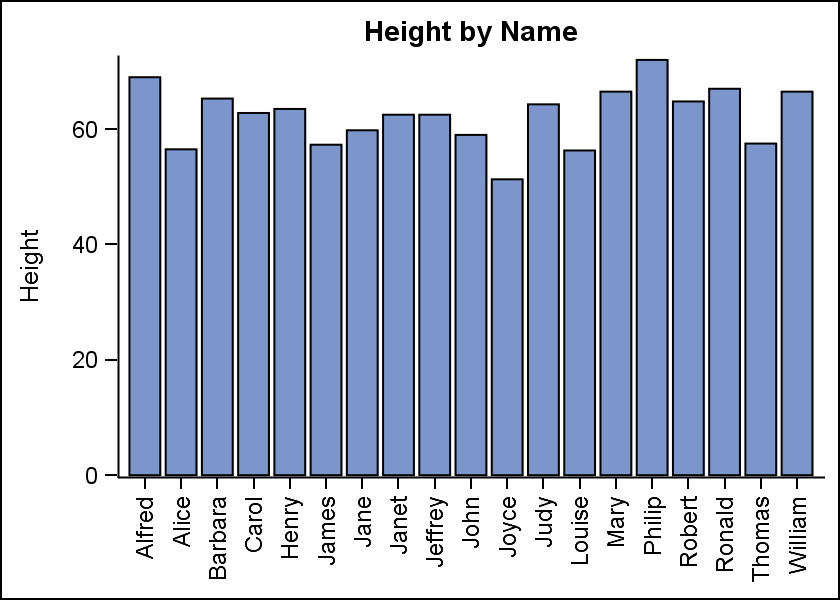 In some cases, the number of tick values are just too many and a vertical orientation for each tick value text may be useful, as shown on the right. Here we have used the default FitPolicy, but set the ValuesRotate option to "Vertical", resulting in the arrangement shown on the right.
Many other settings are available for the FitPolicy option. Please see the software documentation for all the details.
In case of the axis tick values on the Y axis, a different set of issues are in play, and the settings available for the FitPolicy option on the Y axis are different.
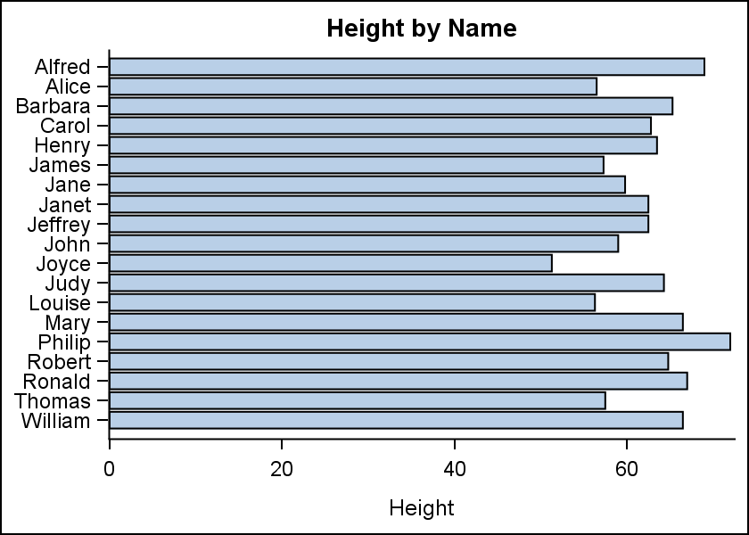
 Here is the HBAR graph of the same data for all students with the default settings. Note, horizontal bars are shown for all the students, but the tick value is shown only for every other value. This happens as all the tick values will not fit without collision. In many cases, where there is some ordering in the discrete values this may be acceptable. However, in the case on the right where each value is a unique string, dropping the display of alternate tick values causes a significant loss of information.
In the graph above, there seems to be sufficient space to draw all tick values. However, the collision algorithm in the software takes into account things like glyph descenders, etc., resulting into potential collision for some of the values.
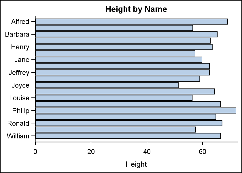
In such a case, using FitPolicy=none on the Y axis can be very useful. As we can see in the graph on the right, all the values are now displayed. There is really not such a great amount of clutter, and this arrangement may be acceptable.
 As we know, plot statements can be combined to create all kinds of standard and nonstandard graphs, including Forest Plots. In such cases, it is often desirable for the Y axis tick values to be left justified, as in a table. An option is available for the Y axis tick values to support just such a use case called ValuesHAlign=Left | Center | Right.
SAS 9.40M3 sample code:
title 'Height by Name';
proc sgplot data=sashelp.class noborder;
hbar name / response=height nostatlabel baselineattrs=(thickness=0)
filltype=gradient dataskin=pressed fillattrs=graphdata3;
yaxis display=(nolabel noline noticks) fitpolicy=none valueshalign=left;
xaxis display=(noline);
run;
Full SAS 9.40M3 code: Axis_Values


