A very common type of graph contains two series plot, where the user is expected to evaluate the difference visually.
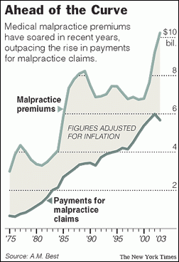 I saw one such plot on the web today shown on the right. This graph has two curves, one for malpractice premiums and one for claims, with a shaded band in the middle. The shaded region represents the difference, or the profit made by the companies issuing the insurance.
What caught my eye was the multiple elements in the graph the often requires the usage of annotation to pull off. The graph features the following:
- The two series plot of the data.
- The shaded band in between.
- The labeling for each plot and the band.
- Axis on the right.
- Grid lines that only go up to the Premium plot.
- Title and a "story" that this graph is telling.
Normally, I try to avoid using annotation to create a graph unless it is indispensable. Annotation is harder to use and not scalable to different situations, and should be used sparingly. So, I set about to see if I could make this graph using SAS 9.4M2 SAS SGPlot procedure without use of annotation.
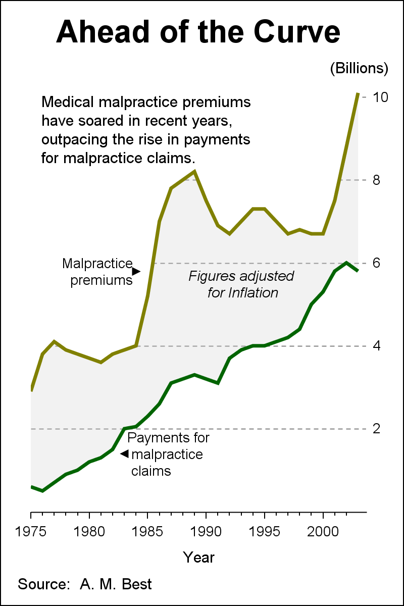 The resulting graph is shown on the right. First of all, I had to eyeball the data in the graph above to extract the data. Not too much work. Then, I used the SAS9.4M2 features of the SGPLOT procedure to create the graph. Click on the graph for a higher resolution image. Pretty close, don't you think?
Here is what I used to create the graph:
- StyleAttrs to set the two colors and the two markers (the left and right triangles).
- A series plot to draw the upper curve with Y2 axis.
- A series plot to draw the upper curve with Y2 axis.
- A band plot to draw the shaded area with Y2 axis.
- A band plot with white color to cover the grid lines.
- One label for each line and band.
- Inset for the "story" the graph is telling.
- No annotation.
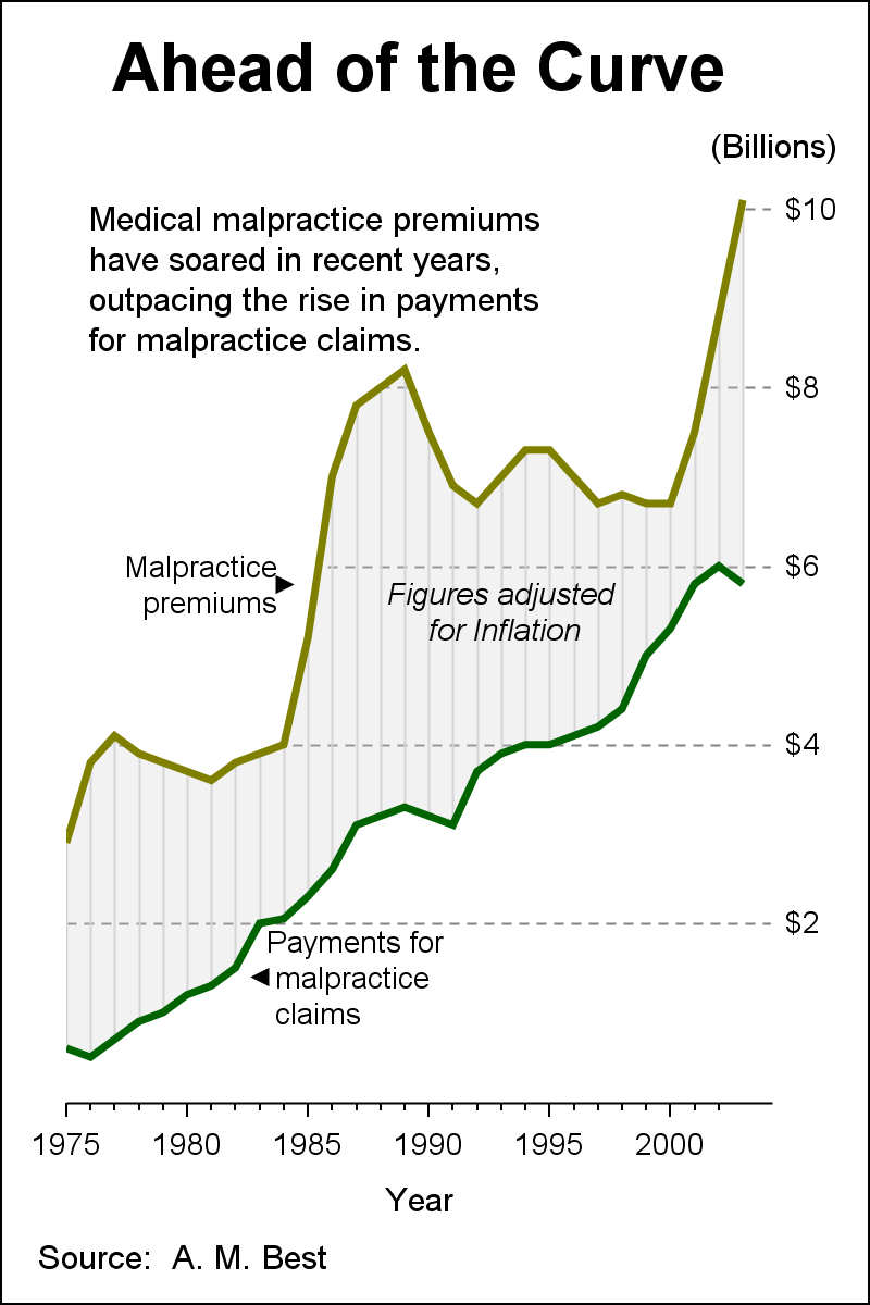
One problem with evaluating differences visually is the eye sees difference as the "shortest" distance between the curves. The actual difference we are plotting for any year is the "vertical" distance. These two are not the same. While the two plots pinch together in two places in the graph, the actual minimum vertical distance is larger than what the eye sees.
The graph on the right adds faint vertical lines in the banded area. These lines help the eye see the vertical distance instead of the smallest distance. We have done that by layering a HighLow plot on top of the band using default Type=line. At the pinch near 1985 the vertical difference is almost 50% larger than what the eye sees as the closest points on the two lines.
Here is the SGPLOT code:
title h=20pt 'Ahead of the Curve'; footnote j=l 'Source: A. M. Best'; proc sgplot data=premiums noborder noautolegend; styleattrs datasymbols=(triangleleftfilled trianglerightfilled); highlow x=year low=claims high=premium / y2axis lineattrs=(color=verylightgray); band x=year lower=premium upper=10.1 / y2axis fillattrs=(color=white); band x=year lower=claims upper=premium / y2axis fillattrs=(color=lightgray transparency=0.7); series x=year y=claims / y2axis lineattrs=(thickness=3 color=darkgreen); series x=year y=premium / y2axis lineattrs=(thickness=3 color=olive); scatter x=year y=yl / y2axis group=grp markerattrs=(color=black) nomissinggroup; text x=year y=yl text=label1 / y2axis splitpolicy=splitalways splitchar=',' position=right contributeoffsets=none textattrs=(size=9); text x=year y=yl text=label2 / y2axis splitpolicy=splitalways splitchar=',' position=left contributeoffsets=none textattrs=(size=9); text x=year y=yl text=label3 / y2axis splitpolicy=splitalways splitchar=',' contributeoffsets=none textattrs=(size=9 style=italic); xaxis minor minorcount=4 offsetmin=0 values=(1975 to 2003 by 5) min=1975 valueshint; y2axis display=(noticks noline) grid gridattrs=(color=gray) min=0 valueshint offsetmin=0 values=(2 to 10 by 2) gridattrs=(pattern=dash) label='(Billions)' labelpos=top; inset 'Medical malpractice premiums' 'have soared in recent years,' 'outpacing the rise in payments' 'for malpractice claims.' / position=topleft textattrs=(size=10); run; |
 Note the use of the following features in the graph.
- Text plot is used instead of the usual scatter plot with markerchar to place the labels. The text plot is specialized for text and has custom options include ContributeOffset.
- X axis has minor ticks and minor tick count.
- Y2 axis places the axis label on top instead on side.
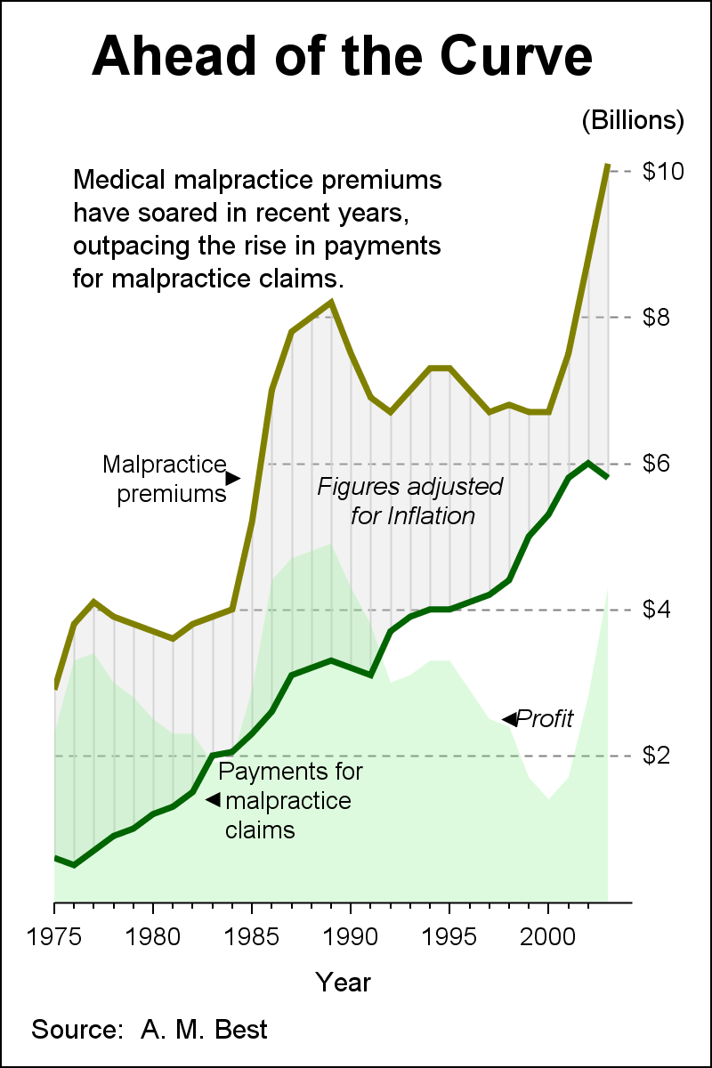
To make your graph more effective, it is better to display the actual derived value directly, instead of relying on each consumer of the graph to evaluate the difference accurately. So, I added a green band showing the actual difference between Premiums and Claims.
Full SAS 9.4M2 code: Premiums
Finally, next week is SAS Global Forum 2015 in Dallas. It is a great year for data visualization with many user presentations on graphics using SG Procedures and GTL. Visual Analytics is also on display. We will be there to meet with you, answer your questions and to hear your pains. See you at SGF in Dallas.


7 Comments
Sanjay,
Very nice. I especially like the addition of the actual difference. Could you post the data so we don't have to eyeball it?
Thanks,
Brian
The full program including the data is included in the program link at the bottom of the article.
I tried to run the supplied code but received an error for each of the three 'text' statements:
ERROR 180-322: Statement is not valid or it is used out of proper order.
The gridattrs= also generated an error:
WARNING 1-322: Assuming the symbol GRID was misspelled as gridattrs.
ERROR 22-322: Syntax error, expecting one of the following:
COLORBANDSATTRS, LABELATTRS, VALUEATTRS.
ERROR 76-322: Syntax error, statement will be ignored.
Is this because I am running SAS 9.4 TS Level 1M0 instead of SAS 9.4 M2?
Any pointers appreciated.
Yes, TEXT plot is SAS 9.4M2. However, you can replace it with a SCATTER plot statement with the MARKERCHAR option. You can remove the other offending options too.
Very interesting post Sanjay. The charts you have drawn are very accurate.
Dear Mr Matange,
I've been following your blog for a few months now. I'm still a student and your examples really help me create pretty neat-looking plots I wouldn't have come up with by myself. Thanks a lot!
Just one question: I'd be happy if you could tell me if there's an option which enables you to plot smoothed bands with the SGPLOT procedure, similar to the 'smoothconnect' option within a SERIES statement?
Sorry to say, I do not see such an option. You would have to compute the smooth points yourself.