Recently a user chimed in on the SAS Communities page, requesting a way to add some observation level annotation to a box plot. Wendy was delighted to see a graph created by the UNIVARIATE procedure called "Schematic Plot". In this graph, the box plot of the analysis variable is shown with a grouping at the bottom. Here is what the graph looks like (sort of):
Schematic Plot:

Note the "Station" and "Segment" grouping shown at the bottom. Wendy wondered if it was possible to add some observation level labels to the graph, where some observations would have labels. With GTL, it is possible to add such labels without external annotation, provided they are included in the data set as a separate column. Here is the graph Wendy wants:
Schematic Plot with Labels:
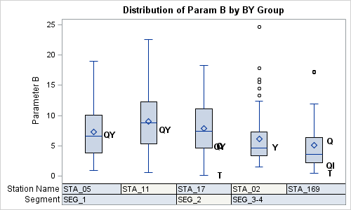
Note, now some of the observations have a label to the right of the box. These labels are displayed using an overlaid SCATTERPLOT with a DISCRETEOFFSET=0.3.
SAS 9.3 GTL Code:
/*--Define graph template--*/ proc template; define statgraph schematic; dynamic _anno; begingraph; entrytitle 'Distribution of Param B by BY Group'; layout overlay / xaxisopts=(display=none); boxplot x=station y=param_b / boxwidth=0.3; if (exists(_anno)) scatterplot x=station y=param_b / markercharacter=eval(strip(param_b_)) discreteoffset=0.3 markercharacterattrs=(size=10 weight=bold); endif; innermargin; blockplot x=station block=segment / filltype=alternate; blockplot x=station block=station / filltype=alternate; endinnermargin; endlayout; endgraph; end; run; /*--Render the graph without any labels--*/ ods graphics / reset width=5in height=3in imagename='schematic'; proc sgrender data=schematic_B template=schematic; run; /*--Render the graph with labels--*/ ods graphics / reset width=5in height=3in imagename='schematicAnno'; proc sgrender data=schematic_B template=schematic; dynamic _anno='yes'; run; |
In this case, both the graph are created by the same GTL template. We have used a "Dynamic" variable "_anno" to render the graphs with or without the annotation. Here are the details:
- An additional column is added the data with the label strings on some of the observations.
- Each observation has a Station and Segment value.
- The data set is sorted by Segment and Station.
- A BOXPLOT is used to draw the analysis variable by station.
- An INNERMARGIN is used to place the grouping bands inside the LAYOUT OVERLAY.
- Two BLOCKPLOTs are added in the inner margin to display the grouping.
- If_anno is defined, a SCATTERPLOT is used to draw the label strings.
- We use the MARKERCHARACTER option with DISCRETEOFFSET.
This example also shows the use of Dynamic, Eval, Function and Conditional logic.
Note, the SGPLOT procedure does not support BLOCKPLOTs and does not allow the overlay of scatter plots on a box plot. This is why we have to use GTL for this graph.
Wendy has kindly consented for me to publish this graph using her data. Thanks, Wendy.
Full SAS9.3 GTL code and Data: Schematic


2 Comments
Hi,
when using this template to create boxplot, what do the whiskers actually represent? min and max observation (skeletal) or the max and min value below the upper/lower fence (schematic boxstyle)?
Thank you in advance!
The whisker upper cap represents the maximum data value below the upper fence. Similarly for lower cap. See SAS documentation for computation of the upper and lower fence.