Recently I posted an article on this blog on how to create bar charts with log response axes in response to a question by a user. This generated some feedback suggesting that bar charts should not be used with log response axes or with a baseline of anything other than zero. John Munoz suggested there may be other ways to better represent the users data.
My initial goal was purely to see how such a graph could be created using SAS software. Following up on John's comments, I contacted the user to see what his exact use case is and why he wants to use a bar chart. Turns out, they do need an odds ratio plot, but usage of a dot plot was not showing the data with enough clarity in the opinion of the PI. So, they wanted to try out a bar chart or needle plot.
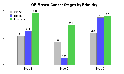
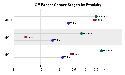
This user sent me sample data, and here is what the bar chart looks like along with the code. I added the bar labels to indicate values to compensate for the log axis:
SAS 9.3 Code:
title 'OE Breast Cancer Stages by Ethnicity'; proc sgplot data=oeb_grp; format stage 4.1; highlow x=type low=min high=stage /group=ethnicity groupdisplay=cluster type=bar highlabel=stage clusterwidth=0.6 lineattrs=(color=grey pattern=solid); yaxis type=log logbase=2 max=4 offsetmin=0 grid display=(nolabel); xaxis display=(nolabel noticks); keylegend / location=inside position=topleft across=1 noborder; run; |
In the above example, we have used the HighLow statement, with the low value set to 1. It is also possible to use the vertical bar chart in GTL, set BASELINE=0.1 and yaxis viewmin=0.1 to create the same plot. We could also make this a horizontal bar chart.
Since the bar chart strongly suggests the association of bar length to data value, the argument is that using a log transform, or a baseline other than zero may misrepresent the data. Some opinions seemed accept a log axis as long as the usage was very clear. It was also suggested that a dot plot may be more appropriate for such a plot with log axis as we are effectively looking at positions of the markers, and not the lengths of the bars.
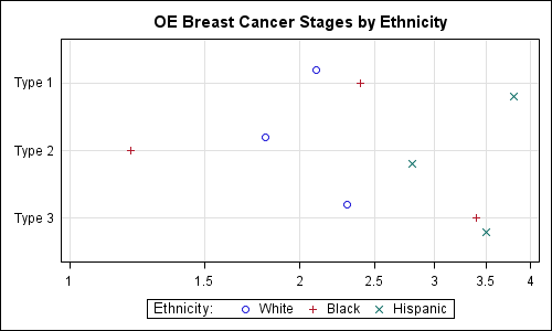
So, I investigated further to see how we could effectively represent such data as a Dot Plot. The SAS 9.3 SGPLOT does not support cluster grouping of dot plots on the Y axis. While this has been addressed for SAS 9.4, I reshaped the data into a multi-response and used discrete offset to make this plot:
Basic Dot Plot with log axis:
SAS 9.3 Code:
title 'OE Breast Cancer Stages by Ethnicity'; proc sgplot data=oeb_multi; format white black hispanic 4.1; dot type / response=white discreteoffset=-0.2 nostatlabel; dot type / response=black discreteoffset= 0.0 nostatlabel; dot type / response=hispanic discreteoffset= 0.2 nostatlabel; xaxis type=log logbase=2 logstyle=linear min=1 max=4 grid display=(nolabel); yaxis display=(nolabel noticks) offsetmin=0.2 offsetmax=0.2; keylegend / title='Ethnicity:'; run; |
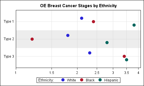
I believe one can see the concern expressed by the PI about the clarity of the display. Not only are the default markers small, the clusters seem to blend together as they are so far away from the axis. So, I tried some alternatives to "improve" the visual representations. The three different alternatives along with code are shown below. I would love to hear your comments.
Bolder markers with category bands: The horizontal bands help to cluster the markers that belong together in one group.
SAS 9.3 Code:
title 'OE Breast Cancer Stages by Ethnicity'; proc sgplot data=oeb_multi; format white black hispanic 4.1; refline ref / lineattrs=(thickness=60 color=lightgray) transparency=0.6; dot type / response=white discreteoffset=-0.2 nostatlabel markerattrs=(symbol=circlefilled size=11) ; dot type / response=black discreteoffset= 0.0 nostatlabel markerattrs=(symbol=circlefilled size=11); dot type / response=hispanic discreteoffset= 0.2 nostatlabel markerattrs=(symbol=circlefilled size=11); xaxis type=log logbase=2 logstyle=linear min=1 max=4.1 grid display=(nolabel) offsetmin=0 offsetmax=0; yaxis display=(nolabel noticks) offsetmin=0.2 offsetmax=0.2; keylegend / title='Ethnicity:'; run; |
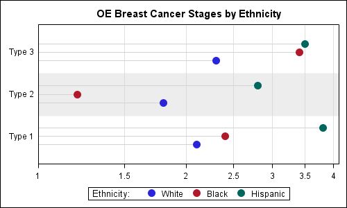
Dot plot with faded needles: The needles may help the eye and their faint rendering may avoid a strong association with length (opinions?). We used high low plot for the needles. The dot plot does not allow overlay of other basic plots, so we used Scatter to draw the markers. Note: Changing from Dot to Scatter also "unreversed" the Y axis so the relative positions of the markers have changed.
SAS 9.3 Code:
title 'OE Breast Cancer Stages by Ethnicity'; proc sgplot data=oeb_multi nocycleattrs; format white black hispanic 4.1; refline ref / lineattrs=(thickness=60 color=lightgray) transparency=0.6; highlow y=type low=min high=white / type=line discreteoffset=-0.2 lineattrs=(color=lightgray pattern=solid); scatter y=type x=white / discreteoffset=-0.2 name='w' legendlabel='White' markerattrs=graphdata1(symbol=circlefilled size=11) ; highlow y=type low=min high=black / type=line discreteoffset= 0.0 lineattrs=(color=lightgray pattern=solid); scatter y=type x=black / discreteoffset= 0.0 name='b' legendlabel='Black' markerattrs=graphdata2(symbol=circlefilled size=11); highlow y=type low=min high=hispanic / type=line discreteoffset= 0.2 lineattrs=(color=lightgray pattern=solid); scatter y=type x=hispanic / discreteoffset= 0.2 name='h' legendlabel='Hispanic' markerattrs=graphdata3(symbol=circlefilled size=11); xaxis type=log logbase=2 logstyle=linear min=1 max=4.1 grid display=(nolabel) offsetmin=0 offsetmax=0; yaxis display=(nolabel noticks) offsetmin=0.2 offsetmax=0.2; keylegend 'w' 'b' 'h' / title='Ethnicity:'; run; |
Dot Plot with Class Labels: Personally, I like direct labeling of curves and points whenever possible to avoid having to always look at the legend to decode the colors. This usually works well for curves, but may also work here with sparse data. Now we can do away with the legend.
SAS 9.3 Code:
title 'OE Breast Cancer Stages by Ethnicity'; proc sgplot data=oeb_multi nocycleattrs noautolegend; format white black hispanic 4.1; refline ref / lineattrs=(thickness=60 color=lightgray) transparency=0.6; highlow y=type low=min high=white / type=line discreteoffset=-0.2 highlabel=whitelabel lineattrs=(color=lightgray pattern=solid); scatter y=type x=white / discreteoffset=-0.2 name='w' legendlabel='White' markerattrs=graphdata1(symbol=circlefilled size=11); highlow y=type low=min high=black / type=line discreteoffset= 0.0 highlabel=blacklabel lineattrs=(color=lightgray pattern=solid); scatter y=type x=black / discreteoffset= 0.0 name='b' legendlabel='Black' markerattrs=graphdata2(symbol=circlefilled size=11); highlow y=type low=min high=hispanic / type=line discreteoffset= 0.2 highlabel=hispaniclabel lineattrs=(color=lightgray pattern=solid); scatter y=type x=hispanic / discreteoffset= 0.2 name='h' legendlabel='Hispanic' markerattrs=graphdata3(symbol=circlefilled size=11); xaxis type=log logbase=2 logstyle=linear min=1 max=4.1 grid display=(nolabel) offsetmin=0 offsetmax=0; yaxis display=(nolabel noticks) offsetmin=0.2 offsetmax=0.2; run; |
We could label the actual response value instead of the class values. I think class labels help in decoding of the data, while the positions of the markers indicate the values just fine. As I said earlier in the article, I would be happy to hear opinions on these alternatives.
Full SAS 9.3 code: DotPlot_V93


3 Comments
Sanjay,
I think your dot plots are excellent! They're clear and beautiful.
I do wonder, though, for this specific application, where the range of values is .1 on the dot plots and 1 on the bars to 4, why don't you just start the axis at zero? If the client wants a graph to show the odds ratio, then isn't it best to let them see risk expressed in a way that’s easy to compare within and across categories? For example, the raw data indicate that the odds are nearly 2x worse for Hispanics than Whites for Type 1 breast cancer. By starting out your chart at 1 rather than 0, the difference between the two groups appears to be 50%, when it's actually about 100%.
Here’s what I think the graph should look like. I made this graph in JMP (don’t have 9.3 yet so I can’t do the clusters:< ).
If the above graph doesn't show through (SAS should think about making it easier for commenters to post images on this blog), head over to http://bit.ly/IDdewz to see it.
Having not been in the discussion with your client, I can’t say for certain that this is what they want. But the only other thing I can think of that would justify starting any of the charts you have on this post at something other than zero would be to draw attention to small differences in cancer risk between the groups. But small differences probably don’t matter nearly as much as the big ones do, so I’ve got to think that calling out large differences and letting the reader compare those differences across the ethnicities are important, and for that, your first chart, but with a zero axis, would work quite well.
Pingback: Broken Y-Axis - Graphically Speaking
Pingback: Axis Break Appearance Macro - Graphically Speaking