The display of statistics, aligned with graphical plot of the data, is a common requirement for graphs, especially in the Clinical Research domain. In the previous post on Discrete Offset, I used an example of the Lipid Profile graph. Now, let us use the same example and add the display of statistics in the graph. The graph shown below displays the median of the lipid values for each treatment group by visit.
Note: The values on the x-axis in this example are intentionally discrete. However the same techniques can be used with linear data as discussed earlier.
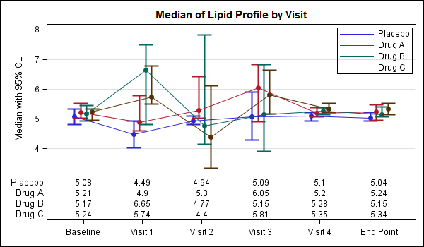
In the above graph, the median lipid values for each treatment group are displayed inside the graph area, below the plotted data. To do this we use a GTL plot statement called BLOCKPLOT. The syntax for this statement is as follows:
BLOCKPLOT X=column BLOCK=column / display=(values labels) (other options); |
In this use case, the BLOCKPLOT statement draws the text values from the column assigned to the BLOCK role at the appropriate location along the x-axis as determined by the X role. Here, we are using the same variable for the X=day role for the scatter, series and block statements, so everything is correctly aligned. We need one BLOCKPLOT for each column of data.
We have placed the blockplots in the INNERMARGIN of the LAYOUT OVERLAY. An InnerMargin reserves a region at the bottom or top of a Layout Overlay into which we can add such plots. Currently only the BLOCKPLOT is allowed. Multiple BLOCKPLOT are automatically stacked. The code snippet is shown below. The full code is shown here: SAS Code For Lipid Graph Inner Stats
layout overlay / yaxisopts=(griddisplay=on label='Median with 95% CL') xaxisopts=(display=(ticks tickvalues)); scatterplot x=day y=p_med / discreteoffset=-0.15 (options); scatterplot x=day y=a_med / discreteoffset=-0.05 (options); scatterplot x=day y=b_med / discreteoffset= 0.05 (options); scatterplot x=day y=c_med / discreteoffset= 0.15 (options); seriesplot x=day y=p_med / discreteoffset=-0.15 (options); seriesplot x=day y=a_med / discreteoffset=-0.05 (options); seriesplot x=day y=b_med / discreteoffset= 0.05 (options); seriesplot x=day y=c_med / discreteoffset= 0.15 (options); discretelegend 'ps' 'pa' 'pb' 'pc' / location=inside (options); innermargin; blockplot x=day block=c_med / repeatedvaluess=true display=(options); blockplot x=day block=b_med / repeatedvaluess=true display=(options); blockplot x=day block=a_med / repeatedvaluess=true display=(options); blockplot x=day block=p_med / repeatedvaluess=true display=(options); enddinnermargin; endlayout; |
While my personal preference is to get the data as close to the graph as possible, the preferred method in the industry is to place the statistics table below the axis. This too can be easily acheived using GTL as shown in the graph below.
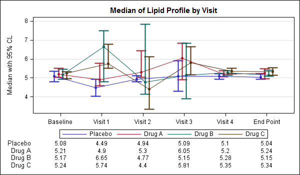
Note, in the graph above we have also moved the legend to its traditional location below the axis. The stat table is now drawn outside the graph area, and the values are still correctly aligned with the x-axis. To do this, we have to use the LAYOUT LATTICE statement to create a graph with two cells. The upper cell has the plots (as before), and the lower cell has the stat table using the same Block Plot. The code snippet for LAYOUT LATTICE is shown below. The full program is shown here: SAS Code For Lipid Graph Outer Stats
layout lattice / rows=2 rowweights=(0.8 0.2) columndatarange=union; |
To aid in matching the correct stat value with the corresponding plot, it could be useful to color the stat values similar to the plot as shown below.
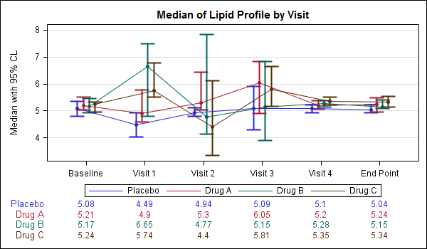
You can do that by setting the VALUEATTRS and LABELATTRS options for the BLOCKPLOT appropriately as shown in the code snippet below. The full program is shown here: SAS Code For Lipid Graph Outer Stats Color
BLOCKPLOT X=day BLOCK=c_med / repeatedvalues=true display=(values label) valueattrs=graphdata4 labelattrs=graphdata4; |


3 Comments
Great stuff Sanjay. Thanks.
I am happy to see the above results and also its useful for every SAS User.
Thanks,
Ramesh
9986008661
Pingback: SGPLOT with axis-aligned statistics columns - Graphically Speaking